User Experience

Business owner reviewing website performance metrics and analytics on a laptop screen

Is Your Website Actually Working? 7 Simple Ways to Measure Website Performance

By Digital Marketing, Web Design

Many businesses invest in a website and then treat it like a digital brochure, something that simply exists online. But a good website should do more than look professional. It should help your business grow. It should attract visitors, guide them toward the right information, and turn interest into enquiries or sales.

Business owner reviewing website performance metrics and analytics on a laptop screen

The challenge is that many business owners don’t know how to tell whether their website is performing well. They might hear about analytics, SEO metrics, or technical performance scores, but those can feel overwhelming and overly technical.

The good news is that measuring website performance doesn’t have to be complicated. You don’t need to be a developer or data analyst to understand whether your site is helping your business.

Here are seven practical ways to measure how well your website is really performing and what to look for if something needs improvement.

1. Are You Getting the Right Visitors?

One of the most basic measures of website performance is traffic: how many people are visiting your site.

But the number alone doesn’t tell the whole story. What matters more is whether the right people are finding your website.

For example, a landscaping company in Christchurch doesn’t benefit much from hundreds of visitors in other countries. What matters is attracting homeowners in the local area who are looking for landscaping services.

Tools like Google Analytics can show where your visitors come from, which pages they land on, and how they found you: through Google searches, social media, referrals, or direct visits.

If your traffic is growing and the majority of visitors are coming from relevant sources, that’s a positive signal your website is reaching the right audience.

If traffic is low or coming from unrelated places, it may mean your SEO, content strategy, or marketing channels need adjustment.

Google Analytics dashboard showing website traffic, visitor behaviour, and the pages people view most often.

Google Analytics dashboard showing website traffic, visitor behaviour, and the pages people view most often.

2. Are Visitors Staying or Leaving Immediately?

Another useful indicator is how long visitors stay on your site.

If people arrive and leave within a few seconds, it often suggests something is wrong. Perhaps the page didn’t match what they expected, the message wasn’t clear, or the website felt confusing.

This is often referred to as a bounce rate – the percentage of visitors who leave after viewing only one page.

A high bounce rate isn’t always bad. For example, someone might visit a contact page, get the phone number, and leave. But if visitors consistently leave your homepage or key service pages quickly, it may indicate that your introduction section isn’t doing its job.

Clear messaging, simple navigation, and strong headlines can make a big difference here.

3. Are Visitors Taking the Next Step?

Ultimately, the purpose of most business websites is to encourage action.

That action might be:

  • Filling out a contact form
  • Booking a consultation
  • Calling your business
  • Downloading a guide
  • Purchasing a product

These actions are known as conversions.

If your website attracts plenty of visitors but very few enquiries, the issue may not be traffic, it may be the way the site guides visitors toward the next step.

Simple improvements can often increase conversions significantly. Clear call-to-action buttons, well-structured service pages, and trust signals like testimonials or reviews help visitors feel confident taking action.

4. Are Your Most Important Pages Being Viewed?

Not every page on your website carries the same importance.

For many businesses, a few key pages do most of the work:

  • Homepage
  • Main service pages
  • Pricing pages
  • Contact page
  • Key blog articles

Looking at which pages people visit most often can reveal whether visitors are finding the information that matters.

If your service pages receive very little traffic, it could mean visitors are struggling to navigate the site or search engines aren’t ranking those pages well.

On the other hand, if certain blog articles attract consistent traffic, they may be worth expanding or linking to more prominently.

Understanding which pages perform well helps guide future improvements.

5. How Fast Does Your Website Load?

Speed has become an important part of the online experience.

Most people expect websites to load quickly. If a page takes too long, many visitors will leave before it finishes loading.

Page speed affects not only user experience but also search engine visibility. Search engines prefer fast websites because they provide a better experience for users.

There are simple tools, such as Google PageSpeed Insights, that can give you a rough idea of how fast your site loads.

You don’t need to understand every technical detail, but it’s helpful to know whether your website performs well on mobile devices and whether any obvious issues are slowing it down.

Common causes of slow websites include very large images, unnecessary scripts, or outdated hosting.
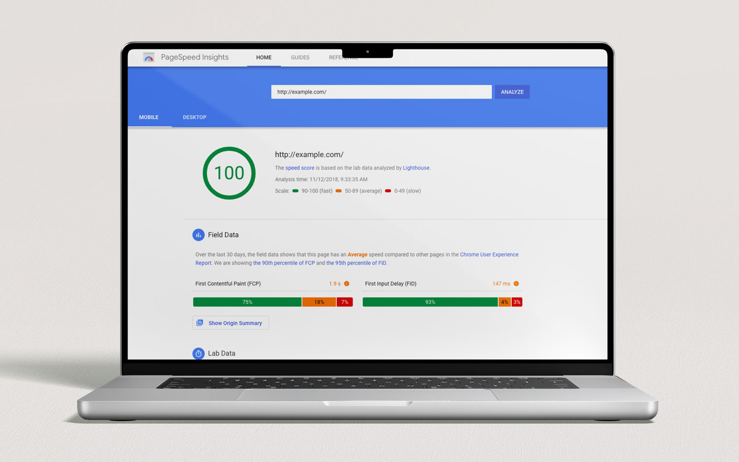
Google PageSpeed Insights helps evaluate how fast your website loads and highlights opportunities to improve performance.

Google PageSpeed Insights helps evaluate how fast your website loads and highlights opportunities to improve performance.

6. Are People Finding You Through Search Engines?

For many businesses, search engines remain one of the most valuable sources of website visitors.

If someone searches for services you offer, for example, “house renovation Christchurch” or “accountant for small business”, ideally your website should appear somewhere in those results.

You can measure this by checking whether visitors are arriving through organic search (Google or other search engines).

Google Search Console is a helpful tool that shows which keywords people are searching for when they discover your site. It can also reveal which pages appear in search results most often.

If your website rarely appears in search results, improving SEO, through clearer service pages, helpful blog content, and technical improvements, can make a significant difference over time.

Google Search Console dashboard showing how your website appears in search results and which queries bring visitors to your site.

Google Search Console dashboard showing how your website appears in search results and which queries bring visitors to your site.

7. Are Visitors Using Your Website Easily?

One of the most overlooked measures of website performance is usability.

Ask yourself:

  • Is it easy to find key information?
  • Are important pages only one or two clicks away?
  • Does the site work smoothly on mobile devices?
  • Is the next step obvious?

A website might technically function well but still frustrate users if navigation is confusing or content is difficult to scan.

One of the simplest ways to evaluate usability is to watch how real people interact with your site. Ask a colleague or customer to try finding a service or booking a consultation and observe what happens.

If they hesitate, get lost, or ask questions like “Where do I click?”, that’s valuable feedback.

Good website design should feel intuitive — visitors shouldn’t need instructions.

Why Measuring Website Performance Matters

A website is never truly finished.

Just like a physical business location evolves over time, your website should continue improving as you learn how people use it.

By regularly checking a few simple indicators: traffic, engagement, conversions, page performance, search visibility, speed, and usability, you gain a clearer picture of whether your website is helping your business or holding it back.

The goal isn’t to obsess over numbers. It’s to understand whether your website is guiding visitors toward becoming customers.

Final Thoughts

Your website should be one of the hardest-working tools in your business. But without measuring performance, it’s difficult to know whether it’s doing its job.

The good news is that you don’t need complex analytics dashboards to get started. Paying attention to a handful of key indicators can reveal a lot about how well your site performs.

Small improvements, such as clearer messaging, faster loading pages, stronger calls to action, can often make a significant difference.

Over time, those improvements compound into better visibility, more enquiries, and a stronger online presence.

Would like a Free Website Audit?

If you’re not sure how well your website is performing, we can help.

Send us your website link and we’ll review it from a usability, design, and performance perspective, highlighting practical improvements that can help turn more visitors into enquiries.

Website Introduction Section: Header & Hero Tips

The Website Introduction Section: How to Get Your Header and Hero Right

By Tips and Guides, Web Design

When someone lands on your website, they form an opinion almost immediately. They don’t take minutes of reading or careful comparison. Within a few seconds, they’re already deciding whether your business feels relevant, trustworthy, and worth exploring further.

That first screen, what we’ll call your introduction section, carries most of that responsibility.

Website Introduction Section: Header & Hero Tips

The introduction section is made up of two parts:

  • Your header (logo, navigation, key call-to-action)
  • Your hero section (main headline, supporting message, image or video and primary action)

Together, they answer four silent questions every visitor has:

  1. Am I in the right place?
  2. What does this business actually do?
  3. Can I trust them?
  4. What should I do next?

If your introduction section gets these right, the rest of your website becomes easier. If it gets them wrong, even a beautiful site can underperform.

Let’s break down how to get both your header and hero section working properly, in clear, practical terms.

Part 1: Getting Your Header Right

Your header is the strip at the very top of your website. It usually includes your logo, navigation menu, and a call-to-action button.

It appears on every page which means small problems become big problems quickly.

1. Make Your Brand Instantly Recognisable

Your logo doesn’t need to be huge. It needs to be clear.

Visitors should be able to glance at the top left and know whose website they’re on. Avoid shrinking your logo so small that it’s unreadable, but also avoid making it dominate half the screen.

Clarity builds confidence.

2. Simplify Your Navigation (More Than You Think)

Most businesses overload their navigation.

They treat the menu like a storage cupboard for every page they’ve ever created. The result? Visitors hesitate instead of clicking.

Your navigation should guide people, not overwhelm them.

Use simple labels:

  • Services
  • About
  • Pricing
  • Our Work
  • Blog
  • Contact

Avoid vague menu titles like “Solutions” or “Capabilities” unless they’re extremely clear in your industry.

And remember: you don’t need 12 top-level items. Five or six is often plenty.

If someone has to think too hard about where to click, they’ll leave.

3. Include One Clear Call-To-Action

Your header should include one primary action.

Examples:

  • Get a Quote
  • Book a Consultation
  • Request a Callback
  • Call Now

Make it visible. Make it specific. Make it match how customers buy from you.

If you’re a high-consideration service (law firm, architecture, consulting), “Book a Consult” makes more sense than “Buy Now”.

If you’re an emergency plumbing company, “Call Now” should be obvious and tappable.

Your header should gently push people toward action without feeling aggressive.

4. Make Sure Your Designer Uses Mobile First Approach

Most people will see your website on their phone. That means your header needs to:

  • Have an easy-to-tap menu icon
  • Keep the logo compact
  • Make the call-to-action accessible
  • Avoid giant dropdowns that feel messy

Open your site on your phone and try using it one-handed. If it feels awkward, it needs improvement. Mobile friction kills conversions quietly.

5. Don’t Overload It With Badges and Noise

Trust matters but too many trust symbols can backfire.

  • A phone number? Great.
  • A subtle review rating? Helpful.
  • “NZ Owned” or “20+ Years Experience”? Strong if true.

But stacking awards, certifications, icons, and banners in the header makes it feel cluttered and desperate.

Example of a clear website introduction section — simple navigation, organised service dropdown, strong headline, and a visible “Book Now” call-to-action guiding users instantly.

Example of a clear website introduction section Sky Media created for Lily’s Choice — simple navigation, organised service dropdown, strong headline, and a visible “Book Now” call-to-action guiding users instantly.

Part 2: Getting Your Hero Section Right

Now let’s talk about the hero section — the large area directly beneath your header. This is where most websites either win or lose attention.

1. Replace “Welcome” With a Real Headline

“Welcome to our website.” This is one of the most cliché lines on the internet.

Your hero headline should clearly explain:

  • What you do
  • Who it’s for
  • What result you provide

For example:

“Landscaping Design and Installation That Transforms Outdoor Spaces”
“Residential Heat Pump Installation in Wellington — Fast, Reliable Service”

No clever metaphors. No vague slogans. Just clarity. People shouldn’t have to decode your business.

2. Support the Headline With Context

Your subheading (the smaller text under the headline) should answer:

Why choose you?

This is where you mention experience, specialisation, speed, quality, or unique approach. Keep it short: two or three sentences at most.

Your hero section is not the place for a full company history.

3. Use One Strong Primary Button (or Primary and Secondary Buttons)

Your hero section should have a clear action.

Usually:

  • Primary button: Get a Quote / Book Now
  • Secondary button (optional): View Services / See Our Work

Make sure the primary button stands out visually.

If everything is the same colour and weight, nothing feels important.

4. Choose Images or Videos That Support — Not Distract

Hero images can elevate your brand or make it feel generic.

Avoid overused stock photos of:

  • People high-fiving in boardrooms
  • Handshakes against city skylines
  • Abstract “success” visuals

Instead, use:

  • Real photos of your team
  • Real photos or videos of your completed projects
  • Real photos of your products
  • Real photos or videos of environments, like your office, your building site etc.

Authenticity builds trust faster than perfection.

Also, make sure your image or video  doesn’t slow down the page. Large, unoptimised images or videos can hurt loading speed, especially on mobile.

A fast-loading website feels professional.

5. Keep It Visually Calm

A common mistake is trying to say everything at once.

Headline. Subheadline. Three badges. Two buttons. Background video. Animated text. Scrolling logos.

It’s too much.

Your hero section should feel focused. One clear message. One clear next step.

Whitespace is not empty space — it’s breathing room and the tool to guide visitors’ attention into the right place.

6. Make It Clear You’re a Real Business

Small credibility signals in the hero area can increase trust:

  • Years in business
  • Number of projects completed
  • Google rating
  • Short testimonial snippet

But again: subtlety wins. Trust is built through clarity, not clutter.

How Header and Hero Work Together

Think of your introduction section like this:

  • Your header is the roadmap.
  • Your hero is the explanation.

The header helps people move around. The hero helps them decide whether to stay.

If your header is clean but your hero is vague, visitors feel unsure.

If your hero is strong but your header is confusing, they struggle to navigate.

They must work together.

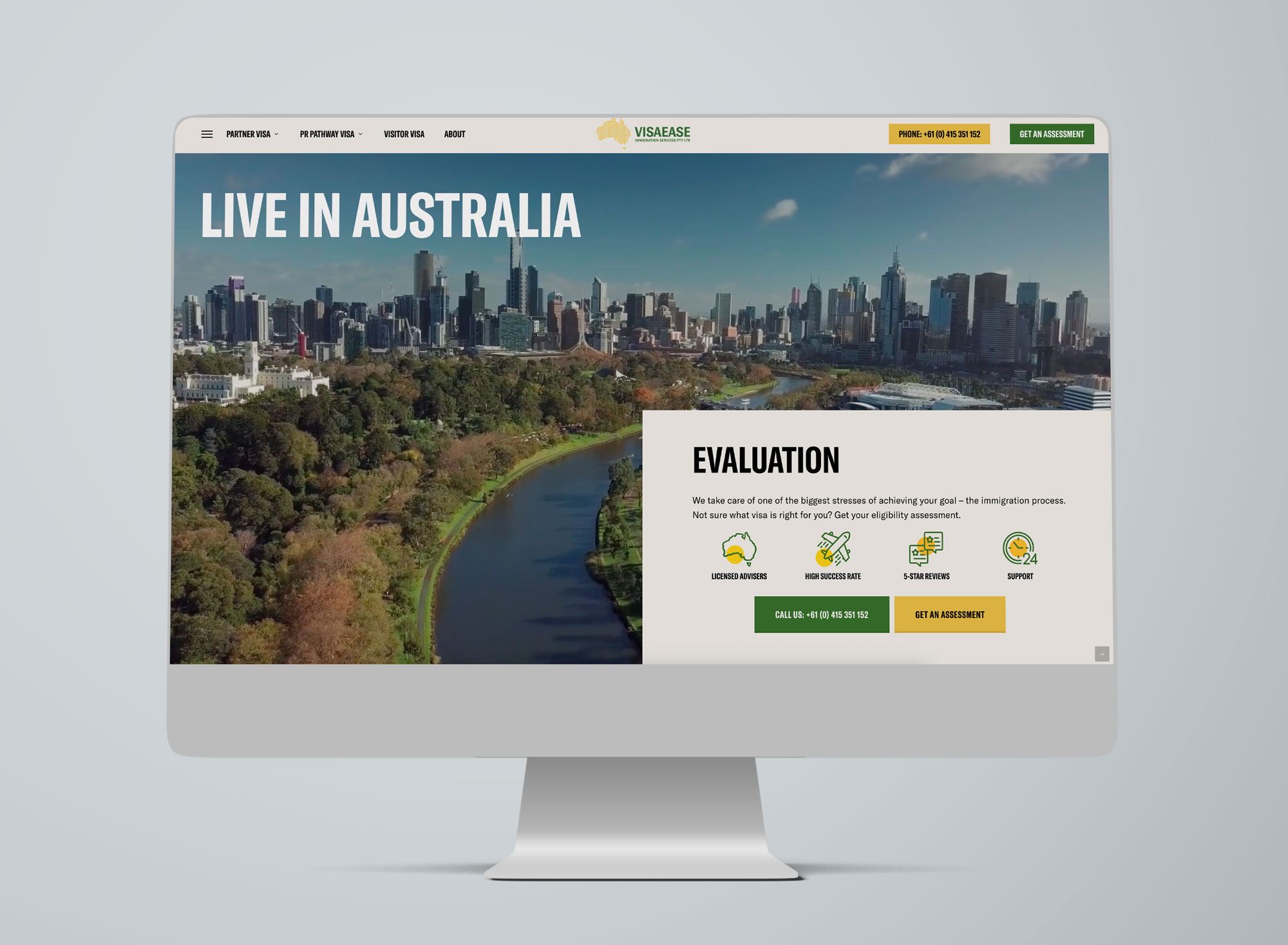
Example of a strong hero section — clear value proposition, trust signals, and prominent call-to-action buttons guiding visitors to call or request an assessment immediately.

Example of a strong hero section Sky Media created for Visa Ease featuring clear value proposition, trust signals, and prominent call-to-action buttons guiding visitors to call or request an assessment immediately.

A Simple Self-Test

Open your homepage and ask:

  • Can I tell what this business does in three seconds?
  • Is the main action obvious?
  • Is the navigation simple and easy to understand?
  • Does it feel calm and confident — not busy and chaotic?

If any answer is “not really”, your introduction section needs refinement.

Would like a Website Audit?

If you’re not sure whether your header and hero section are helping or hurting your conversions, let’s take a look.

Send us your website link and we’ll provide a practical website audit with clear recommendations on what to improve, simplify, and optimise for better results.

What Makes a High-Converting Website for Christchurch Businesses in 2026

What Makes a High-Converting Website for Christchurch Businesses in 2026?

By Tips and Guides, Web Design

In 2026, having a website isn’t enough. For businesses in Christchurch, your website needs to convert — turning local visitors into enquiries, bookings, and sales. With competition increasing across trades, professional services, hospitality, and e-commerce, the difference between an average site and a high-converting one often comes down to how well it reflects local user behaviour, builds trust, performs on mobile, and guides people to take action.

What Makes a High-Converting Website for Christchurch Businesses in 2026

At Sky Media, we see a clear pattern: Christchurch websites that convert well aren’t flashy for the sake of it. They’re clear, fast, credible, and built around how Cantabrians actually browse, compare, and decide.

Let’s break down what truly makes a high-converting website for Christchurch businesses in 2026 — and how you can apply these principles to your own site.

1. Understanding Local User Behaviour in Christchurch

High conversion starts with understanding who is using your website and how they behave.

Christchurch users are practical decision-makers

Christchurch customers tend to value:

  • Clear information over hype
  • Proof and credibility over bold promises
  • Straightforward pricing or next steps

They often compare multiple local providers before making contact. A high-converting website anticipates this by answering key questions early:

  • What do you do?
  • Who is this for?
  • Why should I trust you?
  • What do I do next?

Local intent is strong

That means your website should immediately confirm relevance:

  • Mention Christchurch naturally
  • Reference local industries or challenges
  • Show real local examples and testimonials

When visitors feel “this business is for people like me, in my city,” conversion rates increase dramatically.

2. Trust Signals Matter More Than Ever

In 2026, trust is currency. Christchurch users are cautious, especially when committing to services that require upfront investment.

Essential trust elements for Christchurch websites

High-converting local websites consistently include:

  • Real testimonials from Christchurch clients
  • Photos of real people (not stock-only imagery)
  • Clear contact details with a local presence
  • Transparent explanations of process and pricing

If a visitor has to guess whether you’re legitimate, you’ve already lost them.

Local proof beats generic authority

National awards are nice, but for Christchurch audiences:

  • A testimonial from a Sydenham tradie
  • A case study from a Riccarton business
  • A project completed in the CBD

…often converts better than international logos. Local familiarity reduces perceived risk.

3. Mobile-First Is No Longer Optional

By 2026, most Christchurch website traffic comes from mobile — and not just for hospitality or retail. Professional services, trades, and B2B businesses all see strong mobile usage.

What mobile users in Christchurch expect

A high-converting mobile experience includes:

  • Fast loading times (especially on mobile data)
  • Click-to-call buttons
  • Simple forms (no endless fields)
  • Readable text without zooming
  • Clear navigation with minimal clutter

If your mobile site feels cramped, slow, or confusing, users won’t “check it later” — they’ll bounce and contact a competitor.

Mobile design influences trust

A poorly designed mobile site signals:

  • Outdated business practices
  • Lack of attention to detail
  • Potential communication issues

A smooth mobile experience instantly builds confidence and makes it easier for users to take action.

4. Clear Conversion Paths (No Guessing Required)

One of the biggest reasons Christchurch websites fail to convert is unclear next steps.

High-converting websites answer the question:
“What do you want me to do next?”

Strong calls-to-action that work locally

Effective Christchurch websites use CTAs like:

  • “Get a Quote”
  • “Book a Free Consultation”
  • “Talk to our team”
  • “Request a Call Back”

These are specific, low-pressure, and aligned with local expectations.

One page, one primary goal

Each page should have a dominant action:

  • Home page → enquiry
  • Service page → quote request
  • Contact page → call or form

Too many competing CTAs create hesitation — and hesitation kills conversions.

5. Page Speed and Performance Still Win

Christchurch users won’t tolerate slow websites — especially on mobile. Speed directly affects:

  • Bounce rates
  • SEO visibility
  • Conversion rates

What slows Christchurch websites down

Common issues include:

  • Heavy image files
  • Cheap hosting
  • Bloated themes
  • Unnecessary animations

High-converting websites are lean, optimised, and built with performance in mind from day one.

Speed isn’t just technical — it’s psychological. Fast sites feel professional and trustworthy.

6. Content That Speaks to Christchurch Audiences

Generic content doesn’t convert. Localised, relevant content does.

What effective Christchurch website content includes

  • References to local conditions or industries
  • Language that sounds human, not corporate
  • Clear explanations without jargon
  • Answers to real customer questions

For example, a web design page that explains how website design helps Christchurch businesses get more enquiries will outperform one that simply lists features.

7. SEO and Conversion Working Together

In 2026, SEO and conversion optimisation are inseparable.

A website designed purely for rankings but not humans won’t convert. A beautiful website with no SEO won’t be found.

High-converting Christchurch websites:

  • Target relevant local keywords naturally
  • Use clear headings and structure
  • Align content with real search intent
  • Load fast and work perfectly on mobile

This is why web design Christchurch and website design Christchurch should be treated as user intent topics, not just keywords.

8. Forms That Don’t Scare People Away

Forms are often the final conversion point — and where many websites fail.

What converts better in Christchurch

  • Short forms (name, email, message)
  • Optional phone number
  • Clear privacy reassurance
  • Friendly, conversational labels

Long, aggressive forms feel salesy and reduce trust. In Christchurch, users prefer a softer, more respectful approach.

9. Visual Design That Feels Modern — Not Trendy

Christchurch businesses don’t need ultra-experimental design. They need:

  • Clean layouts
  • Clear typography
  • Consistent branding
  • Easy readability

High-converting sites feel current without being confusing. Design should support clarity, not distract from it.

10. Continuous Improvement Beats “Set and Forget”

Finally, the best converting websites in Christchurch are never finished. Read our “Why Your “Set and Forget” Website is Hurting Your Business” post to learn why you need take care of your website on a regular basis.

  • Monitor user behaviour
  • Improve underperforming pages
  • Update content regularly
  • Refine CTAs based on real data

In 2026, conversion optimisation is an ongoing process — not a one-time project.

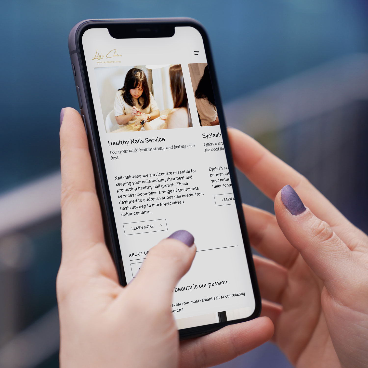
Mobile-first web design NZ example on smartphone for Christchurch based beauty & cosmetic tattoo business
Local Example

Lily’s Choice, Christchurch

A great example of conversion-focused website design in action is Lily’s Choice, a boutique beauty studio based in Christchurch. Lily’s Choice specialises in personalised cosmetic treatments designed to enhance natural beauty while making clients feel confident and cared for from the very first interaction.

When designing the website, the focus was on creating a calm, premium feel that reflects the in-studio experience, while also making it easy for visitors to understand services, build trust, and take the next step. Clear service descriptions, strong visual hierarchy, mobile-friendly booking pathways, and subtle trust cues were all built in to support conversions — especially for users browsing on mobile.

The result is a website that not only looks beautiful, but works as a practical tool for attracting and converting local Christchurch clients.

Final Thoughts: Conversion Is About Relevance and Trust

A high-converting website for Christchurch businesses isn’t about tricks or trends. It’s about:

  • Understanding local users
  • Building trust quickly
  • Making mobile effortless
  • Guiding visitors clearly
  • Removing friction at every step

When web design, SEO, and user experience work together, your website becomes more than an online brochure — it becomes a consistent lead-generation asset.

If your current website isn’t converting visitors into enquiries, it’s not a reflection of your business — it’s a sign your website needs a smarter, more locally focused approach. At Sky Media, we design high-performing websites built specifically for Christchurch businesses, combining conversion-focused design, mobile-first performance, and SEO that actually drives results. If you’re ready to turn your website into a consistent source of leads in 2026, get in touch with our team for a no-obligation chat about your goals.

Common User Experience Mistakes NZ Websites Make (and How to Fix Them)

By Tips and Guides, Web Design

When visitors come to your website, they expect a seamless, intuitive experience. But many New Zealand businesses unintentionally make mistakes that frustrate users, cause them to leave, or lose trust. Below, we walk through five common UX (user experience) mistakes NZ websites make — illustrated with local relevance — and simple fixes you can apply or ask your web team to address.

1. Asking for Too Much Too Soon (“UX Fatigue”)

One of the modern web design traps is UX fatigue — when a site overwhelms users with pop-ups, modals, sign-up prompts, cookie banners, onboarding tutorials, or notification requests before letting people see content.

Why NZ sites fall into this: Some local small businesses try to push newsletter signups, account creation, or tracking consents right at the start, hoping to build leads fast, but many users simply bounce before reading anything.

Fixes Sky Media team can implement on your website:

  • Delay non-essential pop-ups until after the user has consumed some content.
  • Use subtle banners instead of full-screen modals.
  • Bundle cookie consent and tracking prompts in a simple, unobtrusive bar.
  • Let users opt-in later rather than forcing actions immediately.
  • By giving users breathing room, you decrease bounce rates and increase the chance they’ll stick around.
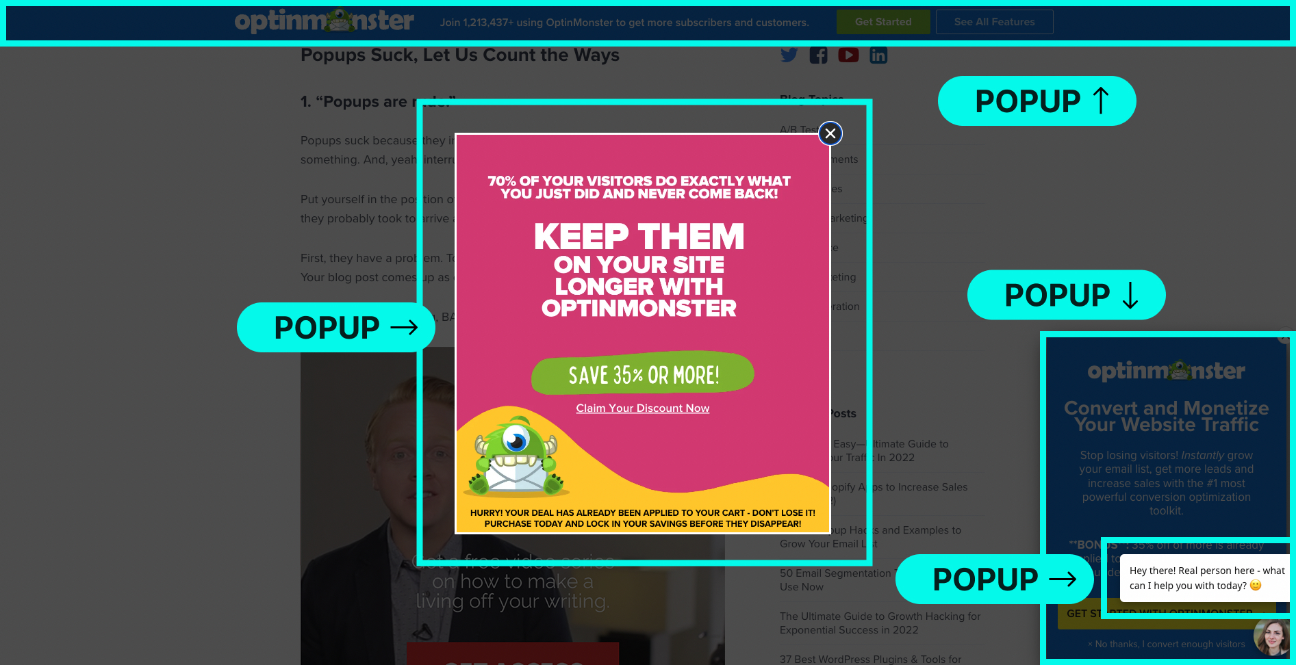
Website example showing misuse of popups overwhelming users

Misuse of popups creating poor user experience.

2. Confusing Navigation & Cluttered Menus

If people arriving at your site can’t find what they’re looking for within seconds, frustration sets in. Cluttered menus, too many options, vague labels or hidden pages all contribute.

Example: Imagine a Wellington café website that labels its menu tab as “Our Story / Eat / Gather” — that’s vague. A more descriptive “Menu | About Us | Book a Table | Contact” works better.

How to improve navigation:

  • Limit primary menu items to 5–7 max.
  • Use clear, descriptive labels (e.g. “Services,” “Pricing,” “Contact”) instead of creative jargon.
  • Use breadcrumbs on deeper pages so users always know where they are.
  • Group related items under parent categories to reduce clutter.
  • Test navigation with real users — ask a friend unfamiliar with your business to “find the contact page” and observe where they click.
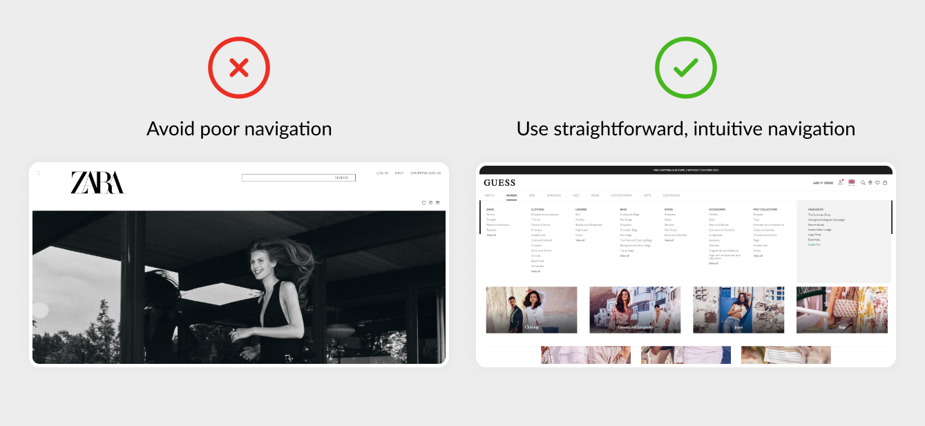
Website example showing confusing navigation menu vs clean navigation

Poor navigation and menus hurt user experience.

3. Poor Mobile Optimisation

In New Zealand, many people browse websites on mobile devices (phones or tablets). If your site isn’t mobile-friendly, buttons are too small, images don’t scale, or layout breaks, users will leave quickly.

Common mobile UX issues to watch for:

  • Tap targets (buttons, links) too small or too close together.
  • Text that requires zooming to read.
  • Overlapping elements or images that don’t scale properly.
  • Menus that become hidden or difficult to use.

Simple fixes:

  • Design mobile-first — start layout and style thinking from small screens, then scale up.
  • Make buttons well noticeable with ample spacing.
  • Use responsive design so images and containers adapt fluidly.
  • Test on multiple real devices (iPhone, Samsung Galaxy, etc.) to catch quirks.
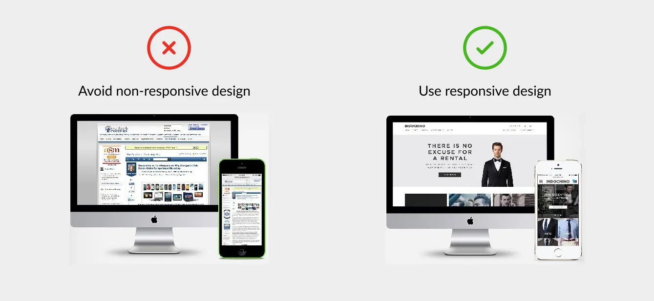
Website example showing poor responsive design

Website example showing non-responsive design vs clean responsive design.

4. Long, Overwhelming Forms & Requests for Data

Nothing kills momentum faster than a long registration or contact form that asks for too much information. If your form looks like a chore, most users won’t bother completing it.

Typical overreach in NZ business sites:

  • Asking for full address, phone, business registration number, custom preferences just to get a quote.
  • Long multiple-step forms without progress indicators.
  • No inline feedback (i.e. telling users immediately when there’s an error).

Better approach:

  • Only ask for essential fields first (name, email, message) and expand later if needed.
  • Use multi-step forms or progressive disclosure (show additional fields after initial information).
  • Provide live validation (e.g. “That email looks invalid”) to reduce submission errors.
  • Show a success message or confirmation immediately after submission — reassure users.
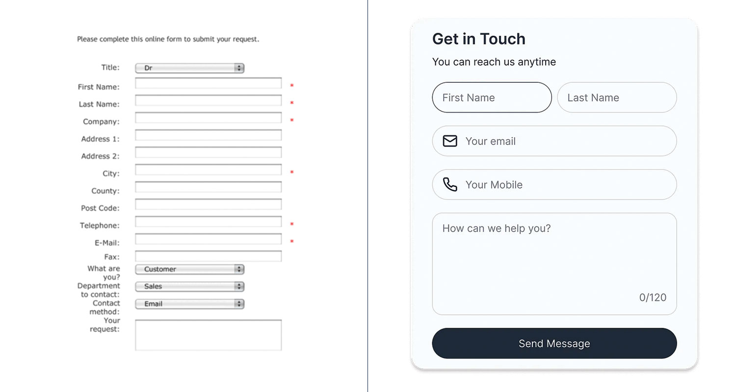
Before and after: simplified form design for better user experience.

Before and after: simplified form design for better user experience.

5. Ignoring Accessibility & Readability

A website may look beautiful, but if users with visual impairments, screen readers, or slower connections can’t use it, you lose a portion of your audience — and credibility.

Examples of accessibility and readability oversights:

  • Insufficient contrast between text and background (e.g. light grey text on white).
  • No alt text for images (so screen readers can’t describe them).
  • Tiny font sizes that are unreadable on some devices.
  • Interface elements (buttons, menus) not navigable via keyboard.
  • Relying on colour alone to communicate meaning (e.g. error messages in red without icons).

What to do:

  • Use a contrast checker (there are free tools online) to ensure text is legible against its background.
  • Always include descriptive alt attributes for images (even decorative ones should have an alternative description).
  • Choose a base font size (e.g. 16px or equivalent) and allow users’ browsers to scale.
  • Test navigation using only keyboard (Tab, Enter) to ensure the site is usable without a mouse.
  • Use icons or labels in addition to colour cues (so red = error, but also show an “X” icon or text).
Website text with poor contrast making it hard to read

Example of poor readability and low contrast text on websites.

How These Mistakes Hurt Your Bottom Line

  • Higher bounce rates — frustrated users leave before exploring.
  • Lower conversions — potential clients never get to your call to action.
  • Brand trust damage — a clunky user experience makes your business seem less professional.
  • Wasted marketing spend — driving traffic is expensive; if UX is bad, that investment is wasted.

In a competitive environment like Auckland, Wellington, Christchurch or even in smaller NZ towns, people have many alternatives. A website that is user-friendly gives you an edge.

At Sky Media, we build websites that don’t just look good — they’re designed to perform. Our team specialises in affordable web design in NZ with SEO baked in from day one, so your business can attract more customers and grow online.

Whether you need a fresh build or want to upgrade your current site, our Web Design packages give you flexible options to suit your goals.

Let’s turn your website into a lead-generating machine. Get a free website and SEO quote today.

4 Common Mistakes When Building a New Website

By Web Design

Designing and building a new website can be fun and exciting, however it’s important to keep the purpose of the website front and centre at all times. What’s the product, or service? Who’s the website for? What do they want and need? How’s this website designed to give it to them?

At times, websites look attractive, but they’re not actually fit for purpose. When a website’s clear about what it does, why it does it, and who it does it for, then it’ll be fit for purpose. In most cases, a website exists for site visitors, which means the whole experience from end-to-end needs to be designed, so it meets (and even exceeds) their wants and needs, while eliminating uncertainty and stress. So, what are the 4 most common mistakes made when building a new website?

Using a Non-Responsive Website Design

Did you know that more than 50% of website traffic comes from mobile phone searches? A non-responsive website is hard to see on a small screen, so many readers will simply hit the back button and look for another website that’s designed to be viewed on a phone. A modern mobile responsive design ensures your website’s easy to use on any mobile device, plus it ensures your site doesn’t get deprioritised by Google for being out of date.

Complicated Navigation

Can people find what they want quickly and easily? If website visitors get stuck, or they can’t find what they want, they’ll leave the site. Poor website navigation is likely to drive potential clients towards your competitor’s websites. Considering the user-experience (UX) is critical when designing and building a website that’s easy for customers to use. If your website’s difficult, or stressful to use, more than likely, people won’t choose you.

Difficulty Finding Contact Information

Can visitors find you when they need to? Is it easy to see your contact information? These details should be easily accessible in the header (at the top) of every page with full contact details on the footer (at the bottom of the page). In addition, a clear link to an up-to-date Contact Page in your site’s menu will make it simple for customers to reach you, or your team with ease.

Unclear or Non-Existent Calls-to-Action

What do you want people to do on your site? It’s critical that your website communicates with the reader. Prominent calls-to-action (CTA) buttons politely invite visitors to take action, whether it’s clicking through to another page, buying a product, or requesting a consultation/estimate. Whatever steps you want visitors to take, calls-to-action should appear on each page to remind them to do so.

At Sky Media, we keep the user-experience (UX) front of mind, by always considering what it’s like to be a site visitor on each website. Is it difficult, or easy? Complicated, or clear? Pleasurable, or stressful? What is the user seeing? Is it helpful? Is it useful? Are people getting what they need from the site? Are they taking the actions we want them to take? Our down-to-earth digital marketing team designs and builds websites that create a positive user-experience from beginning to end. If you’d like a website that’s fit to fly online, speak to us.

Do I Really Need a Website for My Business?

By Web Design

Is it really important to have a website if you’re a business owner, retailer, or service provider?

Having a website means customers can always find you – anytime, anywhere. Even outside of business hours, your website can continue to find and secure new customers for you. It offers web surfers convenience, as they’re able to access the information they need from the comfort of their own home, in their own time, with no added pressure to buy.

A well-designed website can generate new business, and make life easier for existing customers, while placing your business in the best light. A high-quality website can enable your business to shine, whether it’s well-established, or brand-new, small, medium, or large.

A clear and concise website provides a quick and easy way of communicating information between buyers and sellers. You can list your opening hours, contact information, show images of your location or products, and use contact forms to facilitate enquiries from potential customers, or generate feedback from existing ones. You can even upload promotional videos to engage your customers and sell your business in an effective and cost-efficient way. All of this progress can happen while you’re off the clock, because a well-designed website will keep working when you’re not.

In the past when a business shut their doors at 5.30 pm, that was the day done, but with a website your business can be active 24/7/365. From a customer’s point of view, it’s better for them if they don’t have to travel to get what they want. They can buy your products, or research your services without having to wait until your physical store is open. This level of ease means new and existing customers can take action and get what they want, as soon as they feel the need.

In today’s modern world, people don’t expect to have to wait for answers, r solutions. Nowadays, there’s an expectation that companies will have a website. People tend to be distrusting of any business that doesn’t have a website and a branded email address. These are useful tools to share key information about your business, while also generating trust and enhancing the public perception of your business.

A digital marketing study done in 2018 showed 84% of consumers believe a business with a website is more credible than a business listed in an online directory, or on social media. By having a professional website, you’re boosting the credibility of your business, which is critical for attracting new clientele.

Best utilising your website to gain and retain a customer is the ultimate goal and the result of successfully meeting their wants and needs every step of the way. By understanding your ideal audience and how your product or service could provide a benefit to their lives, you can attract new customers via targeted advertising and a positive user-experience on your website.

There are 4.8 billion people online every day, accounting for more than half of the world’s population and these figures increase every year. For the most part, internet users are either looking for information, sharing on social media or using e-commerce websites. Gone are the days of turning to the Yellow Pages, nowadays it’s all about Google and Facebook. If you’re not online, where are you? To potential customers the answer could be, ‘Nowhere to be found.’