
Tips and Guides18

Stay ahead with Sky Media’s latest SEO, web design, and Google Ads tips. Practical advice for Kiwi businesses to boost their online success.

Why Your Google Ads Are Getting Clicks But Not Calls

By Google Ads, Tips and Guides

You’re spending money on Google Ads. People are clicking. But the phone isn’t ringing, and the enquiry form is sitting empty.

It’s one of the most frustrating things a business owner can experience. You’re paying for traffic. The traffic is arriving. Something is going wrong in between.

The good news: this is a fixable problem. And once you understand why it’s happening, the solution is usually clearer than you’d expect.

In most cases, the culprit isn’t your ads. It’s what happens after the click.

First, Let’s Separate the Two Jobs

Google Ads and your landing page have two completely different jobs, and confusing them is where most businesses go wrong.

Your ad’s job is to get the right person to click. That’s it. It needs to show up for the right search, say something relevant, and earn the click from someone who could genuinely become a customer.

Your landing page’s job is to convert that click into an action: a call, a form fill, a booking.

If your ad is getting clicks, it’s probably doing its job reasonably well. The problem is almost certainly on the landing page side.

The Most Common Reason: Intent Mismatch

Here’s the core issue in plain language: the person clicked your ad expecting one thing, and your page gave them something different.

This is called an intent mismatch, and it’s the number one reason clicks don’t turn into customers.

A few real-world examples of how this plays out:

  • Someone searches “emergency plumber Wellington” and clicks your ad — but lands on your homepage, which talks generally about all your plumbing services. They wanted urgency and a phone number. They got a brochure. They left.
  • Someone searches “how much does a bathroom renovation cost” and clicks your ad — but your page has no pricing information at all. Their question isn’t answered. They go back and click a competitor.
  • Someone searches “builders Christchurch” and clicks your ad — but your page is slow to load, hard to read on mobile, and the contact form is buried at the bottom. Too much friction. They give up.
    In each case, the ad worked. The page didn’t.

The Homepage Problem

Sending Google Ads traffic to your homepage is one of the most common and costly mistakes in digital advertising.

Your homepage is designed for everyone: new visitors, existing customers, people who just want your phone number, people researching your industry. It tries to do too many things at once. But the person who clicked your ad? They have a very specific need. They searched for something specific. They clicked something specific. Sending them to a general page that doesn’t match what they were looking for is like a customer walking into a shop and asking for running shoes — and the staff point them towards a giant sign that says “We sell all kinds of footwear.”

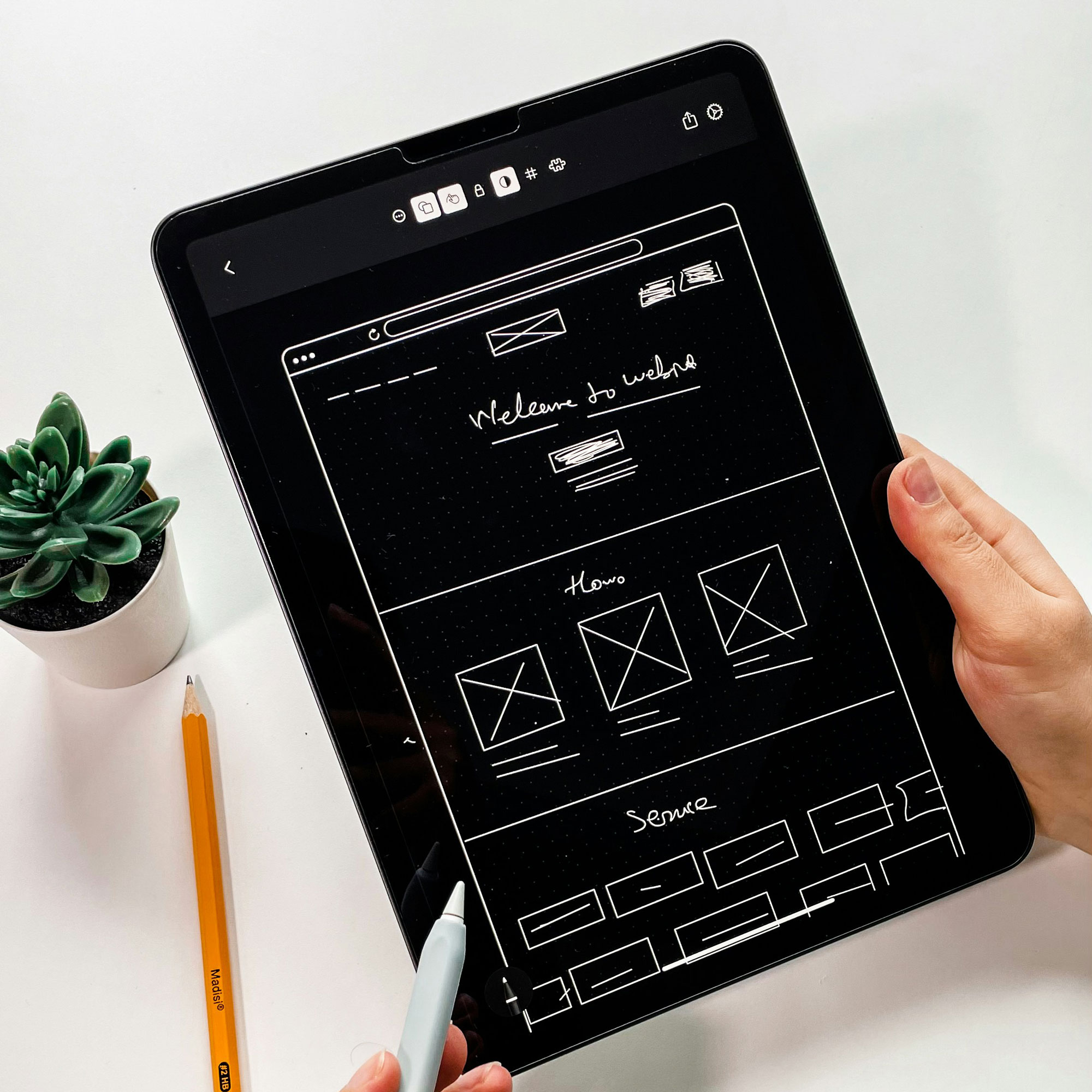
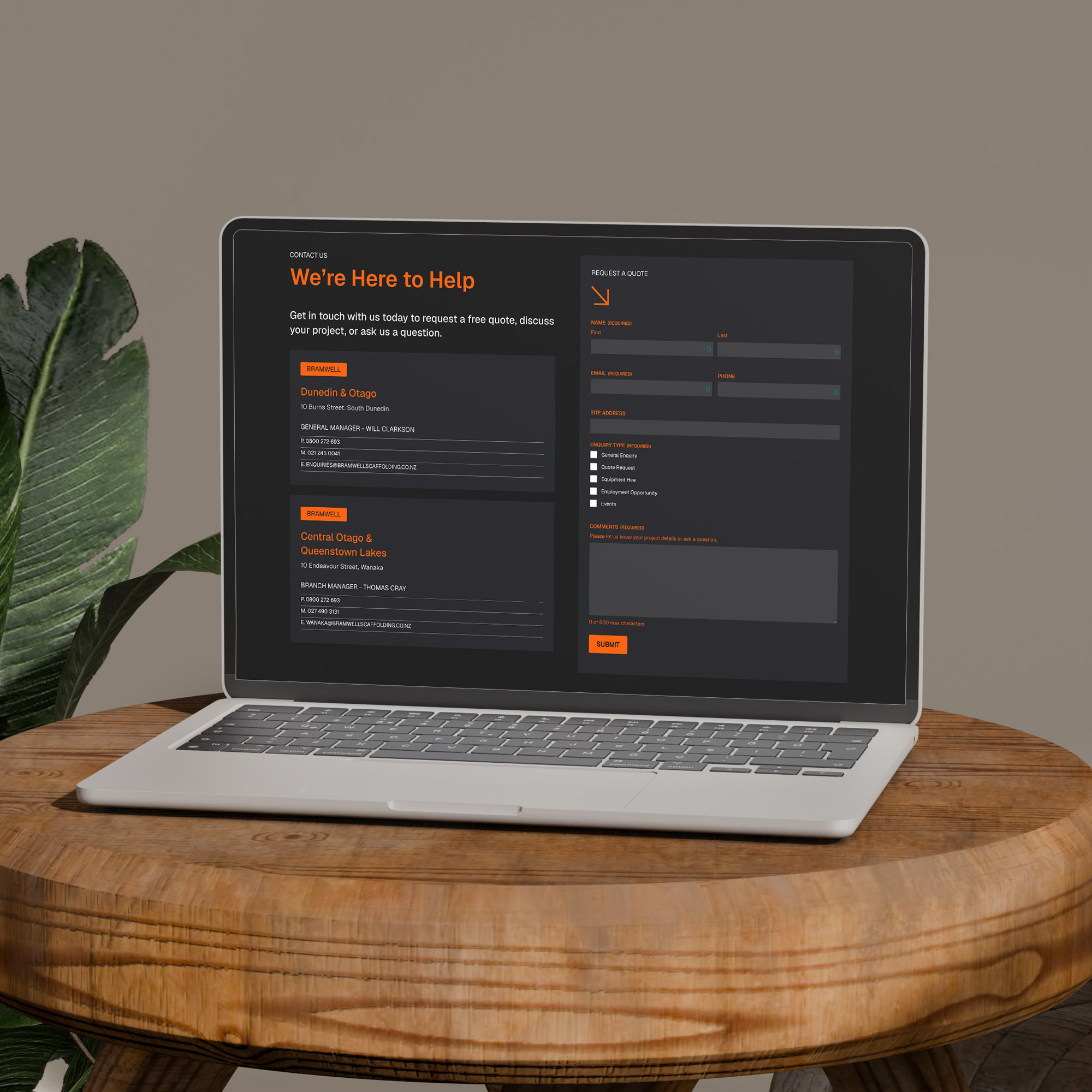
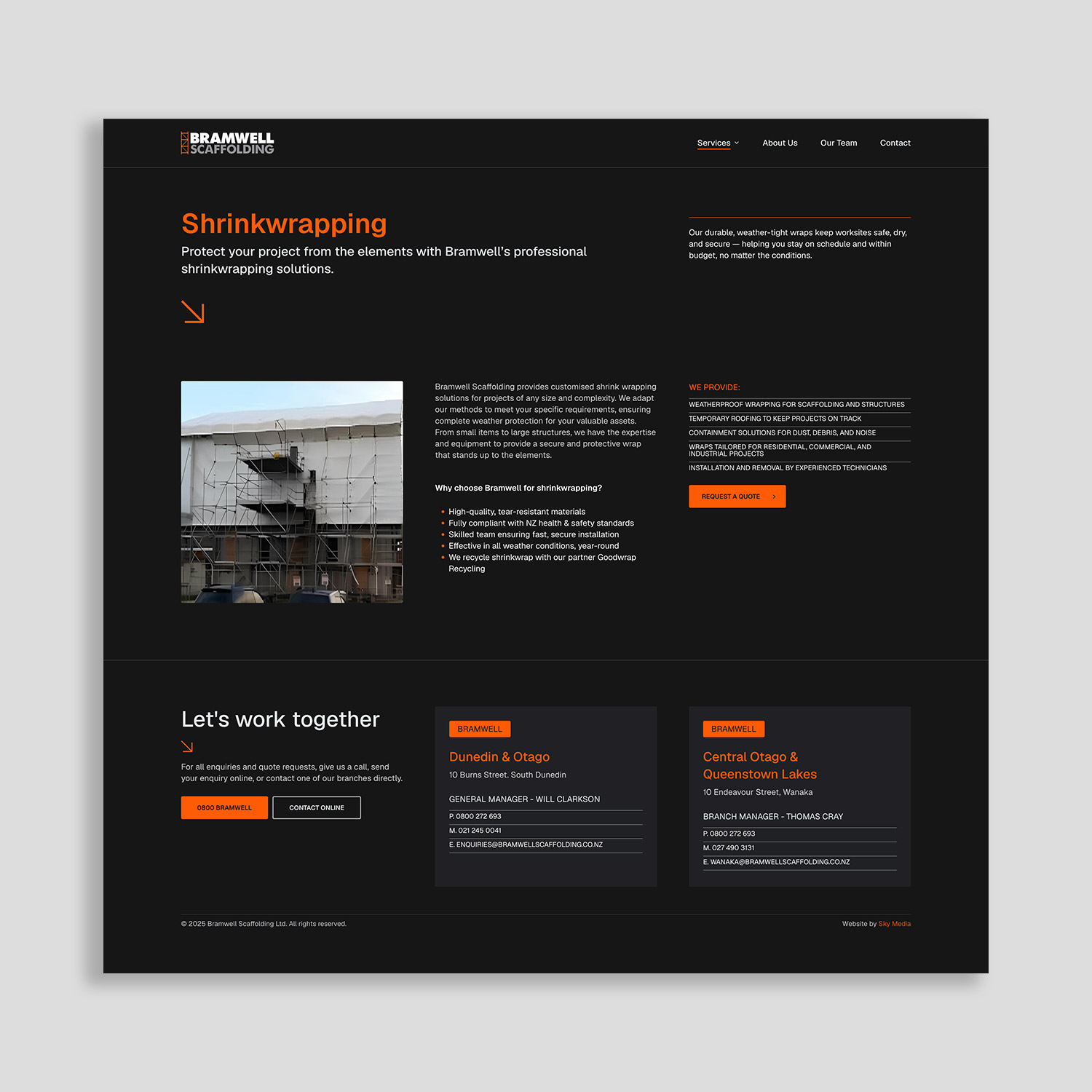
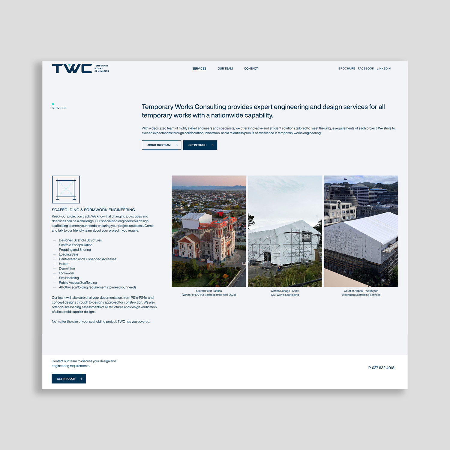
Every ad campaign should send traffic to a page that’s built around exactly what the ad promised. This is called a dedicated landing page, and it’s one of the highest-leverage things you can do to improve your return on ad spend.

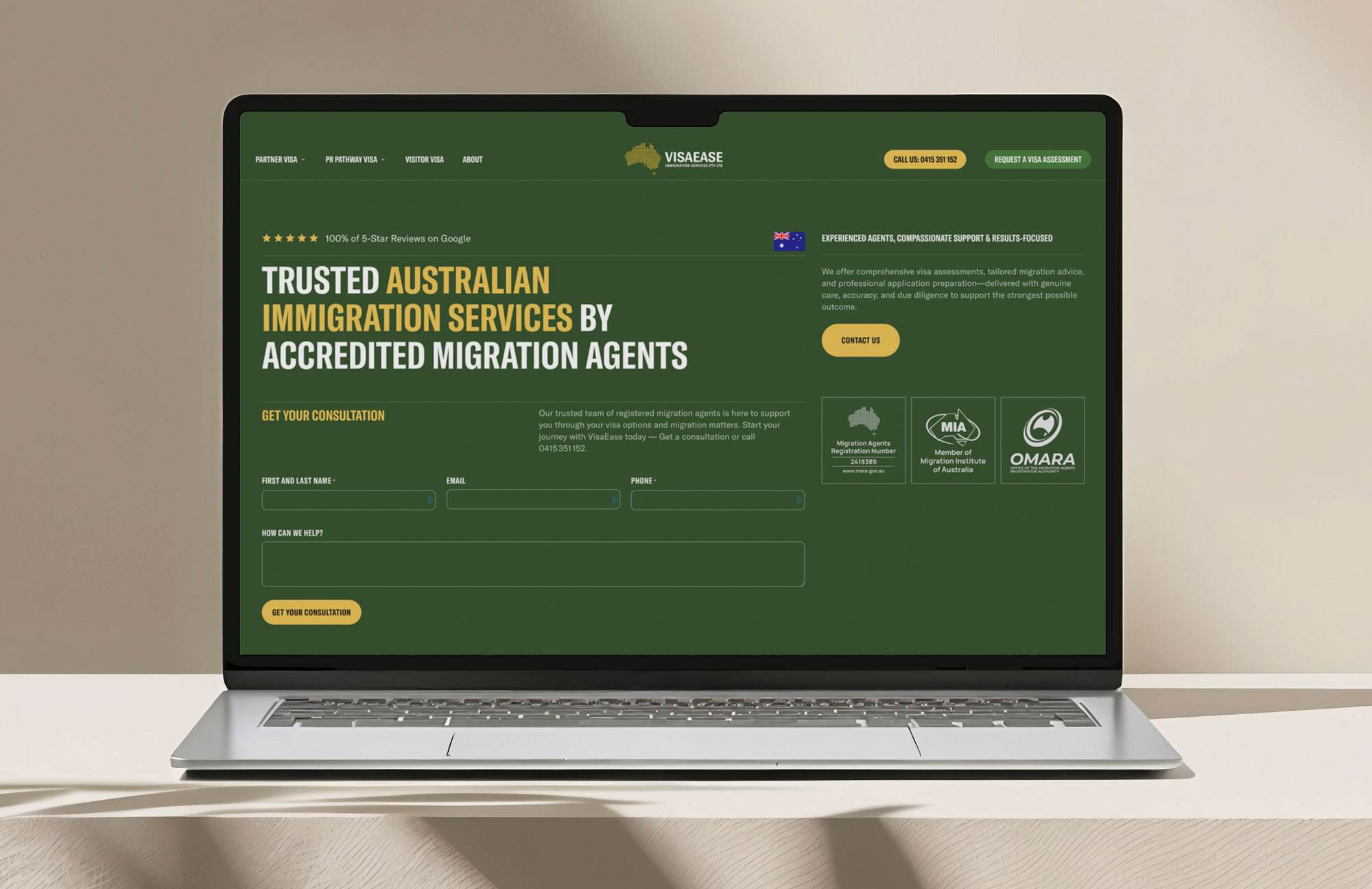
What a High-Converting Landing Page Actually Looks Like

You don’t need a complicated page. You need a focused one. Here’s what the best-performing landing pages for NZ service businesses tend to have:

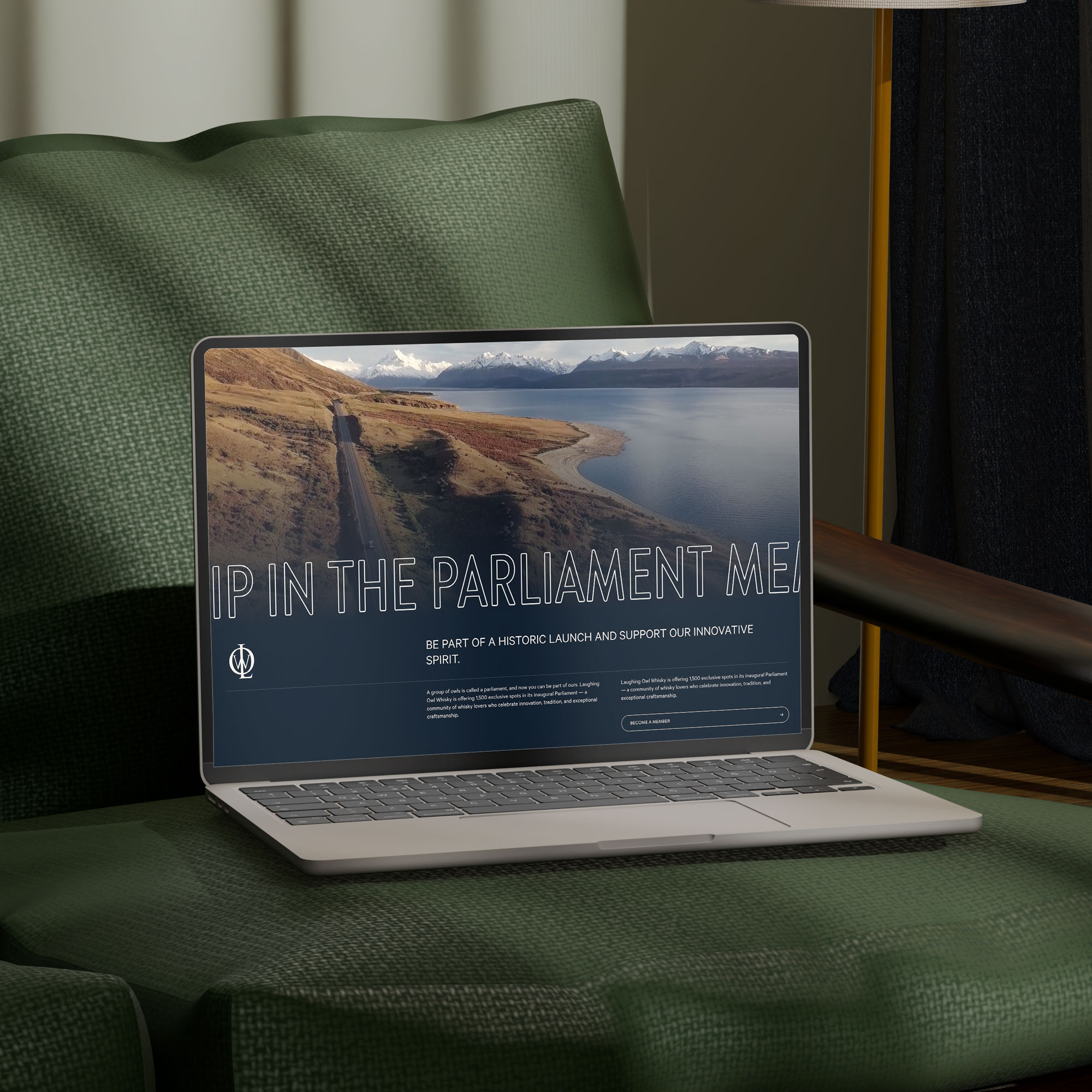
A clear, specific headline
It should match (or closely mirror) the search term someone used and the promise in your ad. If your ad said “Fast Hot Water Cylinder Replacement — Auckland”, your headline should confirm that’s exactly what this page is about.

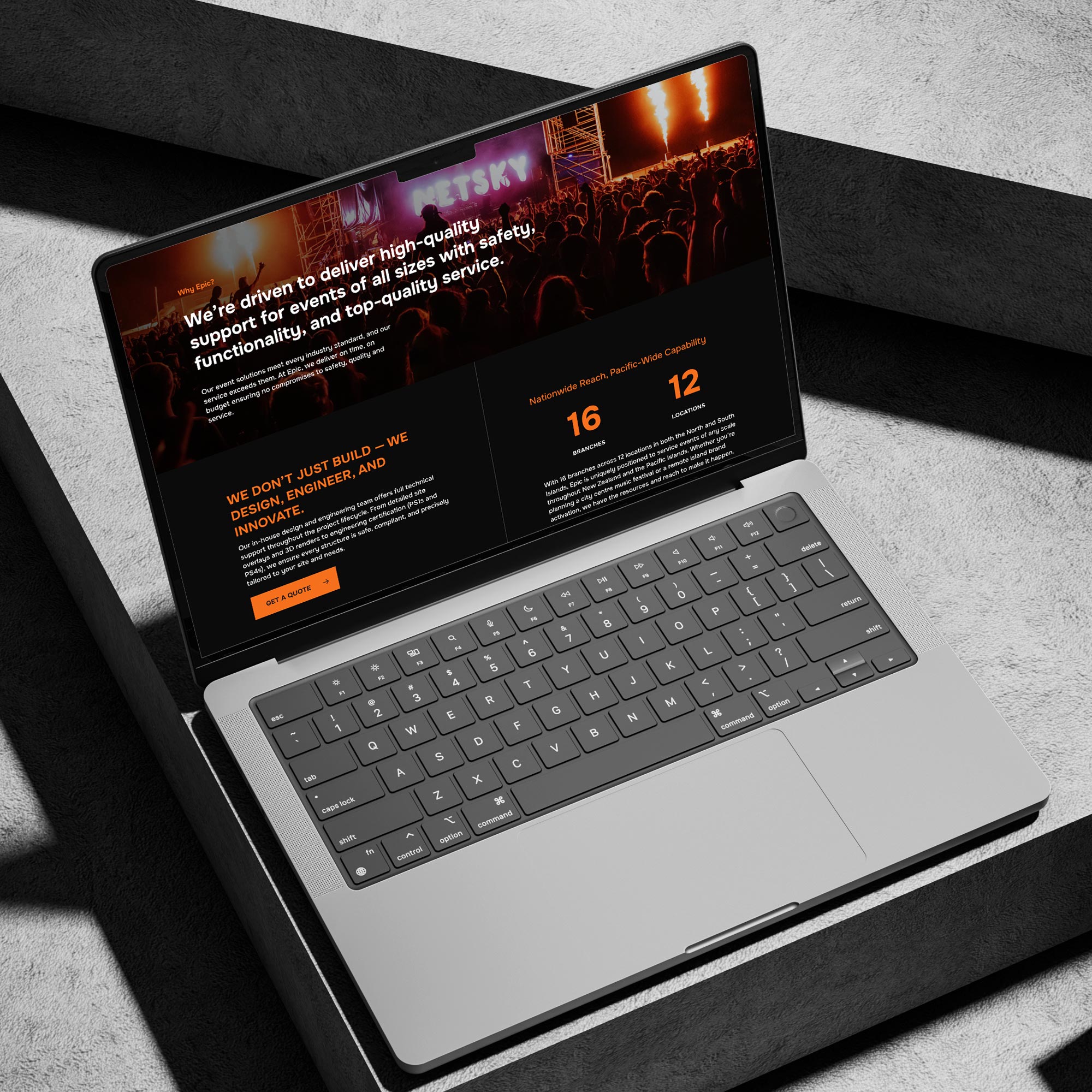
One clear call to action
What do you want the visitor to do? Call you? Fill in a quote form? Book online? Pick one and make it obvious. Pages that ask visitors to do five different things often result in them doing nothing.

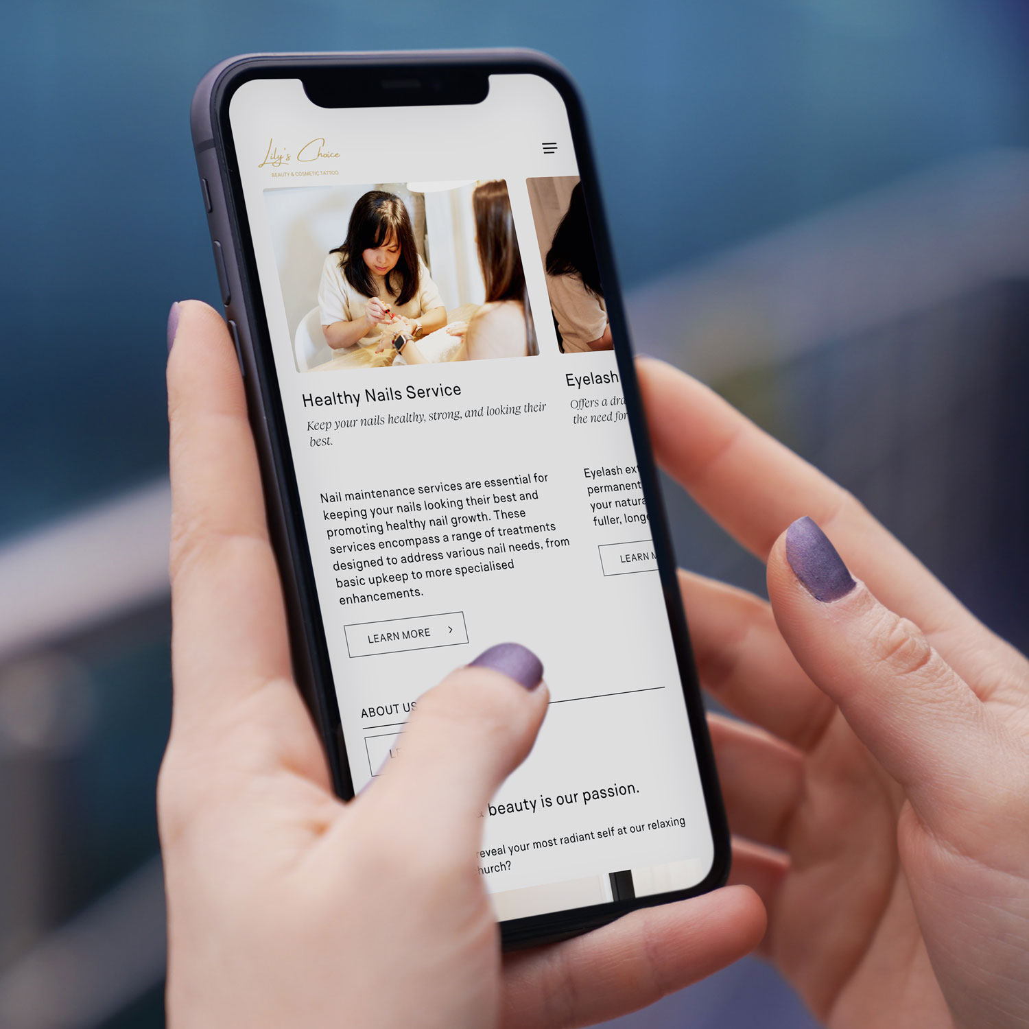
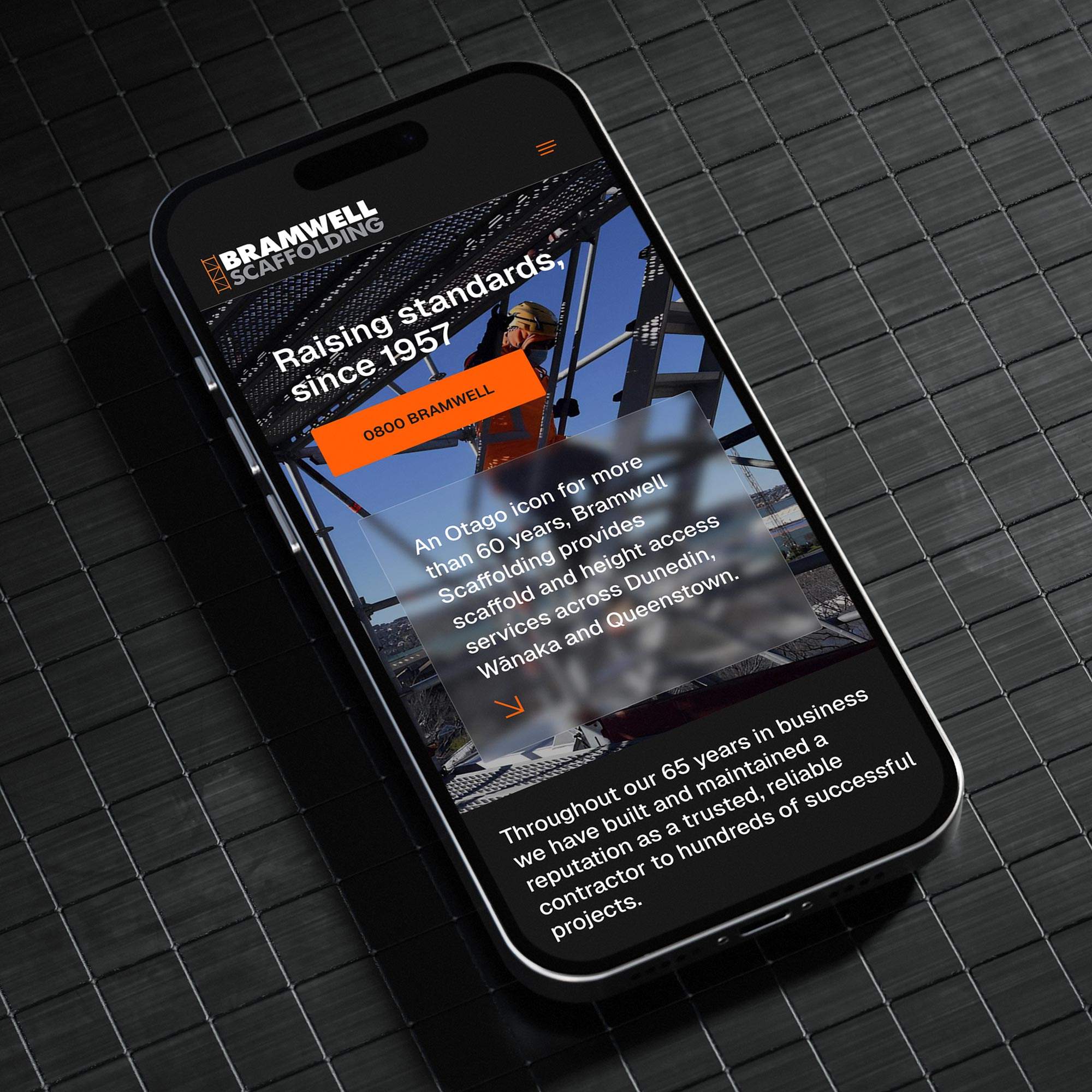
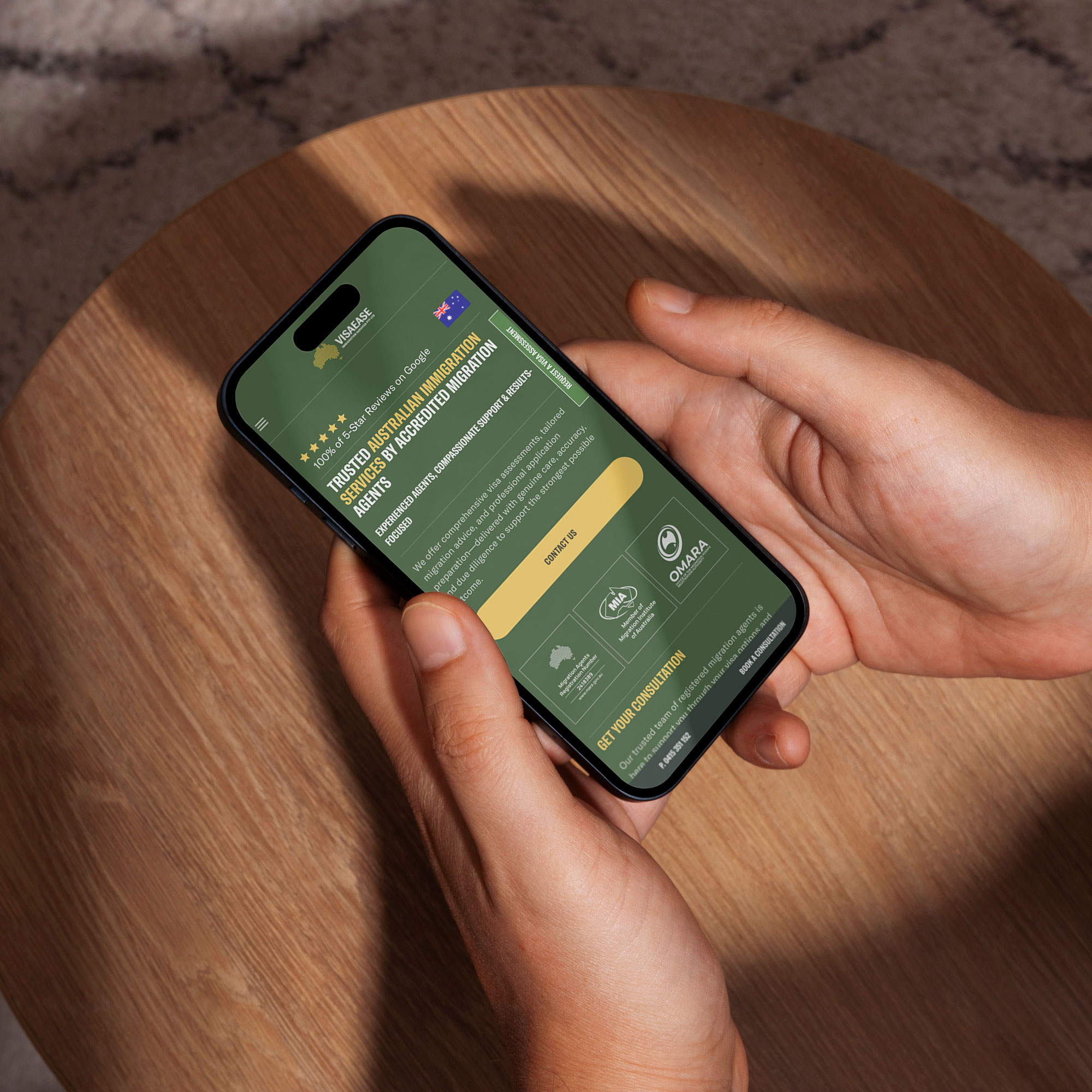
A phone number that’s easy to find and tap
On mobile (where most local searches happen), your phone number should be visible without scrolling and clickable. A number buried in a footer, or displayed as an image that can’t be tapped, is a conversion killer.

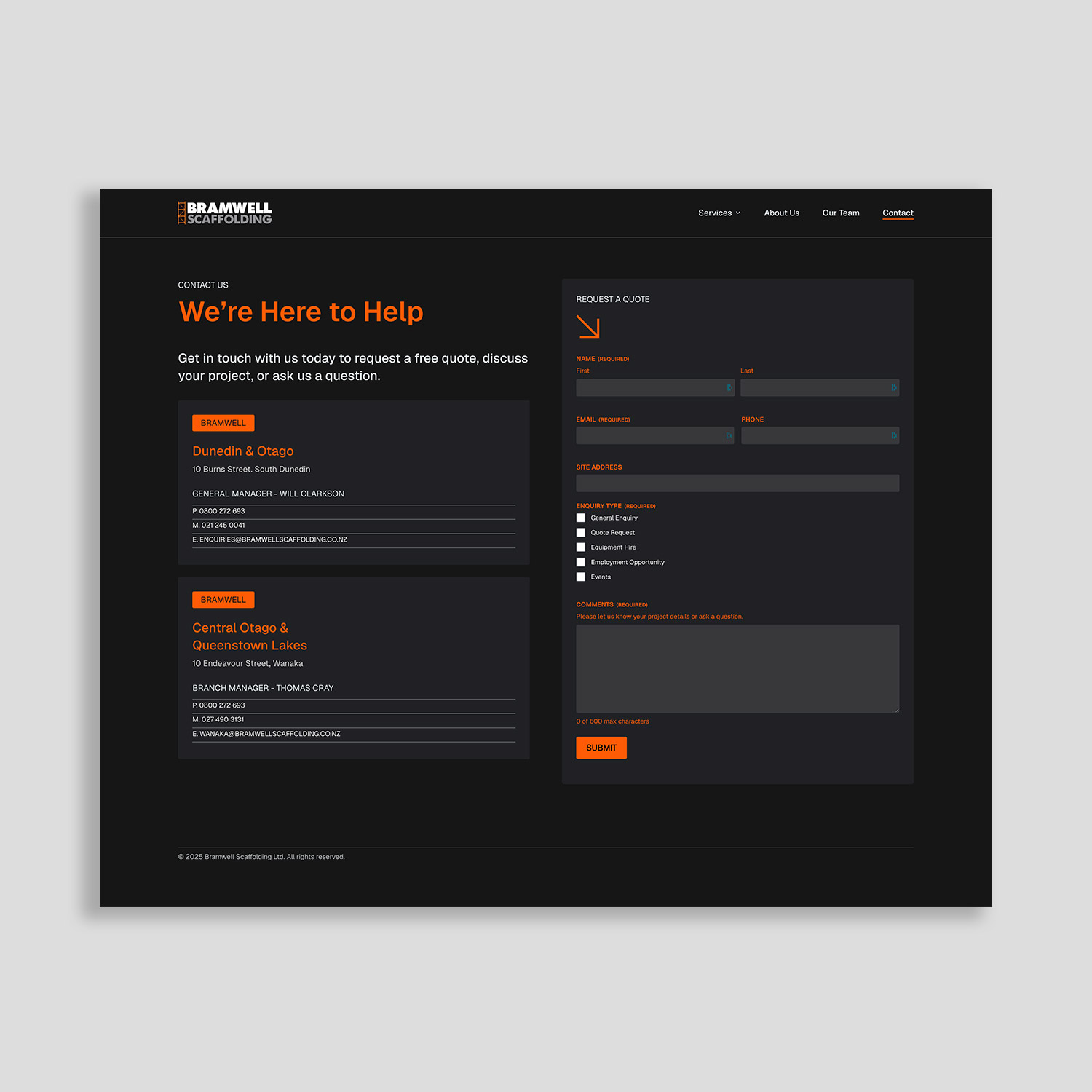
Trust signals above the fold
“Above the fold” means what’s visible before someone scrolls. This prime real estate should include something that builds confidence fast: a Google rating, a short testimonial, a badge (“NZ Certified”, “10+ Years Experience” etc.), or a simple “We’ll call you back within the hour” promise.

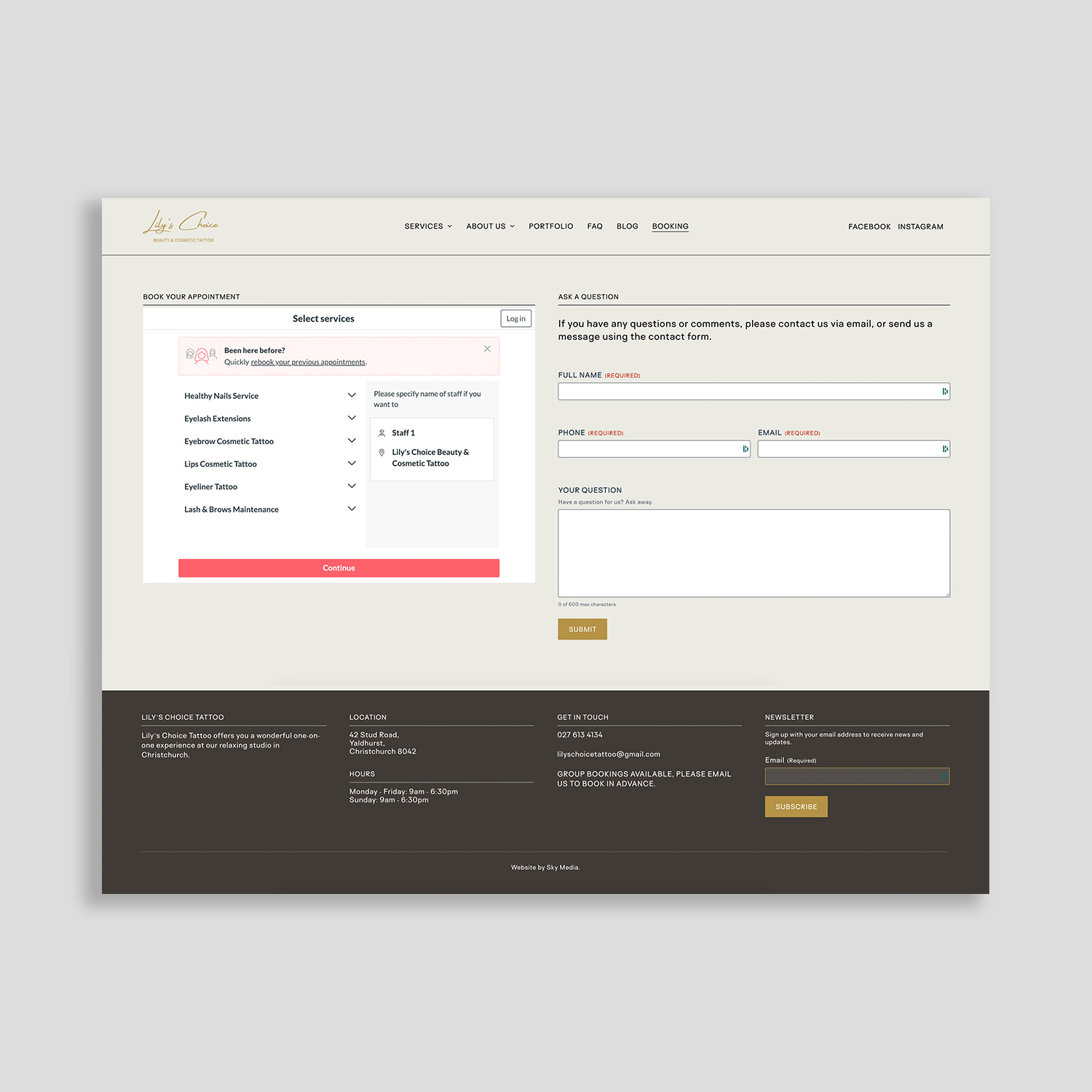
A short, frictionless form (if you use one)
Every extra field you add to a form reduces the chance someone completes it. For most service businesses, name, phone number, and a one-line description of the job is enough to start a conversation. Don’t ask for information you don’t need yet.

Fast load speed and a clean mobile layout
Google’s own research shows that pages taking more than a few seconds to load see significantly higher bounce rates. On a phone with variable signal, slow pages feel broken. If your page loads slowly or looks cluttered on a small screen, you’re losing customers before they even read a word.

Example of conversion focused landing page Sky Media created for Visa Ease.

A conversion-focused landing page Sky Media designed for Visa Ease.

Speed and Mobile: The Silent Conversion Killers

It’s worth spending a moment on these two because they’re responsible for more lost conversions than most business owners realise.

1. Speed: If your page takes longer than 3 seconds to load on a phone, a large proportion of visitors will leave before seeing anything. This is money you’ve already paid for — gone. Page speed is affected by things like image file sizes, hosting quality, and how your website is built.

2. Mobile: Well over half of all Google searches happen on a phone. If your landing page isn’t designed with mobile as the priority, for example, text is too small, buttons are too close together, layout looks awkward on a small screen, you’re creating friction at exactly the wrong moment.

These aren’t nice-to-haves. In 2026, they’re the baseline.

The Message Match Principle

There’s a simple rule that the best-performing ad campaigns follow: the message in your ad should match the message on your landing page. This sounds obvious, but it’s surprising how often it breaks down in practice.

If your ad says:
“Free Quote — Commercial Cleaning Auckland — Same-Day Response”, then your landing page should immediately reinforce all three of those things: free quote, Auckland, same-day response. If the page talks about your residential services, doesn’t mention Auckland, and has a contact form that says “We’ll be in touch within 3–5 business days”, the message has broken down.

Every step from search to click to page should feel like a continuous, consistent experience. When it does, conversion rates improve significantly.

A Quick Self-Check: Is Your Landing Page Doing Its Job?

Ask yourself these questions about the page your ads are sending traffic to:

  • Does the headline match what my ad promised?
  • Is it immediately obvious what I want the visitor to do?
  • Is my phone number visible and tappable on a phone?
  • Is there at least one trust signal (reviews, rating, credential) above the fold?
  • Does my contact form have fewer than five fields?
  • Does the page load in under three seconds on a phone?
  • Does the page make sense to someone who has never heard of my business?

If you answered “no” or “not sure” to any of these, you’ve likely found where your conversions are leaking.

The Bigger Picture: Ads and Your Website Work Together

Here’s the thing: Google Ads can drive excellent results, but only when the website behind the ads is built to convert.

A well-managed ad campaign sending traffic to a weak landing page is like running a great promotional offer and then having the wrong address on the flyer. The interest is there. The follow-through isn’t.

This is why businesses that invest in both a well-run ads strategy and a properly built website consistently outperform those who only focus on one. The two amplify each other.

For NZ businesses running Google Ads, the fastest way to improve your cost per lead is usually not to spend more on ads, it’s to improve the page those ads send people to.

Not Sure Why Your Clicks Aren’t Converting?

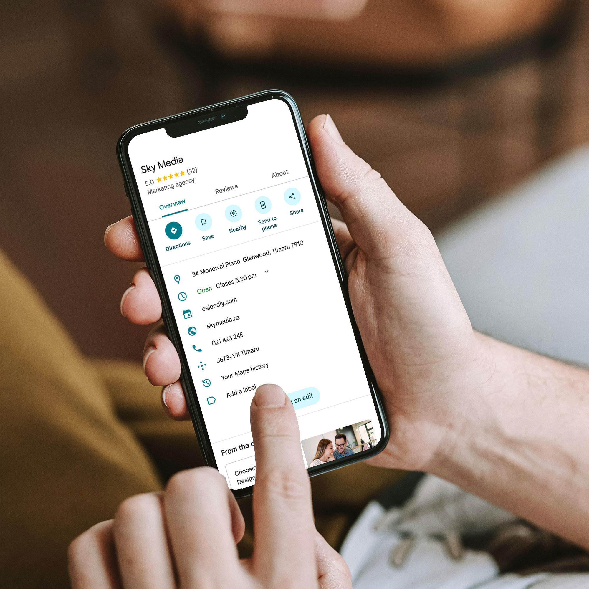
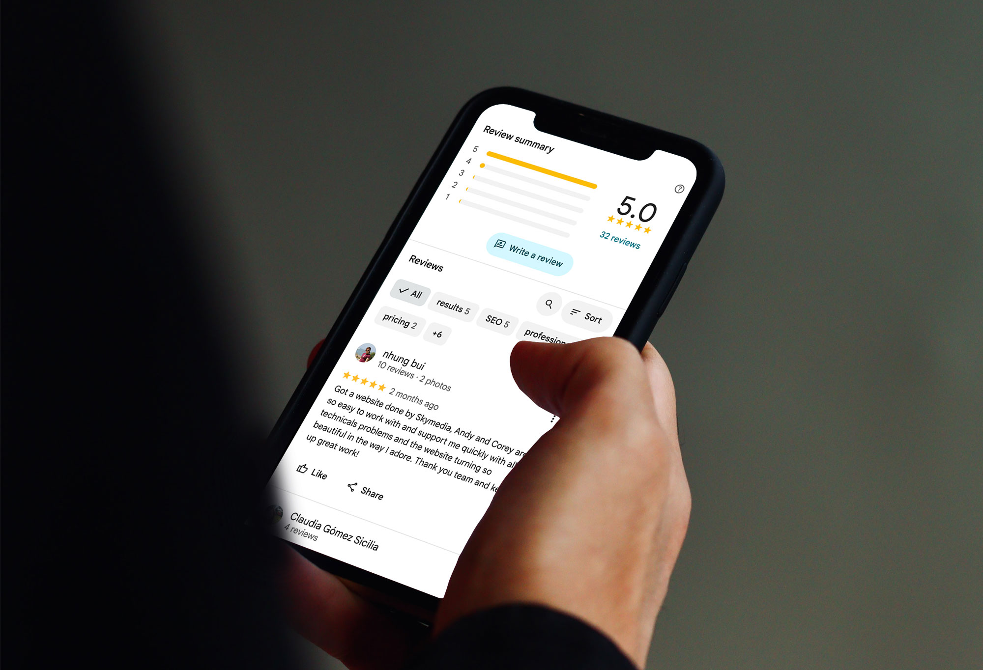
Sky Media works with NZ businesses on both sides of this equation: building high-converting websites and landing pages, and managing Google Ads campaigns that are set up to actually deliver results.

If you’re spending money on ads and not seeing the returns you expected, it’s worth getting a second pair of eyes on both your campaigns and the pages they’re pointing to. Get a free audit of your website today.

Google My Business profile optimisation tips

How to Write a Google Business Profile That Actually Gets You Customers

By Tips and Guides

Your Google Business Profile (GBP) is often the very first thing a potential customer sees — before your website, before your ads, before your reviews, and although, it’s completely free, often businesses don’t make the most of it.

The difference between a profile that sits there doing nothing and one that consistently brings in calls, bookings, and walk-ins comes down to how well it’s set up — and how actively it’s maintained.

This guide walks you through exactly how to do that.

Google My Business profile optimisation tips

Why Your GBP Matters More Than You Think

When someone searches for a local service — “plumber Auckland”, “dentist Christchurch”, “café near me” — Google shows a map pack of three local businesses before any other organic results. That map pack is powered almost entirely by Google Business Profiles.

If your profile is incomplete, inaccurate, or thin on detail, you won’t appear there — or you’ll appear but fail to earn the click.

Google is explicit about what influences local rankings: relevance, distance, and prominence. Your GBP is your primary lever for relevance and prominence. You can’t change your location — but you can absolutely change how well your profile communicates who you are and why you’re the best choice.

Step 1: Claim and Verify Your Profile (If You Haven’t Already)

Before anything else: make sure you actually own your profile. Plenty of NZ businesses have an unclaimed GBP sitting out there — often with wrong information, no photos, and no one managing it.

Go to google.com/business and follow the prompts to claim and verify. Verification is typically done via postcard, phone, or email depending on your business type.

Once verified, you control what appears — and you can start optimising.

Step 2: Get the Basics Exactly Right

This sounds obvious, but you’d be surprised how often it goes wrong. Google cross-references your profile details against your website, local directories, and other sources. Inconsistencies — even small ones like “St” vs “Street” — create doubt.

Make sure these are accurate and consistent across every platform:

  • Business name (exactly as it appears on your signage and website)
  • Physical address or service area
  • Phone number (ideally a local NZ number)
  • Website URL
  • Opening hours — including public holidays if you’re open

If you’re a service-area business (you go to clients, not the other way around), you can hide your physical address and instead list the areas you serve. Don’t use a fake address or a P.O. box — Google can suspend profiles that don’t meet their guidelines.

Step 3: Choose Your Categories Carefully

Your primary category is one of the most important signals you send to Google. It tells the algorithm what kind of business you are — and which searches you should appear for.

Pick the most specific, accurate category available — not the one that sounds most impressive. “Plumber” beats “Trade Services”. “Family Law Attorney” beats “Lawyer”. “Café” beats “Food and Beverage”.

You can also add secondary categories for other services you offer — but be selective. Only add them if you genuinely provide those services. Irrelevant categories dilute your relevance signal.

Step 4: Write a Business Description That Actually Converts

Your description (up to 750 characters) is your pitch. Don’t waste it with vague fluff like “we’re passionate about delivering quality solutions for all your needs”.

Instead, use it to:

  • Describe what you do in plain language
  • Name the specific services or products you offer
  • Mention the areas you serve (e.g., “Serving Auckland’s North Shore and surrounding suburbs”)
  • Include one or two trust signals (years in business, certifications, or a specific customer promise)

Good example: “Auckland Electrical has been providing residential and commercial electrical services across Auckland since 2008. We specialise in EV charger installations, smart home wiring, and after-hours call-outs. All work is certified and guaranteed. Serving Auckland City, North Shore, Manukau, and West Auckland.”

That description tells Google exactly who you are, what you do, and where — and it tells a potential customer why they should call you.

Step 5: Add Your Services (Don’t Skip This)

The Services section is one of the most underused parts of a GBP — and one of the most valuable.

For each service you offer, you can add a name, a description, and a price (optional). This isn’t just good for users — it gives Google more signals about what you actually do, which can help you appear for more specific searches.

Write service names the way customers search, not the way your industry talks. “Blocked drain repair” instead of “drainage remediation”. “Kids haircuts” instead of “junior grooming services”.

For product-based businesses, the Products section works the same way — add your most important lines with clear names and descriptions.

Step 6: Use Real Photos (Not Stock Images)

Photos matter more than most businesses realise. Profiles with photos consistently outperform those without — in clicks, calls, and direction requests.

The key word is real. Stock images signal nothing. They don’t build trust, and savvy customers can spot them instantly.

What works instead:

  • Photos of your actual team at work
  • Before and after shots (great for tradies, landscapers, cleaners)
  • Your premises — exterior and interior
  • Your products or completed projects
  • The team (a friendly face goes a long way for service businesses)

Aim for at least 10 photos to start with, and keep adding. Fresh photos signal an active, legitimate business — which Google (and customers) respond well to.

Step 7: Build a Review Engine (Then Keep It Running)

Reviews are your most powerful conversion signal. A business with 80 genuine, detailed reviews will almost always outperform one with 10 — even if those 10 are all five-star.

The goal isn’t a one-off surge — it’s a steady flow. Google rewards recency as well as volume.

Here’s what works for NZ businesses:

  • Ask every happy customer — make it a habit, not an afterthought
  • Send a direct link (Google makes this easy via your GBP dashboard)
  • Ask for a review in the right time — right after a job is done, or following a positive interaction
  • Encourage specifics: ask them to mention the service, location, or problem you solved
  • Reply to every review — positive and negative

That last point is often overlooked. Responding to reviews shows Google and prospective customers that you’re active and accountable. A thoughtful response to a negative review can do more to build trust than five new five-star reviews.

Step 8: Use GBP Posts to Stay Active and Relevant

Most businesses set up their GBP and then forget about it. The ones that win treat it more like a social media profile — updated regularly, with things worth reading.

GBP Posts let you publish updates, offers, events, and news directly on your profile. They appear in your knowledge panel in search results.

You don’t need to post constantly. A few times a month with genuinely useful content is better than daily filler.

Good post ideas:

  • Seasonal promotions or service reminders
  • A recently completed project (with a photo)
  • New services or products you’ve added
  • A quick answer to a frequently asked question
  • Local events you’re part of or sponsoring

Each post has a call-to-action button — use it. Whether that’s “Call now”, “Learn more”, or “Book”, make it easy for a reader to take the next step.

Step 9: Seed and Answer the Q&A Section

Google Business Profiles have a Q&A section that anyone can contribute to — which means if you don’t manage it, someone else might answer questions about your business inaccurately.

Get ahead of it. Think about the questions you get asked all the time — pricing, parking, whether you do call-outs, payment types, turnaround times — and answer them yourself. This makes your profile more useful, reduces friction for potential customers, and gives Google more context about your business.

Step 10: Monitor Your Profile and Don’t Ignore the Insights

Once your profile is set up and active, check it regularly. Google allows anyone to suggest edits to your profile — including competitors — and sometimes those edits get applied automatically.

Log into your GBP dashboard at least once a week and check:

  • Are your hours still correct?
  • Have any suggested edits been applied?
  • Are there new reviews to respond to?
  • Are there new questions in the Q&A?

The Insights tab in your dashboard shows how many people found your profile, what searches triggered it, and what actions they took (calls, website visits, direction requests). This is useful data for understanding what’s working — and where there’s room to improve.

The GBP + SEO Connection: Why Your Website Matters Too

Your Google Business Profile doesn’t operate in isolation. It works best when it’s backed by a well-structured, locally optimised website.

Google uses your website to validate and expand what’s in your profile. If your GBP says you offer roof painting in Wellington, but your website has nothing about Wellington or roof painting — that creates a disconnect.

The businesses that consistently dominate local search aren’t just running a good GBP. They have:

  • Dedicated service pages that mirror what’s on their GBP
  • Location-specific content that shows up in local searches
  • Consistent NAP details across their site, their GBP, and directories
  • Reviews that mention real services and real locations

Think of your GBP as the front door and your website as the house behind it. Both need to be right.

Quick-Reference: GBP Checklist for NZ Businesses

  • Profile claimed and verified
  • NAP consistent with website and directories
  • Primary category chosen accurately
  • Business description: specific, local, and service-focused
  • Services (and products if applicable) added
  • Minimum 10 real photos uploaded
  • Review request process in place
  • All reviews replied to
  • GBP Posts going out at least 2–3x per month
  • Q&A seeded with common questions and answers
  • Profile checked weekly for edits and new activity

Your GBP Is Your Most Powerful Free Marketing Tool — Use It

Done properly, a Google Business Profile doesn’t just help people find you — it actively persuades them to choose you over a competitor. It builds trust before the first phone call. It answers questions before they’re even asked.

The businesses that treat their GBP as a living part of their marketing (not a box to tick and forget) are the ones that consistently appear at the top of local search — and convert that visibility into actual customers.

If you’d like help optimising your Google Business Profile as part of a broader local SEO strategy, Sky Media can take a look at what you’ve got and build a plan that compounds over time.

Is Your Website Quietly Killing Your Conversions

Is Your Website Quietly Killing Your Conversions?

By Tips and Guides, Web Design

Most businesses invest money getting people to their website — through SEO, Google Ads, social media, or word of mouth. But what happens when visitors arrive and leave without doing anything? No enquiry. No purchase. No sign-up.

That’s a conversion problem, and it’s more common than you’d think.

Is Your Website Quietly Killing Your Conversions

Before you spend another dollar driving traffic, it’s worth asking: is your website actually set up to convert the people already landing on it?
In this post, we’re breaking down the most common website mistakes that silently sabotage your results and what to do about them.

What Does a “Good” Conversion Rate Look Like?

A conversion is any action you want a visitor to take: filling out a contact form, making a purchase, booking a call, downloading a resource. Your conversion rate is simply the percentage of visitors who complete that action.

Most industry sources place a healthy website conversion rate somewhere between 2% and 5%. Businesses consistently sitting above 6% are genuinely performing well. If you’re below 2%, there’s almost certainly something on your site that’s getting in the way.

That said, what counts as “good” varies depending on your industry, your price point, and what you’re asking people to do. A law firm asking visitors to book a free consultation will convert differently than an e-commerce store selling $30 products. Context matters — but the principles below apply across the board.

15 Reasons Your Website Isn’t Converting

1. Poor Quality Images

Visuals shape first impressions faster than any headline can. Blurry photos, stretched images, or tired stock imagery that looks like it came from a 2010 corporate brochure all erode the trust you’re trying to build.

Every modern smartphone produces high-quality photos, and there are plenty of excellent free and paid image libraries available. There’s no reason to put substandard imagery on your site and visitors will notice.

2. Slow Page Load Times

People are impatient online. If your page takes more than a few seconds to load, a significant portion of your visitors will leave before they ever see your content. They’ll simply go back to Google and click the next result.

Page speed is also a ranking factor, so slow pages hurt your SEO too. Run your site through Google PageSpeed Insights and address whatever’s dragging it down — oversized images, too many plugins, and large video files are common culprits.

3. An Abandoned Blog

A blog that hasn’t been updated in six months (or longer) sends a quiet but damaging message: nobody’s home. If a potential customer lands on your insights page and the most recent post is from last year, it raises doubts about whether you’re still active and engaged.

Either commit to publishing consistently, even once a month makes a difference, or take the blog down entirely. A blank space is less damaging than a neglected one.

An example of a modern well-updated blog Sky Media created for Health Perfomance Club.

An example of a modern well-updated blog Sky Media created for Health Perfomance Club.

4. Spelling and Grammar Mistakes

The occasional typo is forgivable. Multiple errors across your website, however, undermine your credibility in a way that’s hard to recover from. Visitors reasonably wonder: if you don’t pay attention to detail here, how careful will you be with their project or money?

Proofread everything, use a grammar tool, and get a second set of eyes on your copy before it goes live. It’s a small effort with a meaningful payoff.

5. Accessibility Gaps

A website that’s difficult or impossible to use for people with disabilities isn’t just an ethical issue — it’s a conversion issue. If your site can’t be navigated by keyboard, uses low-contrast text that’s hard to read, has buttons that are too small to tap on mobile, or lacks alt text on images, you’re locking out potential customers.

Accessibility standards are also moving toward becoming a legal requirement in many markets. Getting ahead of this now protects your business and widens your audience.

6. Pushy, Pressure-Filled Copy

People can smell desperation online just as easily as they can in a shop. If every section of your website is screaming at visitors to buy now, act fast, or don’t miss out, before you’ve given them any reason to trust you, they’ll disengage quickly.

Good web copy earns conversions by demonstrating value, building credibility, and guiding people naturally toward a decision. Pressure tactics work in the short term for certain products, but for most service-based businesses and higher-value purchases, they actively repel customers.

7. Confusing Navigation

If a visitor can’t figure out where to go on your site, they’ll go somewhere else. Navigation problems are one of the most common and easily overlooked conversion killers.

Think about the journey a potential customer needs to take to enquire or buy. Is that path clear and logical? Are menu labels intuitive? Are there too many options competing for attention? Are your calls-to-action easy to find? Walk through your own site as a first-time visitor and pay attention to what feels unclear.

An example of an easy and structured navigation for Alborania Decor & Design E-Commerce website by Sky Media.

An example of an easy and structured navigation for Alborania Decor & Design E-Commerce website by Sky Media.

8. Brand Voice Inconsistency

Your website, ads, social media posts, and emails should feel like they all come from the same company. When the tone shifts dramatically between channels — formal on the website, casual on social, and oddly formal again in ads — visitors notice the disconnect, even if they can’t put their finger on why.

Beyond consistency between channels, make sure your brand voice is appropriate for your audience. A law firm that tries too hard to be casual can feel unprofessional. A business selling to stressed customers that uses overly chipper, breezy copy can feel tone-deaf. Get this right and your conversions will reflect it.

9. An Outdated Design

Your website is your most visible salesperson. It’s working 24 hours a day, seven days a week, representing your business to people who are deciding whether to trust you with their money.

A design that looks like it hasn’t been touched in five or more years signals stagnation. Broken image links, walls of text, old branding, and clunky layouts all undermine confidence. If your site no longer reflects the quality and professionalism of your business, a redesign isn’t a luxury — it’s a priority.

10. Unclear Value Proposition

Within the first few seconds of landing on your site, a visitor should know exactly what you do, who you do it for, and why they should choose you. If your hero section is vague, jargon-heavy, or tries to be too clever, people will simply leave.

Clarity beats creativity every time on a homepage. Explain what you offer in plain language, and make it immediately obvious why that matters to your ideal customer.

11. Poor Mobile Experience

In New Zealand, as elsewhere, the majority of web browsing now happens on smartphones. If your website isn’t properly optimised for mobile with readable text, easy-to-tap buttons, no horizontal scrolling, and menus that actually work on a small screen, you’re handing a large portion of your potential customers a frustrating experience.

Test your site on a real phone. Better yet, ask someone unfamiliar with your site to try to complete a task on their phone and watch what happens. Google Search Console will also flag mobile usability issues worth addressing.

12. Intrusive Pop-Ups

Used well, a pop-up can capture email subscribers or promote an offer. Used badly, they drive people off your site before they’ve had a chance to engage.

Pop-ups that appear immediately on page load, block the entire screen, are difficult to close, or appear multiple times in a single session are among the most annoying experiences a website can deliver. Keep them tasteful, well-timed, and easy to dismiss.

13. A Complicated Checkout or Enquiry Process

Every unnecessary step in your checkout or contact process is an opportunity for a potential customer to abandon the journey. Hidden fees that appear late, mandatory account creation, excessive form fields, or an unclear path to the checkout all contribute to drop-off.

If you have an E-Commerce store, use analytics tools to identify exactly where people are leaving your checkout flow — then work to remove that friction. For service businesses, make your contact form as short as it needs to be and no longer.

14. No Social Proof

People trust other people more than they trust businesses. Reviews, testimonials, case studies, client logos, and media mentions all do a lot of the heavy lifting when it comes to converting hesitant visitors.

If your website has no evidence of past success — no client feedback, no examples of work, no credentials — you’re asking people to take a leap of faith. The more reassurance you can provide, the easier it is for someone to say yes.

An example of an easy and structured navigation for Alborania Decor & Design E-Commerce website by Sky Media.

See how Sky Media team implemented a Customer Experience page into Kia Ora Campers website redesign.

15. Your Site Goes Down and You Don’t Notice

This one sounds obvious, but it happens more often than you’d expect. If your website is offline — due to a hosting issue, a plugin conflict, a server problem, or a cyber attack — every visitor during that period sees an error instead of your business.

If you’re not monitoring your site’s uptime, you could lose hours (or days) of potential leads before a frustrated customer contacts you to let you know. Set up uptime monitoring and make sure your hosting is reliable.

Start With the Fundamentals

If your conversion rate isn’t where you want it to be, the solution isn’t always a full rebuild. Often, targeted improvements to a handful of the issues above can make a measurable difference.

Start by auditing your site honestly — or have someone else do it for you. Identify the two or three issues most likely to be affecting your results, make changes, and give them time to show results before moving on.

If you’d like an expert set of eyes on your website’s performance, Sky Media offers free website audits for NZ businesses. Get in touch with our team — we’d love to help you get more from the traffic you’re already receiving.

How to Rebrand Your Business Without Losing Google Rankings

By SEO, Tips and Guides

Rebranding can be one of the most exciting moments for a business. A new name, a stronger identity, a more modern website — it often signals growth and a fresh direction.

But there’s one area many businesses forget to consider when rebranding: search engine visibility.

Your website may have spent years building credibility with search engines. It may already rank for valuable keywords, attract visitors through Google, and generate enquiries regularly. When a rebrand happens without careful planning, that visibility can disappear almost overnight.

The good news is that rebranding doesn’t have to harm your SEO. In fact, if handled properly, it can strengthen it.

This guide explains how rebranding affects SEO and the steps businesses can take to protect their rankings during the process.

Why Rebranding Can Affect SEO

Search engines build trust with websites over time.

Google looks at signals such as:

  • How long a website has existed
  • What content it contains
  • How other websites link to it
  • How users interact with it

When a business changes its name, domain, website structure, or content, search engines may temporarily struggle to recognise that the new brand is the same business.

Imagine a customer visiting your physical location for years and suddenly finding the building empty with a new sign across the street. Even if it’s the same business, it may take time to reconnect the dots.

The same thing happens online when a rebrand is poorly managed.

Common mistakes include:

  • Launching a new domain without redirects
  • Removing pages that already rank on Google
  • Changing URLs without updating links
  • Forgetting to update business listings

Fortunately, most of these issues are preventable with a bit of planning.

1. Start with an SEO Audit Before You Rebrand

Before making any changes, it’s important to understand what currently works. Your website may already have pages that rank well in Google or blog posts that attract steady traffic. If these pages disappear during the rebrand, you could lose valuable visibility.

An SEO audit helps identify:

  • Pages that generate traffic
  • Keywords your website ranks for
  • Important backlinks from other websites
  • High-performing blog articles

This information becomes your roadmap. Instead of guessing what to keep, you’ll know which pages are worth preserving or improving. Rebranding is not the time to accidentally delete your best-performing content.

2. Keep Your Domain If Possible

If your rebrand does not require a new domain name, keeping your existing domain can help preserve SEO stability. Changing a business name doesn’t always mean you must change the website address.

Search engines associate authority with domains over time. A domain that has existed for several years and earned backlinks carries trust that a brand-new domain does not. If you do decide to change your domain, it’s essential to redirect the old one properly so visitors and search engines can still find your content.

3. Redirect Old Pages to Their New Versions

If your website structure changes during a rebrand, one of the most important steps is setting up 301 redirects. A redirect tells search engines and users that a page has moved to a new location.

For example:

Old page
oldsite.co.nz/services/home-renovations

New page
newbrand.co.nz/services/renovations

Without redirects, visitors who click old links will see a broken page, and search engines may assume the content no longer exists. Redirects help transfer much of the existing SEO value from the old page to the new one. Skipping this step is one of the most common causes of ranking drops during rebrands.

4. Preserve Your Most Valuable Content

Many businesses treat rebranding as an opportunity to wipe everything clean and start again. While refreshing your messaging is valuable, deleting large amounts of content can remove pages that currently bring visitors to your site.

Instead of removing content entirely, consider:

  • Updating outdated information
  • Improving clarity and structure
  • Adding new images or examples
  • Expanding articles that already perform well

This approach allows you to keep the SEO strength you’ve already built while still modernising the website.

5. Update Your Brand Signals Everywhere

Your website isn’t the only place where your brand appears online. Search engines also look at signals from across the internet, including:

  • Google Business Profile
  • Social media accounts
  • Online directories
  • Industry listings
  • Partner websites

When you rebrand, these listings should be updated to reflect the new name, logo, and website address. Consistency helps search engines connect the new brand with the existing reputation of the business.

If some platforms show the old brand while others show the new one, it can create confusion for both customers and search engines.

6. Tell Google About Your New Website

If your rebrand includes a new domain, you can notify Google using tools like Google Search Console. Search Console allows website owners to submit sitemaps, monitor search performance, and inform Google when a site moves to a new domain.

While developers or SEO specialists mostly handle this step, it’s helpful for business owners to know that these tools exist. They help search engines understand changes more quickly and reduce the risk of long-term ranking loss.

Example of a successful website rebrand for Waipu Marine Electrics — updated brand identity and website design that strengthened the business.

7. Expect Temporary Fluctuations

Even with careful planning, it’s normal to see small ranking changes after a rebrand. Search engines need time to crawl new pages, process redirects, and re-evaluate the updated site.

During this transition, you may notice:

  • Temporary traffic dips
  • Slight ranking changes
  • Gradual recovery over several weeks

The key is patience and monitoring performance rather than making drastic changes too quickly. If the rebrand has been implemented correctly, rankings usually stabilise as search engines adapt.

8. Use the Rebrand as an SEO Opportunity

A rebrand isn’t just about protecting what you already have. It can also be a chance to improve your website. Many businesses discover during a rebrand that their website structure, content, or messaging has become outdated.

This is the perfect time to:

  • Improve service pages
  • Add helpful blog content
  • Strengthen internal linking
  • Clarify value propositions
  • Improve page speed and usability

In other words, the rebrand can become a platform for better SEO, not just a risk to manage.

Final Thoughts

Rebranding your business can feel like starting fresh, but your online visibility doesn’t have to start from zero. With the right planning, you can protect the search engine credibility your website has built over time while introducing a stronger brand identity.

The key is remembering that your website is more than just design. It’s a network of pages, links, and signals that search engines use to understand your business. When those signals are handled carefully, a rebrand can strengthen your brand without sacrificing the search visibility you’ve worked hard to build.

Planning a rebrand for your business?

Sky Media can review your current website and help plan a rebrand that keeps your search visibility intact while introducing your new brand the right way. Get in touch with our tem today.

Website Introduction Section: Header & Hero Tips

The Website Introduction Section: How to Get Your Header and Hero Right

By Tips and Guides, Web Design

When someone lands on your website, they form an opinion almost immediately. They don’t take minutes of reading or careful comparison. Within a few seconds, they’re already deciding whether your business feels relevant, trustworthy, and worth exploring further.

That first screen, what we’ll call your introduction section, carries most of that responsibility.

Website Introduction Section: Header & Hero Tips

The introduction section is made up of two parts:

  • Your header (logo, navigation, key call-to-action)
  • Your hero section (main headline, supporting message, image or video and primary action)

Together, they answer four silent questions every visitor has:

  1. Am I in the right place?
  2. What does this business actually do?
  3. Can I trust them?
  4. What should I do next?

If your introduction section gets these right, the rest of your website becomes easier. If it gets them wrong, even a beautiful site can underperform.

Let’s break down how to get both your header and hero section working properly, in clear, practical terms.

Part 1: Getting Your Header Right

Your header is the strip at the very top of your website. It usually includes your logo, navigation menu, and a call-to-action button.

It appears on every page which means small problems become big problems quickly.

1. Make Your Brand Instantly Recognisable

Your logo doesn’t need to be huge. It needs to be clear.

Visitors should be able to glance at the top left and know whose website they’re on. Avoid shrinking your logo so small that it’s unreadable, but also avoid making it dominate half the screen.

Clarity builds confidence.

2. Simplify Your Navigation (More Than You Think)

Most businesses overload their navigation.

They treat the menu like a storage cupboard for every page they’ve ever created. The result? Visitors hesitate instead of clicking.

Your navigation should guide people, not overwhelm them.

Use simple labels:

  • Services
  • About
  • Pricing
  • Our Work
  • Blog
  • Contact

Avoid vague menu titles like “Solutions” or “Capabilities” unless they’re extremely clear in your industry.

And remember: you don’t need 12 top-level items. Five or six is often plenty.

If someone has to think too hard about where to click, they’ll leave.

3. Include One Clear Call-To-Action

Your header should include one primary action.

Examples:

  • Get a Quote
  • Book a Consultation
  • Request a Callback
  • Call Now

Make it visible. Make it specific. Make it match how customers buy from you.

If you’re a high-consideration service (law firm, architecture, consulting), “Book a Consult” makes more sense than “Buy Now”.

If you’re an emergency plumbing company, “Call Now” should be obvious and tappable.

Your header should gently push people toward action without feeling aggressive.

4. Make Sure Your Designer Uses Mobile First Approach

Most people will see your website on their phone. That means your header needs to:

  • Have an easy-to-tap menu icon
  • Keep the logo compact
  • Make the call-to-action accessible
  • Avoid giant dropdowns that feel messy

Open your site on your phone and try using it one-handed. If it feels awkward, it needs improvement. Mobile friction kills conversions quietly.

5. Don’t Overload It With Badges and Noise

Trust matters but too many trust symbols can backfire.

  • A phone number? Great.
  • A subtle review rating? Helpful.
  • “NZ Owned” or “20+ Years Experience”? Strong if true.

But stacking awards, certifications, icons, and banners in the header makes it feel cluttered and desperate.

Example of a clear website introduction section — simple navigation, organised service dropdown, strong headline, and a visible “Book Now” call-to-action guiding users instantly.

Example of a clear website introduction section Sky Media created for Lily’s Choice — simple navigation, organised service dropdown, strong headline, and a visible “Book Now” call-to-action guiding users instantly.

Part 2: Getting Your Hero Section Right

Now let’s talk about the hero section — the large area directly beneath your header. This is where most websites either win or lose attention.

1. Replace “Welcome” With a Real Headline

“Welcome to our website.” This is one of the most cliché lines on the internet.

Your hero headline should clearly explain:

  • What you do
  • Who it’s for
  • What result you provide

For example:

“Landscaping Design and Installation That Transforms Outdoor Spaces”
“Residential Heat Pump Installation in Wellington — Fast, Reliable Service”

No clever metaphors. No vague slogans. Just clarity. People shouldn’t have to decode your business.

2. Support the Headline With Context

Your subheading (the smaller text under the headline) should answer:

Why choose you?

This is where you mention experience, specialisation, speed, quality, or unique approach. Keep it short: two or three sentences at most.

Your hero section is not the place for a full company history.

3. Use One Strong Primary Button (or Primary and Secondary Buttons)

Your hero section should have a clear action.

Usually:

  • Primary button: Get a Quote / Book Now
  • Secondary button (optional): View Services / See Our Work

Make sure the primary button stands out visually.

If everything is the same colour and weight, nothing feels important.

4. Choose Images or Videos That Support — Not Distract

Hero images can elevate your brand or make it feel generic.

Avoid overused stock photos of:

  • People high-fiving in boardrooms
  • Handshakes against city skylines
  • Abstract “success” visuals

Instead, use:

  • Real photos of your team
  • Real photos or videos of your completed projects
  • Real photos of your products
  • Real photos or videos of environments, like your office, your building site etc.

Authenticity builds trust faster than perfection.

Also, make sure your image or video  doesn’t slow down the page. Large, unoptimised images or videos can hurt loading speed, especially on mobile.

A fast-loading website feels professional.

5. Keep It Visually Calm

A common mistake is trying to say everything at once.

Headline. Subheadline. Three badges. Two buttons. Background video. Animated text. Scrolling logos.

It’s too much.

Your hero section should feel focused. One clear message. One clear next step.

Whitespace is not empty space — it’s breathing room and the tool to guide visitors’ attention into the right place.

6. Make It Clear You’re a Real Business

Small credibility signals in the hero area can increase trust:

  • Years in business
  • Number of projects completed
  • Google rating
  • Short testimonial snippet

But again: subtlety wins. Trust is built through clarity, not clutter.

How Header and Hero Work Together

Think of your introduction section like this:

  • Your header is the roadmap.
  • Your hero is the explanation.

The header helps people move around. The hero helps them decide whether to stay.

If your header is clean but your hero is vague, visitors feel unsure.

If your hero is strong but your header is confusing, they struggle to navigate.

They must work together.

Example of a strong hero section — clear value proposition, trust signals, and prominent call-to-action buttons guiding visitors to call or request an assessment immediately.

Example of a strong hero section Sky Media created for Visa Ease featuring clear value proposition, trust signals, and prominent call-to-action buttons guiding visitors to call or request an assessment immediately.

A Simple Self-Test

Open your homepage and ask:

  • Can I tell what this business does in three seconds?
  • Is the main action obvious?
  • Is the navigation simple and easy to understand?
  • Does it feel calm and confident — not busy and chaotic?

If any answer is “not really”, your introduction section needs refinement.

Would like a Website Audit?

If you’re not sure whether your header and hero section are helping or hurting your conversions, let’s take a look.

Send us your website link and we’ll provide a practical website audit with clear recommendations on what to improve, simplify, and optimise for better results.

The Smart Way To Write Content For Your Business Website

The Smart Way to Write Content for Your Business Website

By Tips and Guides

If you’ve ever stared at a blank page in WordPress thinking, “What do I even write here?” you’re not alone.

Most business owners don’t struggle because they lack expertise. They struggle because writing for the internet feels weird. It’s not like talking to a customer in real life, and it’s definitely not like writing an email.

The Smart Way To Write Content For Your Business Website

Then there’s the other stress: images, quotes, and inspiration. You find a great photo on Google, or a competitor has a perfect paragraph, or a blog post explains something beautifully… and you wonder: Can I use that? If I change a few words, is it okay? What if I credit them?

This post is a straightforward, non-tech guide to help you write your own website and blog content confidently — and use images and quotes safely, without copyright headaches.

Quick note: this is practical guidance, not legal advice — if you’re dealing with a big campaign or high-stakes content, it’s worth getting professional legal advice.

1. The easiest way to avoid copyright drama: don’t copy, build your own “source mix”

Let’s get the awkward truth out of the way:
Copying and “rewording” someone else’s page is risky. Even if you change a few words, it can still be too close (and it can also hurt your SEO and credibility).

The better approach is what we call a source mix:

  • Read a few sources for understanding
  • Take your own notes in plain language
  • Then write your version as if you’re explaining it to a customer

This is how you naturally create original content. It also makes your writing sound more human because it actually comes from your voice.

Try this:
After reading a source, close it. Then write a paragraph from memory as if you’re speaking. You can go back and fact-check afterwards, but don’t keep the original text in front of you while writing.

Example of a blog layout we designed for Kia Ora Campers, structured for readability, SEO, and easy content updates.

2. Write blog posts like helpful conversations, not “articles”

Your best blog posts won’t sound like a school assignment. They should sound like you’re helping someone make a decision.

A simple structure that works almost every time:

  • Start with the problem (what the reader is worried about)
  • Explain what matters (what to look for, what to avoid)
  • Give a few clear examples (real scenarios, quick comparisons)
  • Wrap it up with next steps (what to do now, how you can help)

If you’re stuck, open your inbox. Look at the questions customers ask you all the time:

  • “How much does it cost?”
  • “How long does it take?”
  • “What’s the difference between these options?”
  • “What should I do first?”
  • “How do I avoid getting it wrong?”

Those questions are basically ready-made blog topics — and they’re the ones people actually search for.

3. Using images: the biggest mistake is assuming “Google Images equals free images”

This catches so many people out.

Just because you can see an image online doesn’t mean you can use it on your website. Copyright law generally protects creative works like photos, and creators have exclusive rights around how work is used. MBIE New Zealand explains copyright protection and rights at a high level.

So the safe mindset is: Assume an image is copyrighted unless you clearly have permission to use it.

That includes:

  • Photos on other business websites
  • Images found on Google Images
  • Photos from Pinterest
  • “Nice lifestyle photos” from random blogs
Example of Unsplash, a trusted platform for free commercial-use images

Unsplash is a popular source of high-quality, free-to-use images suitable for business websites and blogs.

4. Where to get images you can use

You’ve got a few realistic options:

Option 1: Use your own photos (best option)
Even phone photos can work well if they’re clear and authentic. People trust real images of your team, your work, your space, your process.

Option 2: Use a reputable stock library
Some are paid, some are free. The key is understanding the license.

Option 3: Use free-to-use libraries with clear licensing (but still be sensible)
For example, Unsplash allows photos to be used for free for commercial and non-commercial purposes, and doesn’t require permission (attribution is appreciated). But it also has restrictions, like you can’t sell unmodified photos or compile them into a competing service.

5. A simple “image safety checklist” you can follow

Before you upload any image to your website, ask:

  1. Where did this image come from?
  2. Does the source clearly state the license/permission?
  3. Does the license allow commercial use? (Important if your website promotes a business.)
  4. Do I need to credit the photographer or link back?
  5. Does it contain recognisable people, brands, or private property? (This can add extra usage considerations even if the photo is “free”.)

If you can’t answer #2 confidently, choose a different image.

A practical tip: Google Images has a “Usage rights” filter and can show license details — but Google also recommends you still review the licensing requirements before using an image. In other words: the filter helps, but it doesn’t replace checking the actual license.

6. What about quoting other websites? This is where people get confused.

Quoting is often okay — copying big chunks is not.

In New Zealand, “fair dealing” exceptions can allow use of copyright material for specific purposes like criticism, review, or news reporting, provided it’s fair and you include an acknowledgement.

But here’s the practical, business-owner version:

  • Use short quotes, not whole sections
  • Quote for a reason (to comment on it, explain it, compare it)
  • Always include credit + a link to the source
  • Don’t use quotes as a shortcut to avoid writing your own explanation

And one extra caution: some guidance notes that fair dealing exceptions can be limited depending on the type of work (for example, photographs can be treated differently), which is another reason not to “borrow” images without a proper license.

7. The safest way to use someone else’s idea: paraphrase + add your experience

Let’s say you’ve read a great article and want to cover the same topic.

That’s totally fine, ideas aren’t the issue. The issue is copying the expression of the idea (their wording, structure, examples).

A safe approach:

  • Write the point in your own words
  • Add a real example from your work
  • Add a local angle (NZ context, your industry, your customer questions)
  • Add a unique opinion (what you recommend, what you’ve seen go wrong)

This turns “inspiration” into something genuinely original and more useful for your audience.

8. A quick note on AI tools (because yes, people are using them)

AI can help you brainstorm structure, headlines, or ways to simplify explanations. But don’t use it as a copy-and-paste machine.

If AI is involved, your job is to:

  • Make sure the final version sounds like you
  • Add real details and examples
  • Fact-check anything important
  • Avoid including long “borrowed” passages from anywhere else

Human editing is what makes content trustworthy.

9. The simplest “do this every time” workflow for blog posts

Here’s a smooth routine that keeps you safe and keeps writing manageable:

  1. Pick one question your customers ask weekly
  2. Write 5 bullet notes (your answers, not the internet answers)
  3. Add one real story, for example, a job, a customer mistake, a common misconception
  4. Pull in 1 – 2 supporting sources if needed (statistics, definitions, guidelines)
  5. Write the post conversationally
  6. Add 2 – 4 images you have rights to use
  7. If you quote anything, keep it short and credit it
  8. Re-read the intro and conclusion: make sure it feels like a human, not a brochure

That’s it. No complicated content strategy required.

Final thought: originality isn’t about being “clever”, it’s about being real

The easiest way to write content that passes plagiarism checks isn’t to “rewrite harder.”

It’s to write from your actual knowledge, your actual customers, and your actual point of view, then support it with properly licensed images and appropriately credited sources.

If you want, Sky Media can help in two ways:

  • Build you a simple blog template that makes writing easier (intro, headings, CTA, image placement), or
  • Review one draft post and help polish it so it’s clearer, more engaging, and safe to publish.

Want us to check a draft before you publish it? Send it through, we’ll point out what to improve and what to avoid.

Local SEO in 2026: A Guide for Small Businesses

Local SEO in 2026: How Small Businesses Can Outrank Big Brands

By SEO, Tips and Guides

Big brands have budgets, teams, and name recognition. But in local search, that doesn’t automatically mean they win.

In 2026, Google’s local results still come down to a simple idea: show the best nearby option for the searcher. Google even explains local rankings are largely shaped by relevance, distance, and prominence.

Local SEO in 2026: A Guide for Small Businesses

That’s good news for small businesses — because “prominence” isn’t just about being famous nationwide. It can also mean being trusted, visible, and consistently talked about in your community.

Here’s how to compete (and often beat) bigger players with a focused Local SEO strategy that’s practical, sustainable, and easy to maintain.

1. Win the “relevance” game by being crystal clear about what you do

Local SEO starts with one question: Does Google understand your business properly?

If your Google Business Profile (GBP) category is wrong, your services are vague, or your website is a “general brochure” with no clear focus, you’ll struggle — even with lots of reviews.

Start here:

  • Choose the most accurate primary category (not the one that sounds nicest).
  • Add secondary categories only if you truly offer those services.
  • Use plain-language service descriptions that match how customers search (“blocked drain repair”, not “hydraulic solutions”).

Google doesn’t rank what it can’t confidently identify — and category clarity is one of the biggest levers small businesses can control.

Small-business advantage: you can specialise. Big brands often create generic pages that try to please everyone. You can create a sharper “this is exactly what we do” signal.

2. Accept that you can’t “hack” distance — so build strength everywhere else

Distance (proximity) is a major local ranking factor, and you can’t change where your business is located.

So instead of trying to “rank everywhere”, focus on:

  • Ranking very strongly in your real service area
  • Increasing visibility for suburbs and neighbourhoods you actually serve
  • Making it obvious you’re the best local choice through proof (reviews, photos, local content, local links)

If you’re a service-area business, follow Google’s guidelines on representing your location/service area properly (don’t use fake addresses or PO boxes). That’s not just an ethics point — it’s a risk-management point.

3. Treat your Google Business Profile like your new homepage

For many local searches, your GBP is what people see before they ever click to your website. Your photos, services, reviews, and Q&A often do the “selling” first.

A strong 2026 GBP baseline looks like:

  • Accurate NAP (Name, Address, Phone) + opening hours
  • Primary + secondary categories done properly
  • Services added (not just a vague description)
  • Fresh photos (real team, real work, real location)
  • Regular updates/posts when you have something meaningful to share
  • Review replies (yes, even the awkward ones)

Google also reinforces the idea that you can’t pay to rank higher in local results — the way forward is accuracy, quality, and trust signals.

Small-business advantage: you can show “realness” better than big brands. Authentic photos and specific service details often outperform polished but generic brand imagery.

4. Make reviews your unfair advantage (and do it consistently)

Reviews are the most obvious “prominence” signal customers notice — and they influence click choices even when rankings are similar.

BrightLocal’s 2025 review research points to consumers becoming more “objective” and reading both positive and negative reviews to form their own view.

Practical review moves that help in 2026:

  • Ask every happy customer (make it part of your process)
  • Aim for steady review flow, not random bursts
  • Encourage details: what service, which location, what problem you solved
  • Respond to reviews — it shows you’re active and accountable
  • Address negative reviews calmly and professionally

Small-business advantage: your customer relationships are closer. Use that. A consistent review engine can outperform a national chain with a “big total number” but weak recency and low detail.

5. Build “local authority” with citations and local mentions that make sense

This part isn’t glamorous — but it still matters.

Your business details should be consistent anywhere you’re listed: key directories, local associations, industry bodies, suppliers, and community websites.

Think of it like this: Google is cross-checking whether you’re a real, stable entity. Inconsistent phone numbers, mismatched business names, or old addresses create doubt.

Start with the basics:

  • Google Business Profile
  • Your website contact page
  • Major local directories (NZ-focused where relevant)
  • Industry associations and local chambers
  • Facebook/LinkedIn business profiles

Small-business advantage: you can be “locally everywhere” faster — sponsorships, community pages, local partnerships, and niche directories often don’t cost much but are highly relevant.

6.Create location pages that are genuinely helpful (not copy/paste suburb pages)

In 2026, thin location pages don’t impress users (or search engines). The goal isn’t to “stuff suburbs” — it’s to answer local intent.

A strong local service page includes:

  • The exact service + the area you serve
  • Common local problems you solve (weather, housing type, local compliance, etc.)
  • Pricing guidance or ranges (even “from” pricing helps)
  • Photos from jobs in that area (where appropriate)
  • FAQs based on real customer questions
  • Clear call to action (call, quote form, booking)
  • If you serve multiple areas, create fewer pages — but make them better.

Small-business advantage: your knowledge is local. Big brands struggle to write truly local content because they aren’t on the ground.

7. Prepare for AI-shaped search (and why local trust signals matter more)

Search is being reshaped by AI experiences. Google has publicly discussed AI-powered experiences like AI Overviews and how they change how people interact with results.

  1. Two important implications for local businesses:
  2. Some users will get answers without clicking as often

Being the trusted local entity becomes even more valuable

Industry studies have observed click-through changes on queries that show AI features (results vary by query type), which is a reminder that relying on “ten blue links” alone is risky.

So what do you do?

  • Double down on your Google Business Profile completeness and accuracy
  • Strengthen reviews and reputation signals
  • Publish clear “proof” content (case studies, FAQs, service explanations)
  • Make it easy for searchers to take action without thinking (call buttons, booking, quote forms)

In a world where attention is fragmented, clarity wins.

8. Turn Local SEO into a system (not a one-off project)

Big brands can spend their way into visibility. Small businesses win by being consistent.

Here’s a simple monthly routine that compounds:

Weekly (15 minutes):

  • Reply to new reviews
  • Add 1–2 photos to GBP (real work, team, before/after)
  • Check for incorrect GBP edits

Monthly (60–90 minutes):

  • Publish one helpful piece of local content (FAQ post, project spotlight, “what it costs”, “how it works”)
  • Audit your top service pages: do they still match how customers search?
  • Look at GBP insights + basic lead tracking (calls, forms)

Quarterly:

  • Add or refresh a key service page
  • Do a citation check (especially after moving address or changing phone numbers)
  • Run a lightweight competitor scan: what are they doing that you’re not?

The bottom line: small businesses can absolutely win local search in 2026

Local SEO isn’t about being the biggest. It’s about being the best match for the person searching nearby — and proving it with consistent signals:

  • Clear categories and services (relevance)
  • Strong reputation and real-world trust (prominence)
  • Accurate location/service area info (distance + legitimacy)

If you build those foundations, small businesses can compete with — and often beat — big brands because you can be more specific, more personal, and more locally trusted.

If you’d like, Sky Media can turn this into a practical plan for your business: a cleaned-up Google Business Profile, a tighter service-page structure, and a simple content system that keeps visibility growing month by month.

Get a Local SEO strategy that actually fits your business.

No guesswork. No generic checklists. Just a clear plan built around how your customers search — and how Google ranks local results in 2026. Talk to Sky Media about Local SEO.

What Makes a High-Converting Website for Christchurch Businesses in 2026

What Makes a High-Converting Website for Christchurch Businesses in 2026?

By Tips and Guides, Web Design

In 2026, having a website isn’t enough. For businesses in Christchurch, your website needs to convert — turning local visitors into enquiries, bookings, and sales. With competition increasing across trades, professional services, hospitality, and e-commerce, the difference between an average site and a high-converting one often comes down to how well it reflects local user behaviour, builds trust, performs on mobile, and guides people to take action.

What Makes a High-Converting Website for Christchurch Businesses in 2026

At Sky Media, we see a clear pattern: Christchurch websites that convert well aren’t flashy for the sake of it. They’re clear, fast, credible, and built around how Cantabrians actually browse, compare, and decide.

Let’s break down what truly makes a high-converting website for Christchurch businesses in 2026 — and how you can apply these principles to your own site.

1. Understanding Local User Behaviour in Christchurch

High conversion starts with understanding who is using your website and how they behave.

Christchurch users are practical decision-makers

Christchurch customers tend to value:

  • Clear information over hype
  • Proof and credibility over bold promises
  • Straightforward pricing or next steps

They often compare multiple local providers before making contact. A high-converting website anticipates this by answering key questions early:

  • What do you do?
  • Who is this for?
  • Why should I trust you?
  • What do I do next?

Local intent is strong

That means your website should immediately confirm relevance:

  • Mention Christchurch naturally
  • Reference local industries or challenges
  • Show real local examples and testimonials

When visitors feel “this business is for people like me, in my city,” conversion rates increase dramatically.

2. Trust Signals Matter More Than Ever

In 2026, trust is currency. Christchurch users are cautious, especially when committing to services that require upfront investment.

Essential trust elements for Christchurch websites

High-converting local websites consistently include:

  • Real testimonials from Christchurch clients
  • Photos of real people (not stock-only imagery)
  • Clear contact details with a local presence
  • Transparent explanations of process and pricing

If a visitor has to guess whether you’re legitimate, you’ve already lost them.

Local proof beats generic authority

National awards are nice, but for Christchurch audiences:

  • A testimonial from a Sydenham tradie
  • A case study from a Riccarton business
  • A project completed in the CBD

…often converts better than international logos. Local familiarity reduces perceived risk.

3. Mobile-First Is No Longer Optional

By 2026, most Christchurch website traffic comes from mobile — and not just for hospitality or retail. Professional services, trades, and B2B businesses all see strong mobile usage.

What mobile users in Christchurch expect

A high-converting mobile experience includes:

  • Fast loading times (especially on mobile data)
  • Click-to-call buttons
  • Simple forms (no endless fields)
  • Readable text without zooming
  • Clear navigation with minimal clutter

If your mobile site feels cramped, slow, or confusing, users won’t “check it later” — they’ll bounce and contact a competitor.

Mobile design influences trust

A poorly designed mobile site signals:

  • Outdated business practices
  • Lack of attention to detail
  • Potential communication issues

A smooth mobile experience instantly builds confidence and makes it easier for users to take action.

4. Clear Conversion Paths (No Guessing Required)

One of the biggest reasons Christchurch websites fail to convert is unclear next steps.

High-converting websites answer the question:
“What do you want me to do next?”

Strong calls-to-action that work locally

Effective Christchurch websites use CTAs like:

  • “Get a Quote”
  • “Book a Free Consultation”
  • “Talk to our team”
  • “Request a Call Back”

These are specific, low-pressure, and aligned with local expectations.

One page, one primary goal

Each page should have a dominant action:

  • Home page → enquiry
  • Service page → quote request
  • Contact page → call or form

Too many competing CTAs create hesitation — and hesitation kills conversions.

5. Page Speed and Performance Still Win

Christchurch users won’t tolerate slow websites — especially on mobile. Speed directly affects:

  • Bounce rates
  • SEO visibility
  • Conversion rates

What slows Christchurch websites down

Common issues include:

  • Heavy image files
  • Cheap hosting
  • Bloated themes
  • Unnecessary animations

High-converting websites are lean, optimised, and built with performance in mind from day one.

Speed isn’t just technical — it’s psychological. Fast sites feel professional and trustworthy.

6. Content That Speaks to Christchurch Audiences

Generic content doesn’t convert. Localised, relevant content does.

What effective Christchurch website content includes

  • References to local conditions or industries
  • Language that sounds human, not corporate
  • Clear explanations without jargon
  • Answers to real customer questions

For example, a web design page that explains how website design helps Christchurch businesses get more enquiries will outperform one that simply lists features.

7. SEO and Conversion Working Together

In 2026, SEO and conversion optimisation are inseparable.

A website designed purely for rankings but not humans won’t convert. A beautiful website with no SEO won’t be found.

High-converting Christchurch websites:

  • Target relevant local keywords naturally
  • Use clear headings and structure
  • Align content with real search intent
  • Load fast and work perfectly on mobile

This is why web design Christchurch and website design Christchurch should be treated as user intent topics, not just keywords.

8. Forms That Don’t Scare People Away

Forms are often the final conversion point — and where many websites fail.

What converts better in Christchurch

  • Short forms (name, email, message)
  • Optional phone number
  • Clear privacy reassurance
  • Friendly, conversational labels

Long, aggressive forms feel salesy and reduce trust. In Christchurch, users prefer a softer, more respectful approach.

9. Visual Design That Feels Modern — Not Trendy

Christchurch businesses don’t need ultra-experimental design. They need:

  • Clean layouts
  • Clear typography
  • Consistent branding
  • Easy readability

High-converting sites feel current without being confusing. Design should support clarity, not distract from it.

10. Continuous Improvement Beats “Set and Forget”

Finally, the best converting websites in Christchurch are never finished. Read our “Why Your “Set and Forget” Website is Hurting Your Business” post to learn why you need take care of your website on a regular basis.

  • Monitor user behaviour
  • Improve underperforming pages
  • Update content regularly
  • Refine CTAs based on real data

In 2026, conversion optimisation is an ongoing process — not a one-time project.

Mobile-first web design NZ example on smartphone for Christchurch based beauty & cosmetic tattoo business
Local Example

Lily’s Choice, Christchurch

A great example of conversion-focused website design in action is Lily’s Choice, a boutique beauty studio based in Christchurch. Lily’s Choice specialises in personalised cosmetic treatments designed to enhance natural beauty while making clients feel confident and cared for from the very first interaction.

When designing the website, the focus was on creating a calm, premium feel that reflects the in-studio experience, while also making it easy for visitors to understand services, build trust, and take the next step. Clear service descriptions, strong visual hierarchy, mobile-friendly booking pathways, and subtle trust cues were all built in to support conversions — especially for users browsing on mobile.

The result is a website that not only looks beautiful, but works as a practical tool for attracting and converting local Christchurch clients.

Final Thoughts: Conversion Is About Relevance and Trust

A high-converting website for Christchurch businesses isn’t about tricks or trends. It’s about:

  • Understanding local users
  • Building trust quickly
  • Making mobile effortless
  • Guiding visitors clearly
  • Removing friction at every step

When web design, SEO, and user experience work together, your website becomes more than an online brochure — it becomes a consistent lead-generation asset.

If your current website isn’t converting visitors into enquiries, it’s not a reflection of your business — it’s a sign your website needs a smarter, more locally focused approach. At Sky Media, we design high-performing websites built specifically for Christchurch businesses, combining conversion-focused design, mobile-first performance, and SEO that actually drives results. If you’re ready to turn your website into a consistent source of leads in 2026, get in touch with our team for a no-obligation chat about your goals.

Essential guide on how to write a website design brief for a successful project.

Your Blueprint for Success: How to Brief Your Website Design Team

By Tips and Guides, Web Design

You’ve made the exciting decision to invest in a new website. It’s a project filled with potential—the chance to revitalise your brand, connect with more customers, and finally have an online presence that truly works for your business. But before you see stunning mock-ups or click through a sleek new interface, there’s a critical first step that will make or break your entire project: the brief.

Essential guide on how to write a website design brief for a successful project.

Think of your website brief as the blueprint for a new house. You wouldn’t approach a builder and say, “Build me a house,” without discussing the number of bedrooms, the style of the kitchen, or the location of the bathrooms. The same goes for your website. A vague request like, “Make me a modern website that generates leads,” leaves far too much room for interpretation, delays, and budget overruns.

A powerful, well-constructed brief is your single most important tool for a successful partnership with your web agency. It aligns your vision with their expertise, setting the stage for a smooth, efficient, and rewarding process that delivers a website you’re proud of.

This guide will walk you through, step-by-step, how to create a comprehensive website brief that will get your project started on the right foot.

Why the Brief is Your Secret Weapon

Many business owners see the brief as a bureaucratic hurdle. In reality, it’s your strategic advantage. A great brief:

Creates Clarity and Alignment: It ensures everyone—your team and the agency—is on the same page from day one. There are no surprises about goals, scope, or style.

Saves You Time and Money: A clear brief reduces the back-and-forth, countless revisions, and scope creep that inflate budgets and delay launches. The agency can quote accurately and work efficiently.

Establishes a Measurable Goal: How do you know if the new website is a success? The brief defines the key performance indicators (KPIs) upfront, so you can measure the return on your investment.

Empowers the Agency’s Creativity: Counterintuitively, constraints encourage creativity. When an agency understands your boundaries and objectives deeply, they can innovate within that space to deliver truly brilliant solutions.

In short, the time you invest in the brief will be repaid tenfold throughout the project.

WordPress website design for TWC by Sky Media.

WordPress website design for TWC by Sky Media.

The Anatomy of a Perfect Website Brief: A Step-by-Step Guide

Ready to build your blueprint? Here are the essential components you need to include.

Step 1: Tell Your Story (The Company Overview)

Start by introducing your business to the agency as if they know nothing about you. This context is invaluable.

  • Who are you? What is your company’s name and what do you do?
  • What is your mission? What core purpose drives your business?
  • What are your core values? Is your brand playful and disruptive, or trusted and authoritative?
  • What is your unique selling proposition (USP)? What makes you different from and better than your competitors?

Pro Tip: Include links to any existing brand guidelines, logos, and your current website. This gives the agency an immediate feel for your brand’s world.

Step 2: Define the “Why” (Project Goals & Objectives)

This is the heart of your brief. Be specific about what you want this new website to achieve. Avoid vague statements.

Instead of: “I want more traffic.”
Write: “We aim to increase organic traffic from 5,000 to 10,000 monthly visitors within 12 months of launch, and grow our email newsletter sign-ups by 25%.”

Common website goals include:

  • Generate more qualified leads (e.g., contact form submissions, demo requests).
  • Increase online sales and revenue.
  • Improve brand awareness and perception.
  • Reduce customer support calls by providing better self-service resources.
  • Attract top-tier talent to our careers page.

Ask yourself: “If this website could only achieve one thing, what would that be?” This helps you identify your primary objective.

Step 3: Know Your Audience (Target Audience)

You wouldn’t design a children’s toy using the same language and colors as a financial report. Your website must be built for its intended users.

  • Who are your ideal customers? Create simple buyer personas. Give them names like “Marketing Mary” or “IT Director Ian.”
  • What are their demographics? (Age, location, job title, industry)
  • What are their pain points? What problems are they trying to solve that your business can help with?
  • What are their goals and motivations? What does success look like for them?
  • How do they search for solutions? What language do they use? What information do they need to make a decision?

Pro Tip: If you have any customer interviews, survey data, or support tickets, share them. This is gold dust for the agency to understand your audience’s real voice.

Step 4: Scope the Work (Project Scope)

This section outlines the “what” of the project. It defines the boundaries and helps the agency provide an accurate quote. Be explicit about what you need built.

  • Number of Pages: Do you need a 5-page brochure site or a 50-page content-rich hub? (e.g., Home, About, Services, Blog, Contact)
  • Key Functionalities: What does the website need to do?
    • E-commerce shopping cart and payment processing?
    • A membership portal or login area?
    • A booking or appointment scheduling system?
    • A complex contact form with dropdowns and file uploads?
    • Integration with your CRM (like Salesforce or HubSpot)?
  • Content Creation: Who is responsible for writing the website copy and providing the professional photos? (Be aware, this is often the client’s responsibility unless specifically included in the agency’s scope).

Step 5: Paint a Picture of Success (Design & User Experience)

This is where you guide the agency’s creative direction. Don’t just say what you like; explain why.

  • Brand Guidelines: Reiterate any specific colors and fonts that must be used.
  • Desired Look & Feel: Use descriptive words. Do you want the site to feel:
    • Warm and inviting, or cool and professional?
    • Bold and energetic, or minimalist and serene?
  • Inspirational Examples (The “Do’s and Don’ts”): This is incredibly helpful. Provide 3-5 links to websites you admire and explain what you like about them (e.g., “I love the navigation on this site,” or “The use of animation here is engaging but not distracting”). Also, provide examples of what you don’t like.
  • User Journey: Briefly describe the ideal path you want a visitor to take. For example: “A visitor lands on our blog, reads an article, clicks a call-to-action to download a guide, and is then presented with a contact form to book a consultation.”

Step 6: Plan for Growth (SEO & Ongoing Marketing)

A website is not a “build it and forget it” asset. Discuss its future from the start.

  • SEO Strategy: Do you have an existing SEO strategy? Are there specific keywords you are already ranking for that you want to preserve? Does the agency need to conduct new keyword research?
  • Technical Requirements: Do you need the site to be multilingual? Is mobile-first performance a top priority?
  • Analytics: How will you track performance? Ensure Google Analytics 4 (GA4) and Google Search Console are part of the setup.
  • Ongoing Maintenance: Who will handle security updates, backups, and technical support after the site launches? Clarify if this is part of the agency’s ongoing retainer.

Step 7: Set the Stage (Practical Details)

Finally, lay out the logistical framework for the project.

  • Project Timeline: Do you have a specific launch date in mind? (e.g., tied to a product launch or a season). Be realistic and discuss this with the agency.
  • Budget Range: This is crucial. Providing a realistic budget range allows the agency to propose solutions that fit your financial constraints. It shows you are serious and saves everyone time.
  • Key Stakeholders: Who is the main point of contact on your side? Who has the final sign-off on designs and content?
  • The Next Steps: What do you expect to happen after you send the brief? A meeting? A formal proposal?
WordPress website design for Epic Events by Sky Media.

WordPress website design for Epic Events by Sky Media.

What to Do After You Send the Brief

Your job isn’t done once the brief is sent. The best client-agency relationships are partnerships.

  1. Schedule a Kick-off Meeting: Don’t just email the document. Schedule a call to walk through it together. This allows for immediate questions and discussion.
  2. Be Open to Questions: A good agency will probe deeper into your brief. Welcome their questions—it shows they are thinking critically about your project.
  3. Collaborate, Don’t Dictate: You are the expert on your business; they are the experts in web design and development. Trust their professional advice when they suggest a different approach based on your goals.

Common Pitfalls to Avoid

  • Being Too Vague: “Make it pop” is not actionable feedback.
  • Withholding Your Budget: This leads to proposals that are either unrealistically high or too basic for your needs.
  • Design by Committee: While feedback is important, having too many decision-makers can paralyse a project. Appoint a single point of contact.
  • Scope Creep: Adding new features and pages mid-project is the primary cause of budget and timeline blowouts. Please stick to the agreed-upon scope, or formally agree on changes and their impact.

Conclusion: Your Partnership Starts Here

A powerful website is the cornerstone of modern business. It’s your hardest-working employee, your 24/7 salesperson, and the face of your brand to the world. By investing time in creating a clear, comprehensive, and collaborative brief, you lay the foundation for a successful project and a final product that not only looks beautiful but also delivers tangible business results.

Your brief is more than a document; it’s the opening conversation in a partnership. Make it count.

Ready to turn your vision into a website that drives growth? The team at Sky Media are experts in translating ambitious briefs into stunning, high-performing digital experiences. Contact us today for a no-obligation consultation about your project.

Modern website design generating online enquiries and sales leads.

Simple Ways to Get Better Leads from Your Website

By Tips and Guides, Web Design

Every business wants more website traffic. But traffic alone doesn’t pay the bills — quality leads do.

At Sky Media, we often meet business owners who’ve invested in a new website that sadly brings in little to no work. The truth is: design alone isn’t enough. To make your website work as a real sales tool, you need strategy, structure, and clear communication.

Modern website design generating online enquiries and sales leads.

Below, we break down how the Sky Media team approaches building a website that not only looks great, but consistently attracts and converts the right kind of leads — the ones that fit your services, your values, and your price point.

1. Start With the Goal — Not the Design

Before picking colours or fonts, get clear on what success looks like.
Ask yourself: what do you actually want people to do when they land on your website? Do you want them to call you, request a quote, make a booking, or download a guide?

Once you know the goal, everything else — the layout, images, and copy — should serve that purpose. A site without a goal is like a billboard with no message.

For example, a trades company might have one primary goal: get quote requests. That means the contact form, CTA buttons, and copy should all nudge visitors toward that action.

Tip: Write your main goal at the top of your design brief. Every section of your website should move visitors closer to that goal. If it doesn’t, it probably doesn’t need to be there.

2. Know Who You’re Talking To

You can’t speak to everyone. The best-performing websites speak clearly to a defined audience — and make those people feel understood.

  • Start by thinking about your ideal client:
  • What do they want most?
  • What problems or frustrations do they face?

What would make them trust you?

Once you understand your audience, reflect that understanding through your design and words. A scaffolding company in Dunedin, for example, might focus on reliability and winter shrink-wrapping solutions, while a dance academy might highlight family-friendly classes and community connection.

When people feel your website “gets” them, they’re far more likely to get in touch.

A scaffolding company in Dunedin - Bramwell Scaffolding website
Awaken Dance a dance academy website design

3. Design for Action, Not Distraction

Beautiful websites don’t automatically perform well. Function should lead form. Your design should guide people — not just impress them.

That means using clean layouts, plenty of white space, and logical flow. Too many colours, flashing banners, or competing buttons just confuse visitors.

Every page should have one clear next step: book a call, get a quote, sign up. When someone lands on your homepage, it should take no more than three seconds to see what you offer and what to do next.

Use language that’s helpful and specific. Instead of a generic “Submit” button, say “Get A Quote” or “Book A Free Call.”

The goal is to make action feel easy and obvious.

4. Turn Every Service Page into a Sales Page

Think of each service or product page as a mini sales pitch. Your homepage gives the overview, but it’s the deeper pages that actually close the deal.

Each service page should have:

A clear headline that promises value (“Fast, Reliable Scaffolding for Dunedin Builders”).

A few paragraphs explaining how you help and why it matters.

Proof that builds trust — testimonials, client logos, or short case studies.

A strong call-to-action encouraging the next step.

For example, if you’re an electrician, a service page about “New Build Wiring” could include photos of past projects, your safety certifications, and a form that says, “Tell us about your new build — we’ll reply within 24 hours.”

Remember: people don’t buy services, they buy outcomes. Tell them what they’ll gain — not just what you’ll do.

Bramwell Scaffolding services page design example for lead generation
TWC website service page design example for lead generation

5. Speak Like a Human (Copy That Builds Trust)

Good website copy doesn’t sound clever — it sounds clear.

Your visitors are busy. They don’t want jargon or buzzwords like “innovative solutions” or “synergistic platforms.” They want to know, quickly, whether you can solve their problem.

Use plain language, short sentences, and active verbs. Focus on benefits — what your service does for them.

Example:
Instead of saying “We deliver innovative scaffolding solutions.”, say: “We build strong, safe scaffolds that help your team finish faster.”

Small changes in tone can transform your message from vague to confident.

Also, use your customer’s language. If they say “house painting,” don’t call it “residential coating systems.” Speak their words back to them — that’s what builds connection.

6. Speed, Mobile, and SEO — The Silent Heroes

Even the best copy won’t help if your site takes ten seconds to load or doesn’t work on mobile.

Most visitors decide within seconds whether to stay or leave. If your pages are slow or broken on mobile, they’ll bounce before reading a word.

That’s why at Sky Media we prioritise:

  • Fast loading times (compressed images, optimised code).
  • Mobile-first design that looks great on every screen.
  • SEO-friendly structure — clear headings, internal links, and page titles that match what people search for.

Search engine optimisation (SEO) isn’t just about ranking on Google — it’s about helping the right people find you. If someone searches “Villa Painting Auckland,” they should land on a page that answers that need directly — not your homepage with a generic message.

7. Make Getting in Touch Effortless

If someone has to dig around to find your contact form, you’ve already lost them. Make the next step obvious and easy.

Keep your forms short — name, email or phone, and one key question is often enough. On mobile, make sure phone numbers are clickable so people can call with one tap.

Tools like Calendly or booking systems are great for service businesses. They let potential clients book a chat or consultation instantly — no back-and-forth emails required.

And don’t forget your thank-you page. It’s a small but powerful touchpoint. Use it to confirm you’ve received their message, tell them when they’ll hear back, and maybe offer a useful resource while they wait.

8. Measure, Review, and Improve

A great website isn’t built once and forgotten. It evolves.

Sky Media uses analytics tools like Google Analytics and Google Site Kit to see what’s working — and what’s not. Which pages bring in the most enquiries? Where do people drop off? Which buttons get clicked?

With that data, we can make small, strategic changes. Test a new headline, rewrite a call-to-action, or simplify your form.

Even minor tweaks can dramatically boost conversion rates. We’ve seen clients increase the number of their leads just by refining button text or rearranging key content.

Calendly booking systems on the Lily's Choice website
Request a quote contact page design on Bramwell website

9. Common Lead-Killing Mistakes to Avoid

Many websites fail because of small but costly mistakes:

  • Too many options: Too many menu items or buttons overwhelm users. Guide them clearly.
  • Walls of text: Break up long paragraphs with headings, short sentences, and images.
  • Slow pages: Optimise your images — large, uncompressed files can slow you to a crawl.
  • Weak CTAs: “Contact Us” is fine, but “Get a Free Quote in 24 Hours” works better.
  • Vague messages: Be specific about what you do and where you do it.

Fixing these basics can instantly make your site feel smoother and more professional — and that confidence translates into more leads.

10. Turn Your Website into Your Best Salesperson

When your website is built with purpose, clarity, and empathy, it becomes more than an online brochure — it becomes your hardest-working salesperson.

It never takes holidays, it doesn’t forget to follow up, and it presents your business exactly how you want to be seen, 24 hours a day.

The combination of strategy, smart design, and consistent optimisation is what turns a static site into a lead-generating asset. And that’s exactly what we build for our clients at Sky Media.

Ready to Turn Your Website into a Lead-Winning Machine?

At Sky Media, we design and develop WordPress websites that look sharp and bring in the right kind of enquiries. From initial strategy to ongoing SEO, we focus on clarity, conversion, and measurable results.

Let’s chat about how your current site could perform better — we can provide a quick review, highlight missed opportunities, and outline a plan to get you more of the leads you actually want. Book a 15-Minute Strategy Call.