Every year or two, someone declares WordPress “done”.
A new website builder pops up with slick ads and a promise: No code. No hassle. Launch today. Then AI website generators arrive and the hype cycle starts all over again. You’d think WordPress would be pushed aside by now.
But in 2026, it’s still everywhere — quietly powering everything from local trades and professional services to publishers, ecommerce stores, and serious brand sites. Not because it’s trendy… but because it keeps doing the job businesses actually need a website to do. And that job isn’t “exist online.” It’s to attract customers, build trust, and convert attention into enquiries or sales.
Here’s why WordPress still dominates — explained in real-world terms, without the tech jargon.
The biggest reason? Businesses don’t want to rent their website.
A lot of modern website platforms are convenient… right up until they’re not.
They’re like renting a fully furnished apartment. It looks great. It’s easy to move in. But you can’t knock down a wall, you can’t change the layout much, and if the landlord decides to change the rules (or the rent), you don’t have much say.
That’s how many “all-in-one” website builders work. Your site lives inside their system. Your options are limited to their templates, their features, and their pricing tiers. If you want to move later, it can be surprisingly painful.
WordPress is different. A WordPress website is something you own. You control your domain, your hosting, your content, and what happens next. That freedom might not sound exciting on day one — but it becomes incredibly valuable once your business grows or your marketing changes.
It’s the difference between a website that fits right now… and a website that still fits three years from now.
WordPress is built for growth, not just launch day
A lot of business owners have the same experience:
They build a website, launch it, feel relieved… and then reality kicks in.
Now they want leads. Now they want bookings. Now they want to add more services. Now they want to rank on Google. Now they want the site to “do more” than just sit there.
This is where WordPress shines, because it doesn’t force you to rebuild every time your business evolves.
You might start with a clean five-page site. Later you add a booking tool. Then you integrate a CRM. Then you create a library of FAQs and guides that bring in organic traffic every month. Then you open a second location and need location pages, service-area content, and better tracking.
That’s not a rare scenario — that’s normal business growth. WordPress supports that journey.
Other platforms can support growth too, but they often cap out when you want something specific, custom, or deeply integrated. WordPress is still one of the few platforms where the answer is usually, “Yes, we can do that,” instead of, “Not unless you upgrade to the enterprise plan” (or “Not possible”).
SEO still matters in 2026 — and WordPress still makes it easier to do properly
AI has changed how people search. Social media influences decisions earlier. Google results pages are busier than ever.
But here’s what hasn’t changed: if your business shows up at the right moment, when someone is ready to buy, you win.
SEO is still one of the most consistent ways to do that. And WordPress remains a strong SEO platform because it gives you control over the things that actually affect performance.
You can structure pages properly. You can organise content in a way Google understands. You can fix technical issues instead of being stuck with them. And you can publish content easily — which matters more than ever now that buyers want proof, clarity, and answers before they contact you.
A lot of platforms claim to be “SEO friendly.” WordPress actually lets you do SEO.
That difference becomes obvious when you’re trying to rank for competitive searches in your area and every small improvement counts.
The design doesn’t have to look like… “WordPress”
This is another misconception that’s surprisingly common.
Some people hear “WordPress” and picture clunky layouts, outdated fonts, and a site that looks like it was built in 2014.
But WordPress doesn’t dictate design. The quality comes down to how it’s built.
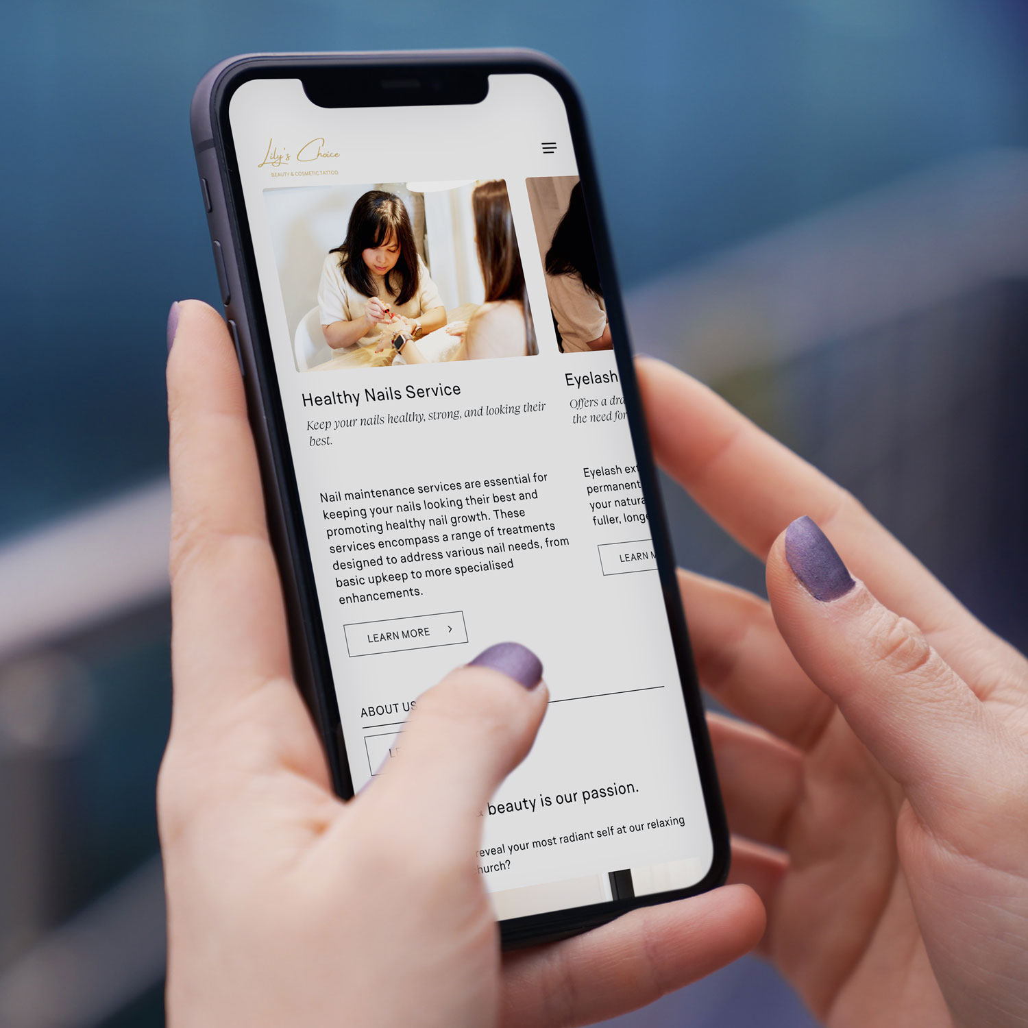
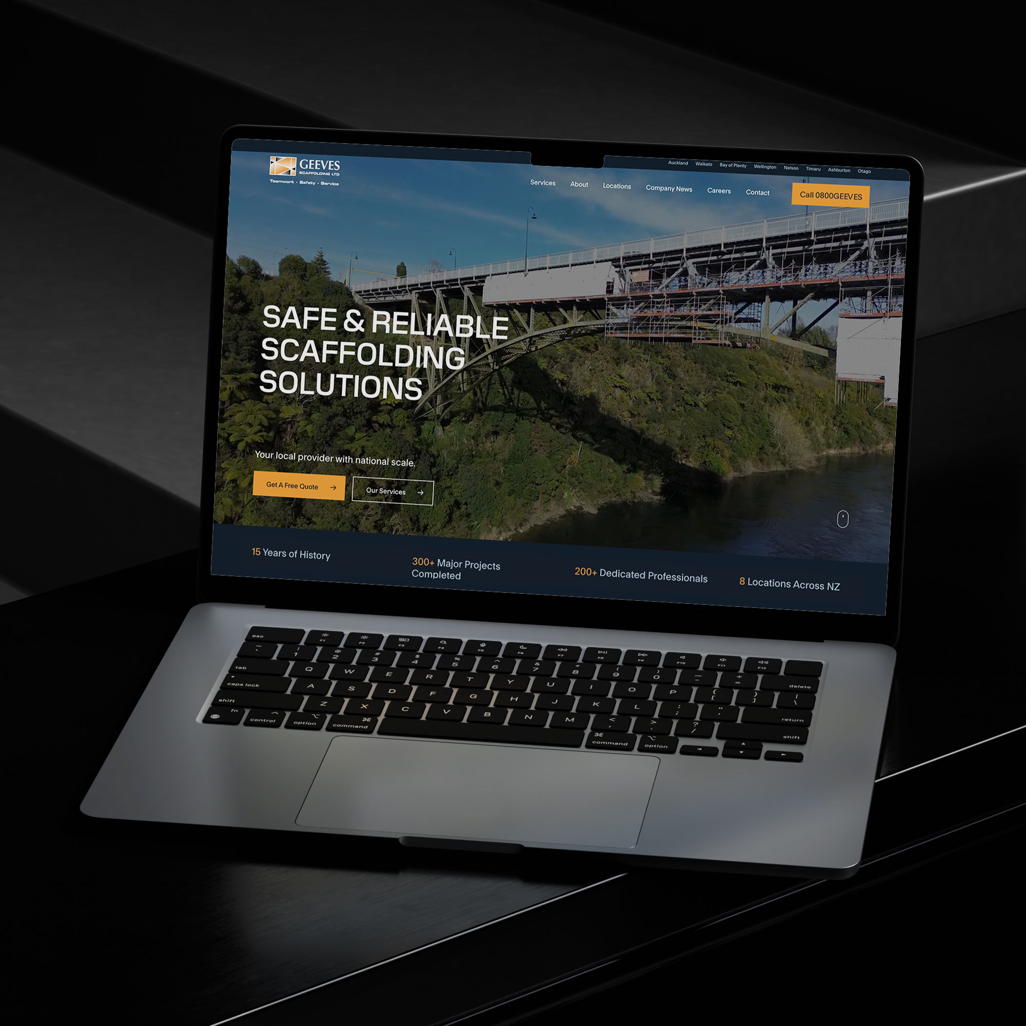
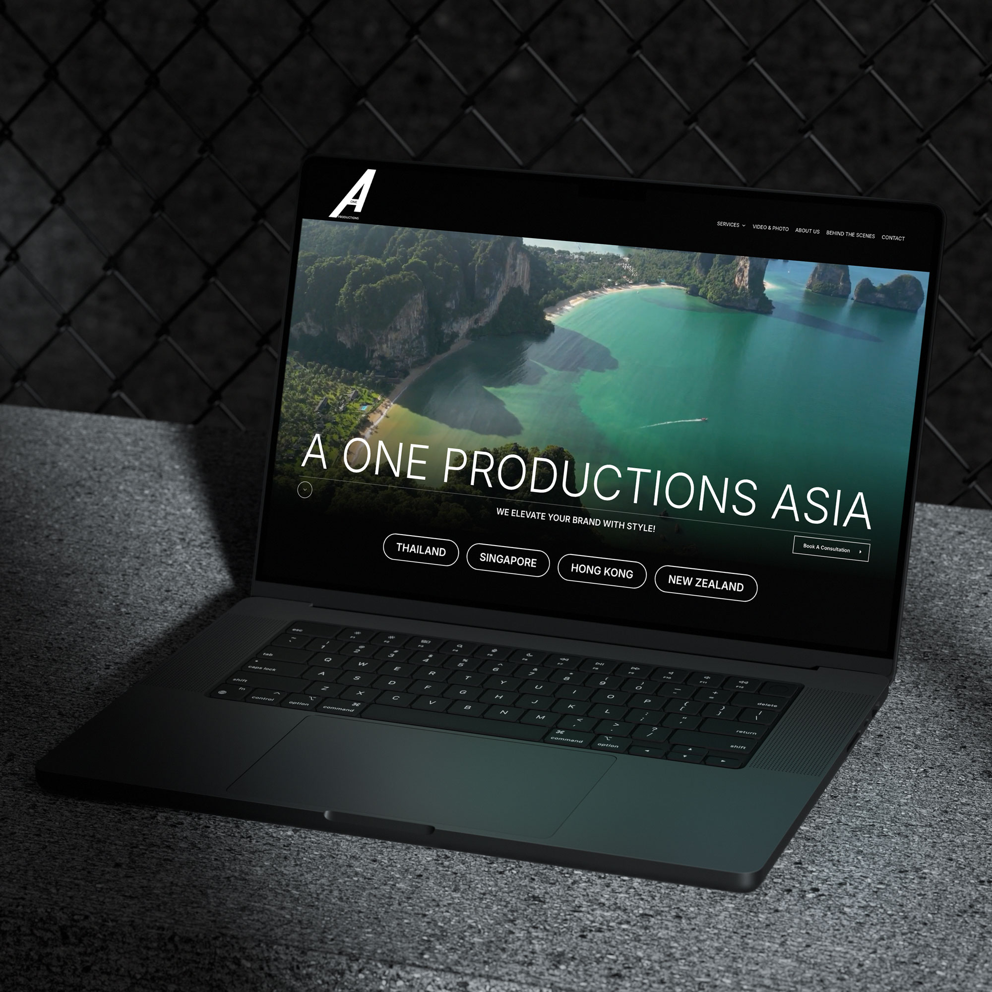
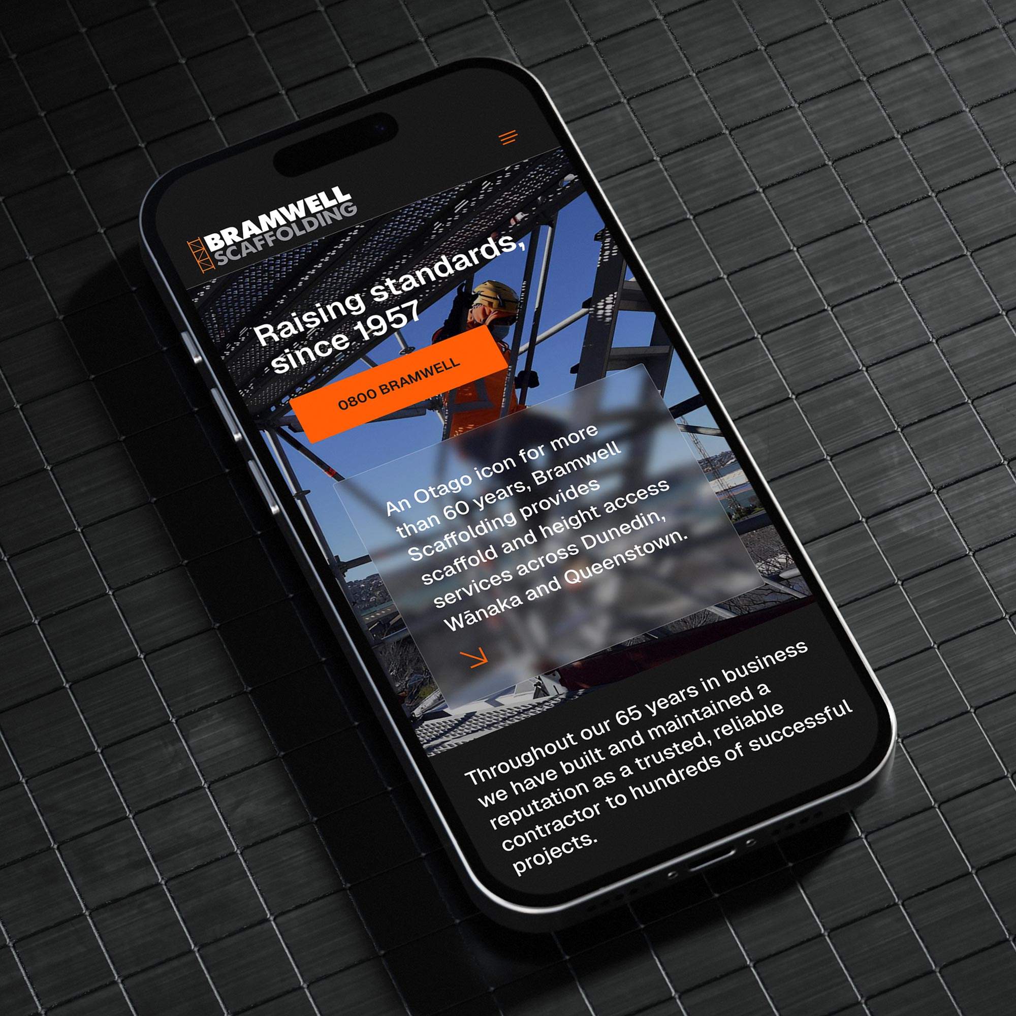
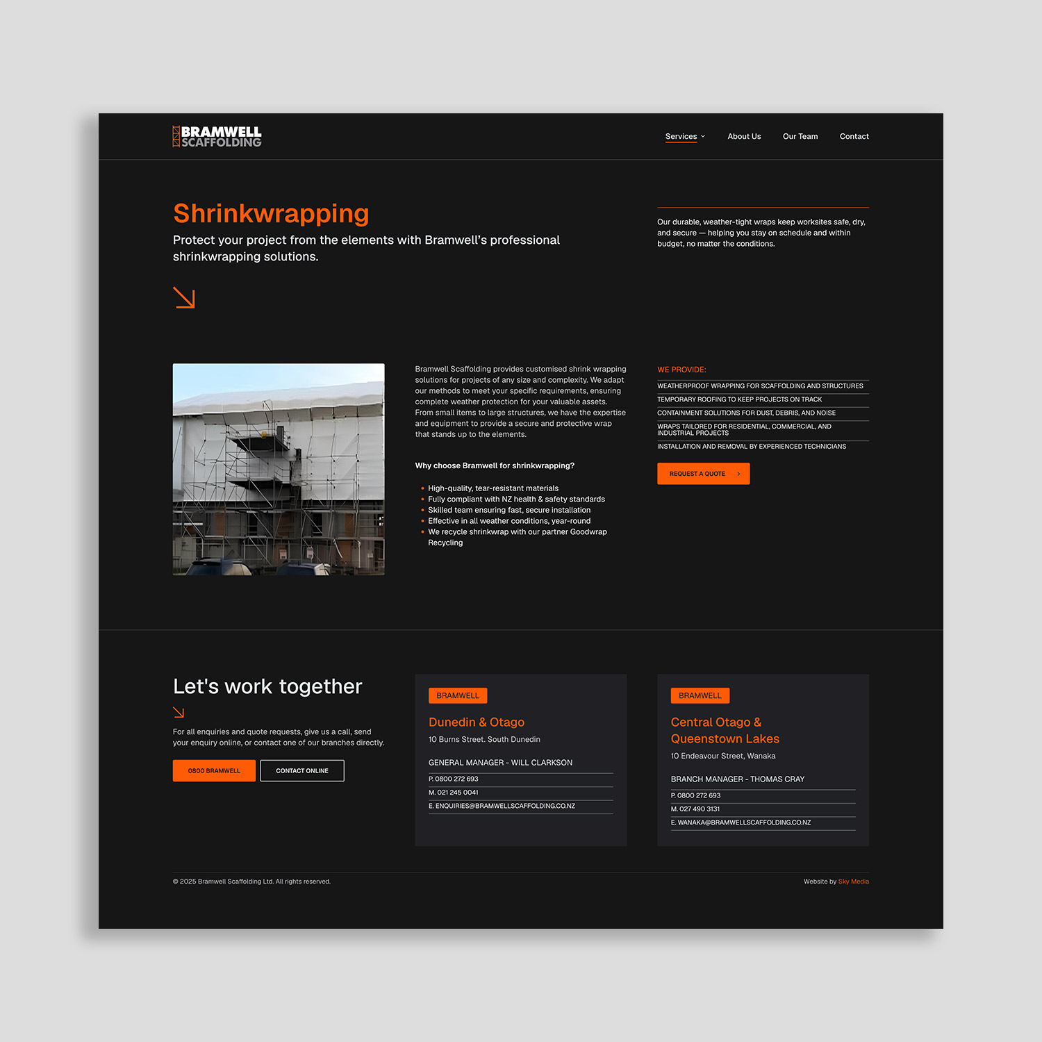
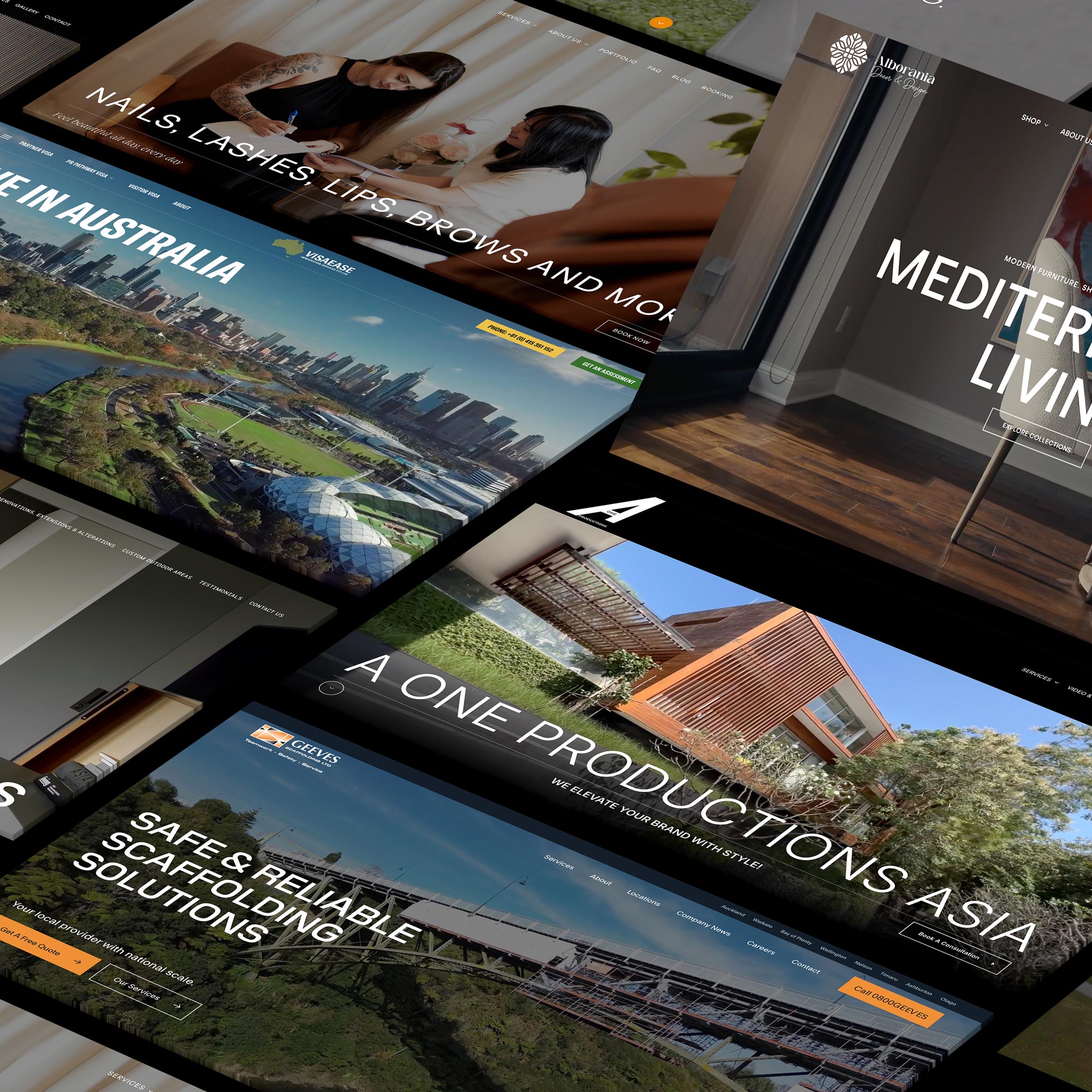
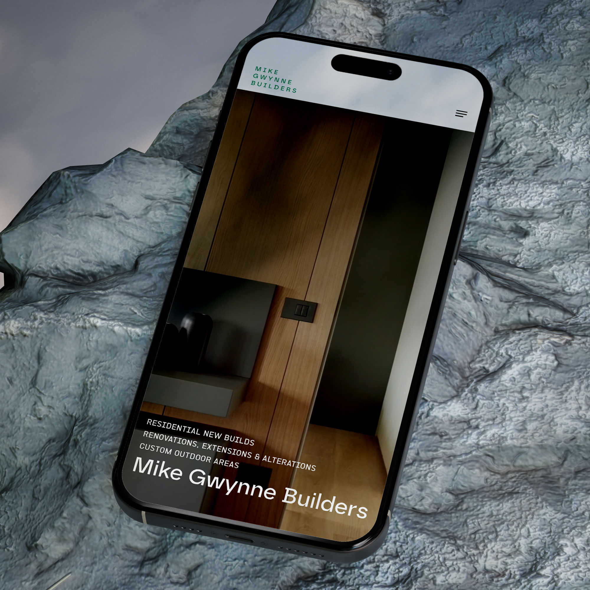
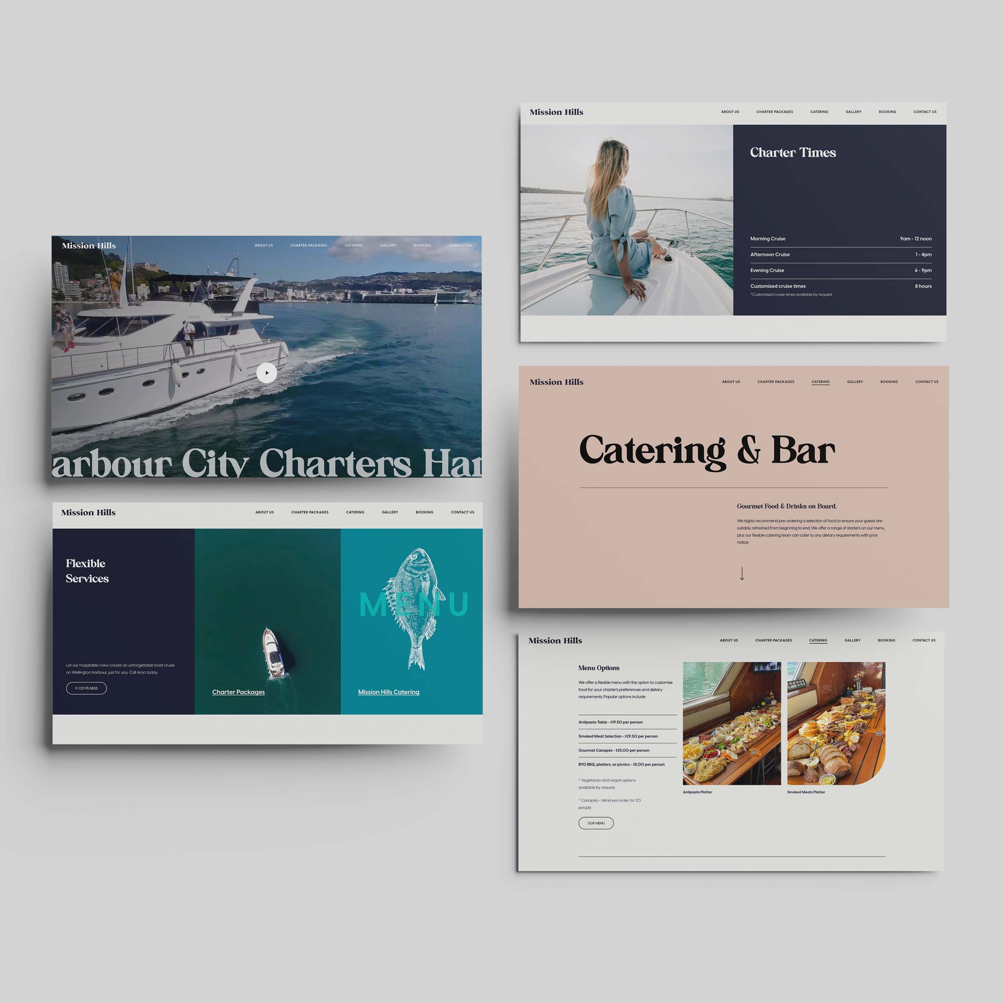
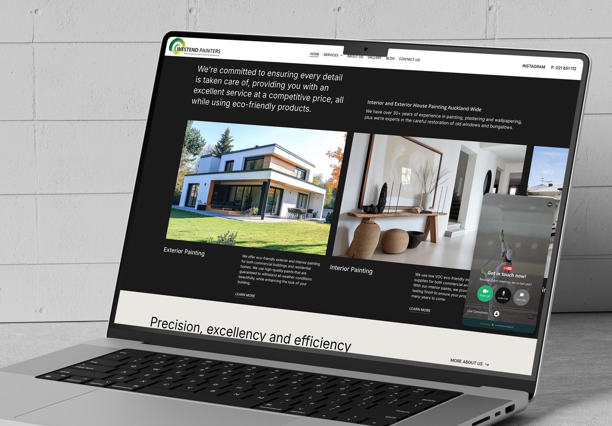
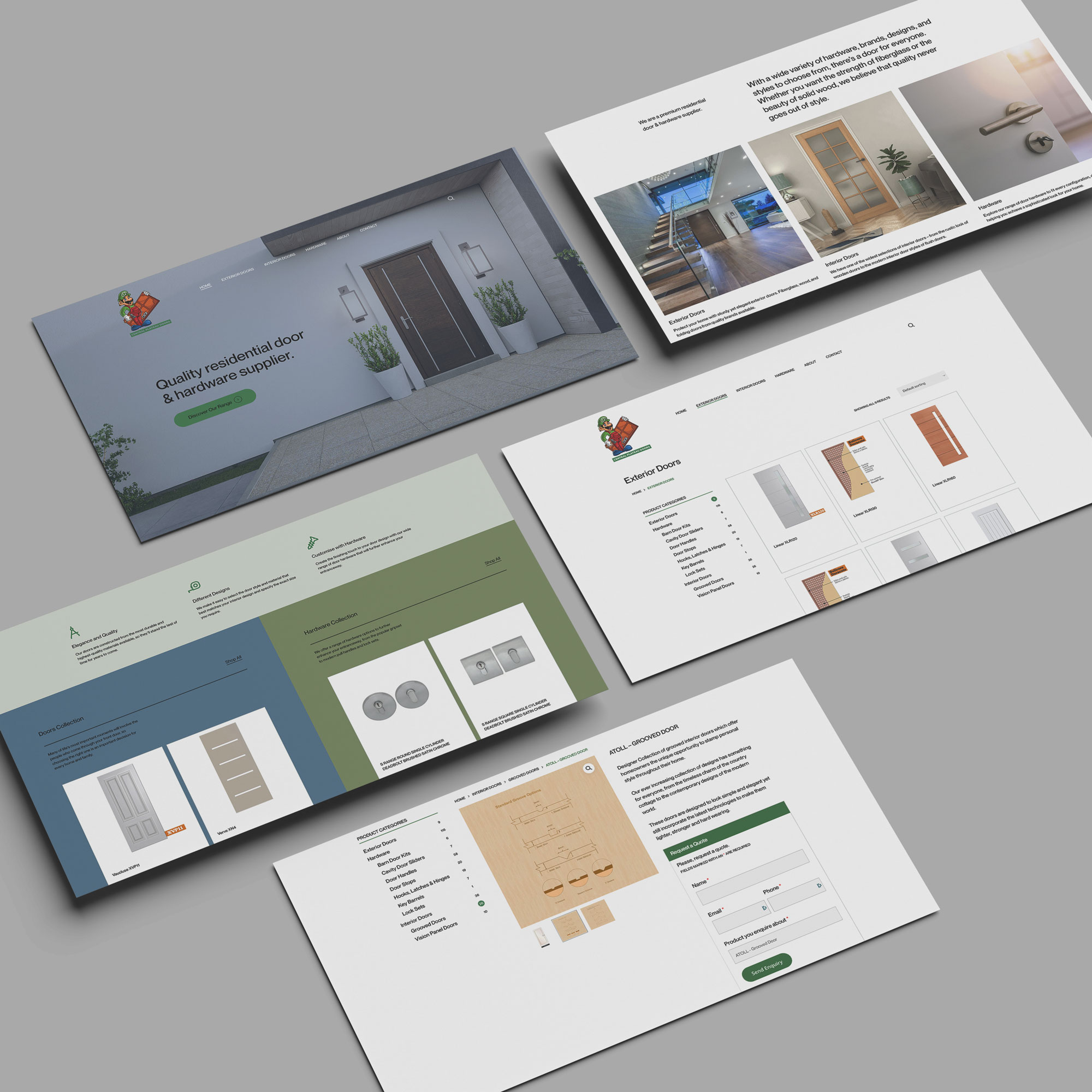
A modern WordPress website can look and feel premium: clean spacing, strong typography, smooth mobile experience, fast loading, and a user journey designed for conversions. You’re not limited to generic blocks that look like everyone else’s website.
In fact, WordPress is often the better option if you want a site that looks unique but still stays practical to manage.
Because here’s the truth: good design isn’t about fancy visuals. It’s about clarity. It’s about making it easy for a customer to understand what you do, trust you, and take the next step.
WordPress gives you the freedom to design around that purpose.

“But isn’t WordPress insecure?”
WordPress gets blamed for security issues the same way cars get blamed for accidents.
WordPress itself is one of the best maintained, updated, and widely tested platforms. The problems usually come from what’s layered on top — outdated plugins, poor hosting, weak passwords, and websites that haven’t been updated in years.
If a WordPress site is treated like a “set and forget” asset, it becomes vulnerable. But that’s true for any platform.
A properly built WordPress website with good hosting, regular updates, and basic security hygiene is extremely safe. And the upside is that you have options: you can strengthen security, monitor, update, and improve — you’re not relying on a closed system where you can’t see what’s happening behind the scenes.
For many business owners, the real “security” benefit isn’t just protection from hacking; it’s peace of mind that the site is supported and maintainable long-term.
WordPress is no longer slow — slow websites are just built poorly
Speed is one of those things everyone cares about but few people prioritise until it hurts.
A slow site means fewer enquiries. More drop-offs. Less trust. And yes, often worse SEO performance too.
WordPress used to have a reputation for being heavy, mainly because people installed everything under the sun and stacked low-quality themes with dozens of unnecessary scripts.
In 2026, that’s simply not the standard anymore.
A well-built WordPress website can be super fast, because you can choose performance-focused hosting, implement modern caching, optimise images properly, and build with a cleaner structure.
The platform isn’t the problem. The build is.
And this is one reason WordPress continues to dominate: it gives professionals the tools to create high-performing sites instead of being restricted by platform limitations.
Ecommerce? WordPress still plays a serious role
Shopify is fantastic for many E-Commerce businesses, especially if you want a streamlined product and checkout system with minimal customisation.
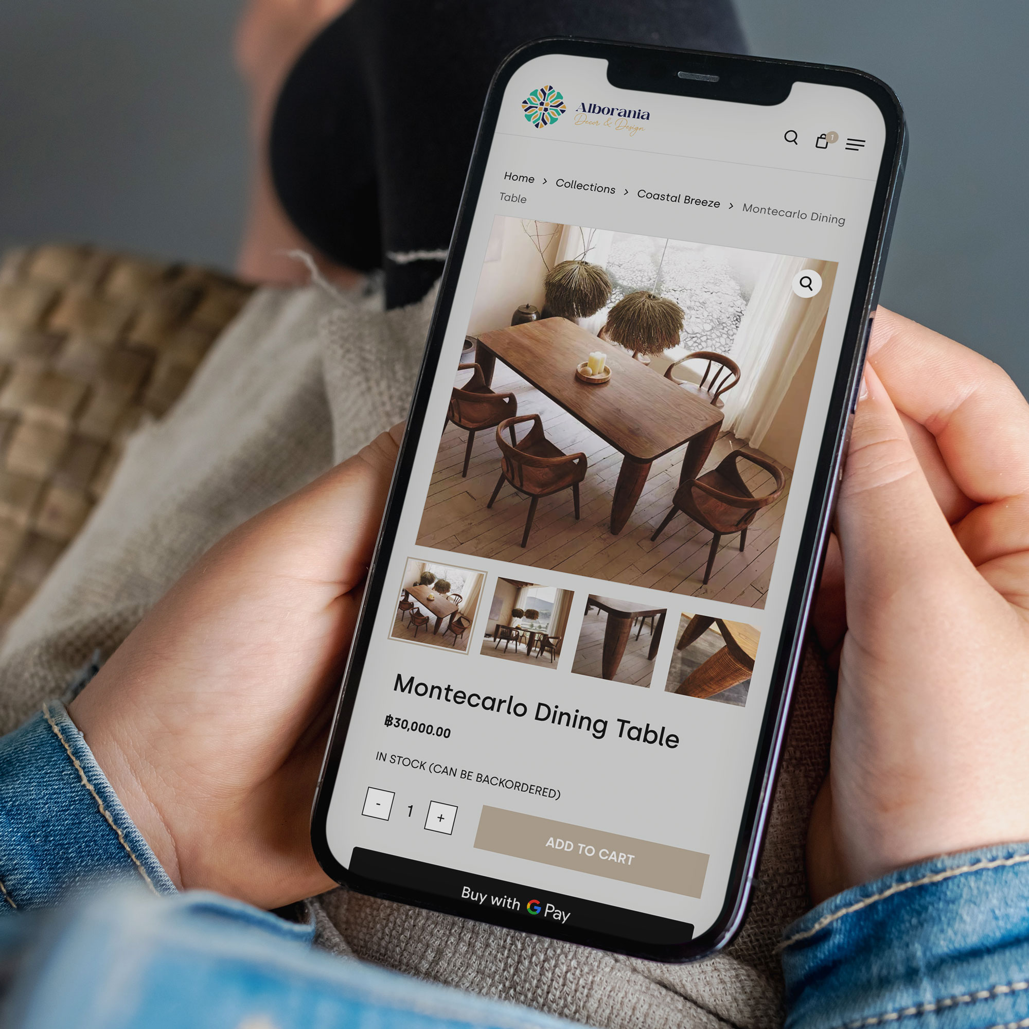
But WordPress (via WooCommerce) continues to be popular in 2026 because it’s flexible.
Some businesses don’t just want “a store.” They want E-Commerce integrated into the broader marketing website. They want content driving product discovery. They want custom bundles, membership perks, subscriptions, unique shipping rules, or a checkout journey built around how their customers buy.
WooCommerce makes sense when E-Commerce isn’t a standalone “storefront,” but part of a bigger digital strategy.
It’s not about one platform being “better.” It’s about choosing what fits your business model and WordPress still fits a lot of them.
Content marketing is back in the spotlight (and WordPress has always been good at it)
Here’s a pattern we see again and again:
Businesses that publish helpful content, even just once or twice a month, tend to build momentum over time. They rank for more searches, earn more trust, and reduce reliance on paid ads.
In 2026, this matters more because people want reassurance before they enquire. They want answers. They want to know what things cost, how the process works, what to expect, and what makes you different.
WordPress was built for publishing. It’s one of the easiest platforms to maintain a blog, add FAQs, build resource libraries, and expand service pages without turning it into a technical project every time.
When content is part of your growth plan, WordPress supports that naturally.
It’s still the most “future-proof” choice for many businesses
Trends come and go. Platforms rise and fall. But WordPress has remained dominant because it’s not tied to one company’s pricing model or design philosophy.
It evolves. It adapts. It has a huge global community. And because it’s open-source, it doesn’t disappear if a product team decides to “pivot.”
For business owners, that stability is a big deal.
A website isn’t an app you try for a month. It’s a long-term asset. You want the option to improve it, grow it, and keep it relevant without being forced into a rebuild every time the market changes.
WordPress offers that path.
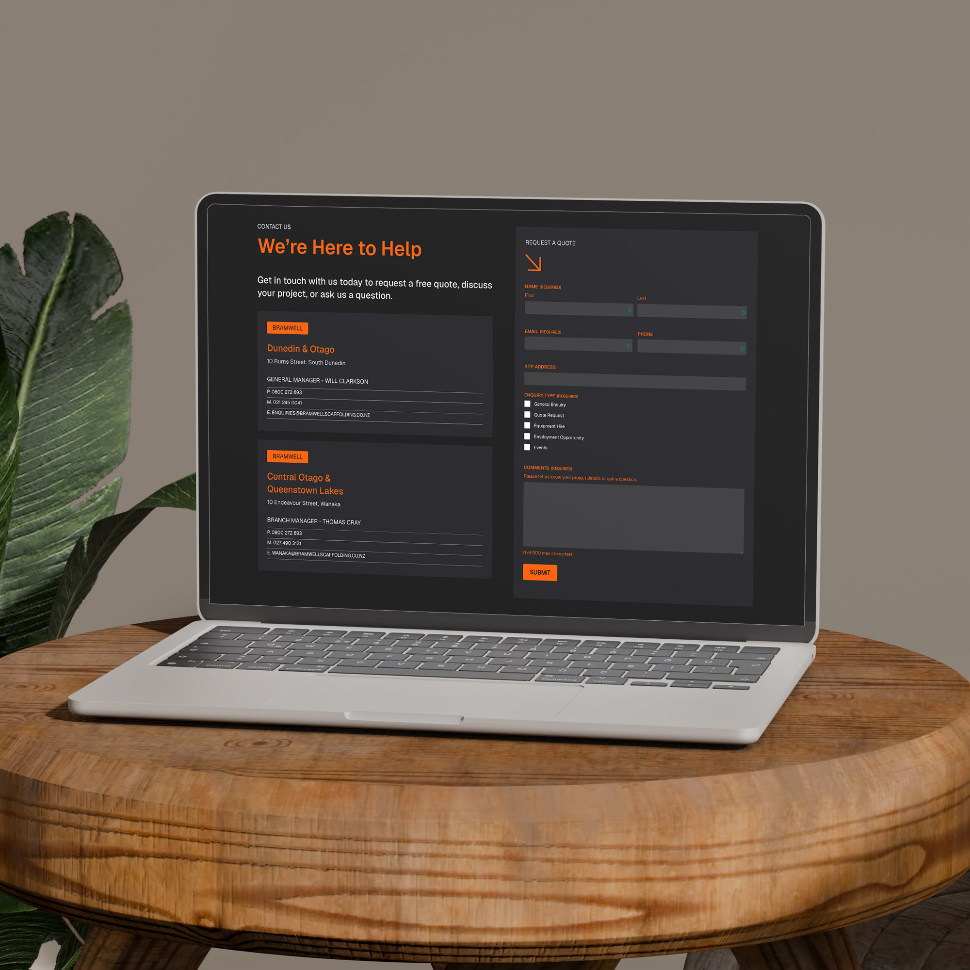
Thinking about a new WordPress website — or upgrading what you already have?
If your website is meant to drive growth and you care about SEO, lead generation, scalability, and building a real digital asset, WordPress remains one of the smartest choices in 2026.
Sky Media builds modern WordPress websites designed for one thing: turning traffic into enquiries. If you want a site that loads fast, ranks well, and feels trustworthy from the first click, let’s talk.