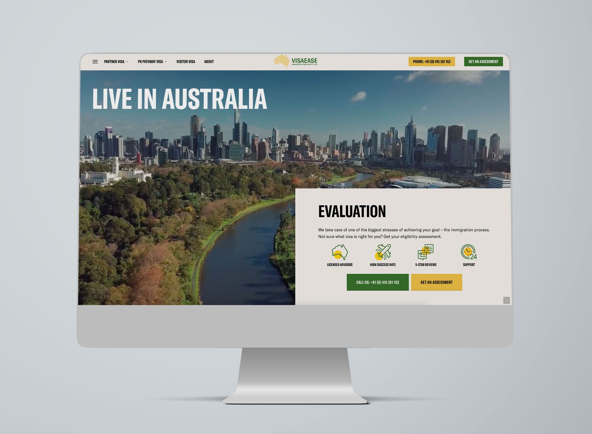
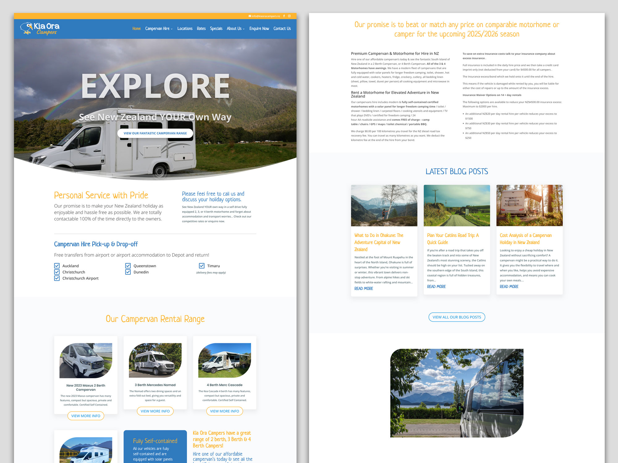
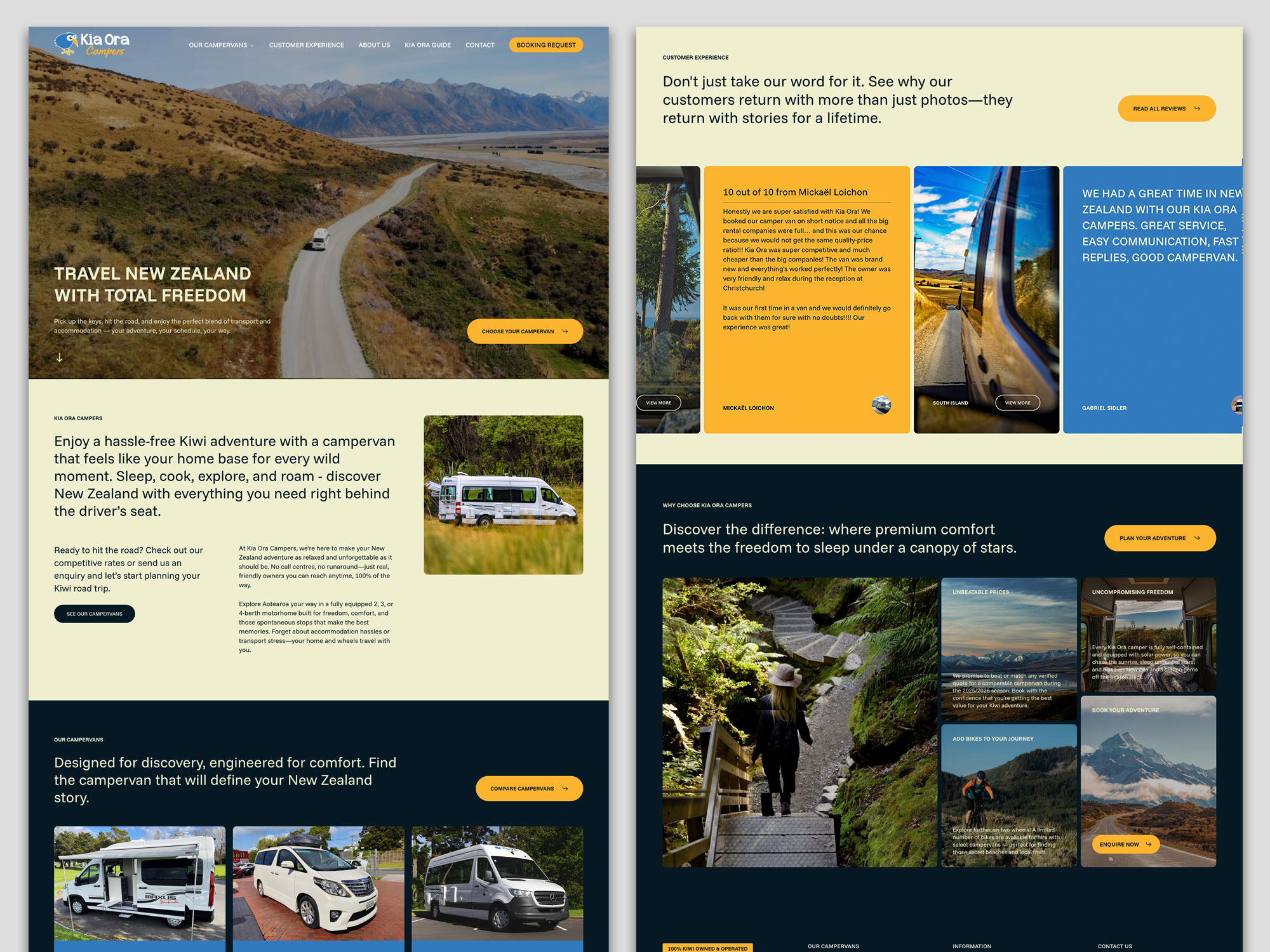
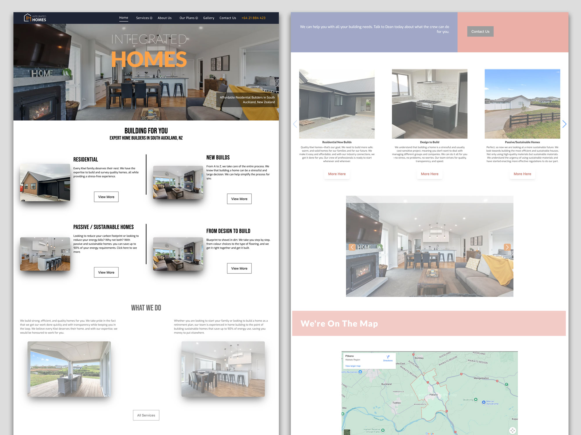
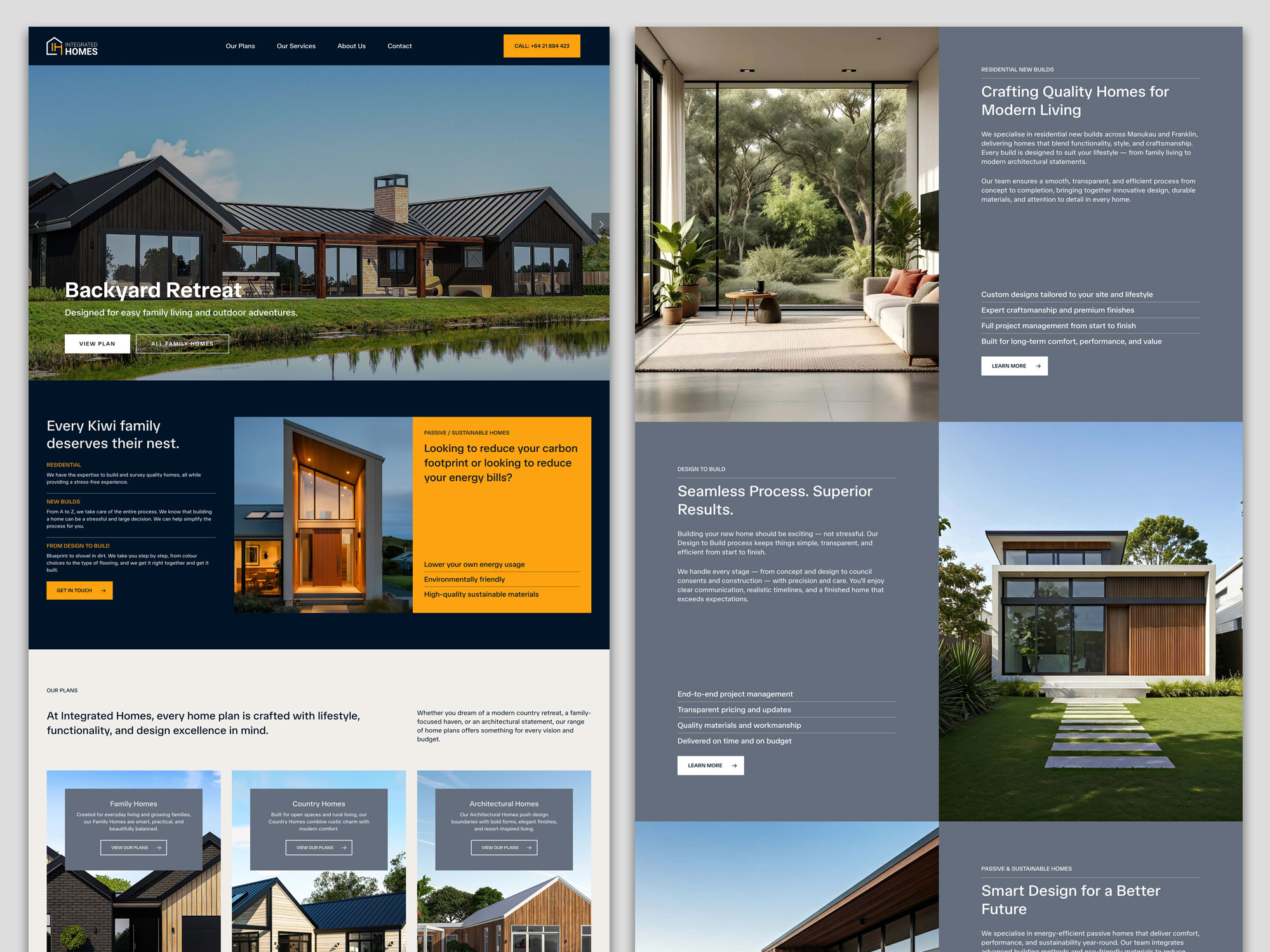
Many businesses invest in a website and then treat it like a digital brochure, something that simply exists online. But a good website should do more than look professional. It should help your business grow. It should attract visitors, guide them toward the right information, and turn interest into enquiries or sales.
The challenge is that many business owners don’t know how to tell whether their website is performing well. They might hear about analytics, SEO metrics, or technical performance scores, but those can feel overwhelming and overly technical.
The good news is that measuring website performance doesn’t have to be complicated. You don’t need to be a developer or data analyst to understand whether your site is helping your business.
Here are seven practical ways to measure how well your website is really performing and what to look for if something needs improvement.
1. Are You Getting the Right Visitors?
One of the most basic measures of website performance is traffic: how many people are visiting your site.
But the number alone doesn’t tell the whole story. What matters more is whether the right people are finding your website.
For example, a landscaping company in Christchurch doesn’t benefit much from hundreds of visitors in other countries. What matters is attracting homeowners in the local area who are looking for landscaping services.
Tools like Google Analytics can show where your visitors come from, which pages they land on, and how they found you: through Google searches, social media, referrals, or direct visits.
If your traffic is growing and the majority of visitors are coming from relevant sources, that’s a positive signal your website is reaching the right audience.
If traffic is low or coming from unrelated places, it may mean your SEO, content strategy, or marketing channels need adjustment.

Google Analytics dashboard showing website traffic, visitor behaviour, and the pages people view most often.
2. Are Visitors Staying or Leaving Immediately?
Another useful indicator is how long visitors stay on your site.
If people arrive and leave within a few seconds, it often suggests something is wrong. Perhaps the page didn’t match what they expected, the message wasn’t clear, or the website felt confusing.
This is often referred to as a bounce rate – the percentage of visitors who leave after viewing only one page.
A high bounce rate isn’t always bad. For example, someone might visit a contact page, get the phone number, and leave. But if visitors consistently leave your homepage or key service pages quickly, it may indicate that your introduction section isn’t doing its job.
Clear messaging, simple navigation, and strong headlines can make a big difference here.
3. Are Visitors Taking the Next Step?
Ultimately, the purpose of most business websites is to encourage action.
That action might be:
- Filling out a contact form
- Booking a consultation
- Calling your business
- Downloading a guide
- Purchasing a product
These actions are known as conversions.
If your website attracts plenty of visitors but very few enquiries, the issue may not be traffic, it may be the way the site guides visitors toward the next step.
Simple improvements can often increase conversions significantly. Clear call-to-action buttons, well-structured service pages, and trust signals like testimonials or reviews help visitors feel confident taking action.
4. Are Your Most Important Pages Being Viewed?
Not every page on your website carries the same importance.
For many businesses, a few key pages do most of the work:
- Homepage
- Main service pages
- Pricing pages
- Contact page
- Key blog articles
Looking at which pages people visit most often can reveal whether visitors are finding the information that matters.
If your service pages receive very little traffic, it could mean visitors are struggling to navigate the site or search engines aren’t ranking those pages well.
On the other hand, if certain blog articles attract consistent traffic, they may be worth expanding or linking to more prominently.
Understanding which pages perform well helps guide future improvements.
5. How Fast Does Your Website Load?
Speed has become an important part of the online experience.
Most people expect websites to load quickly. If a page takes too long, many visitors will leave before it finishes loading.
Page speed affects not only user experience but also search engine visibility. Search engines prefer fast websites because they provide a better experience for users.
There are simple tools, such as Google PageSpeed Insights, that can give you a rough idea of how fast your site loads.
You don’t need to understand every technical detail, but it’s helpful to know whether your website performs well on mobile devices and whether any obvious issues are slowing it down.
Common causes of slow websites include very large images, unnecessary scripts, or outdated hosting.
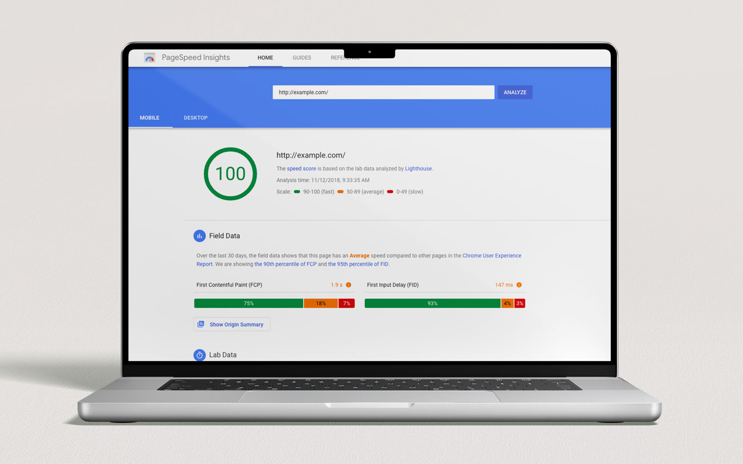
Google PageSpeed Insights helps evaluate how fast your website loads and highlights opportunities to improve performance.
6. Are People Finding You Through Search Engines?
For many businesses, search engines remain one of the most valuable sources of website visitors.
If someone searches for services you offer, for example, “house renovation Christchurch” or “accountant for small business”, ideally your website should appear somewhere in those results.
You can measure this by checking whether visitors are arriving through organic search (Google or other search engines).
Google Search Console is a helpful tool that shows which keywords people are searching for when they discover your site. It can also reveal which pages appear in search results most often.
If your website rarely appears in search results, improving SEO, through clearer service pages, helpful blog content, and technical improvements, can make a significant difference over time.

Google Search Console dashboard showing how your website appears in search results and which queries bring visitors to your site.
7. Are Visitors Using Your Website Easily?
One of the most overlooked measures of website performance is usability.
Ask yourself:
- Is it easy to find key information?
- Are important pages only one or two clicks away?
- Does the site work smoothly on mobile devices?
- Is the next step obvious?
A website might technically function well but still frustrate users if navigation is confusing or content is difficult to scan.
One of the simplest ways to evaluate usability is to watch how real people interact with your site. Ask a colleague or customer to try finding a service or booking a consultation and observe what happens.
If they hesitate, get lost, or ask questions like “Where do I click?”, that’s valuable feedback.
Good website design should feel intuitive — visitors shouldn’t need instructions.
Why Measuring Website Performance Matters
A website is never truly finished.
Just like a physical business location evolves over time, your website should continue improving as you learn how people use it.
By regularly checking a few simple indicators: traffic, engagement, conversions, page performance, search visibility, speed, and usability, you gain a clearer picture of whether your website is helping your business or holding it back.
The goal isn’t to obsess over numbers. It’s to understand whether your website is guiding visitors toward becoming customers.
Final Thoughts
Your website should be one of the hardest-working tools in your business. But without measuring performance, it’s difficult to know whether it’s doing its job.
The good news is that you don’t need complex analytics dashboards to get started. Paying attention to a handful of key indicators can reveal a lot about how well your site performs.
Small improvements, such as clearer messaging, faster loading pages, stronger calls to action, can often make a significant difference.
Over time, those improvements compound into better visibility, more enquiries, and a stronger online presence.
Would like a Free Website Audit?
If you’re not sure how well your website is performing, we can help.
Send us your website link and we’ll review it from a usability, design, and performance perspective, highlighting practical improvements that can help turn more visitors into enquiries.