Website Redesign

What Makes a High-Converting Website for Christchurch Businesses in 2026

What Makes a High-Converting Website for Christchurch Businesses in 2026?

By Tips and Guides, Web Design

In 2026, having a website isn’t enough. For businesses in Christchurch, your website needs to convert — turning local visitors into enquiries, bookings, and sales. With competition increasing across trades, professional services, hospitality, and e-commerce, the difference between an average site and a high-converting one often comes down to how well it reflects local user behaviour, builds trust, performs on mobile, and guides people to take action.

What Makes a High-Converting Website for Christchurch Businesses in 2026

At Sky Media, we see a clear pattern: Christchurch websites that convert well aren’t flashy for the sake of it. They’re clear, fast, credible, and built around how Cantabrians actually browse, compare, and decide.

Let’s break down what truly makes a high-converting website for Christchurch businesses in 2026 — and how you can apply these principles to your own site.

1. Understanding Local User Behaviour in Christchurch

High conversion starts with understanding who is using your website and how they behave.

Christchurch users are practical decision-makers

Christchurch customers tend to value:

  • Clear information over hype
  • Proof and credibility over bold promises
  • Straightforward pricing or next steps

They often compare multiple local providers before making contact. A high-converting website anticipates this by answering key questions early:

  • What do you do?
  • Who is this for?
  • Why should I trust you?
  • What do I do next?

Local intent is strong

That means your website should immediately confirm relevance:

  • Mention Christchurch naturally
  • Reference local industries or challenges
  • Show real local examples and testimonials

When visitors feel “this business is for people like me, in my city,” conversion rates increase dramatically.

2. Trust Signals Matter More Than Ever

In 2026, trust is currency. Christchurch users are cautious, especially when committing to services that require upfront investment.

Essential trust elements for Christchurch websites

High-converting local websites consistently include:

  • Real testimonials from Christchurch clients
  • Photos of real people (not stock-only imagery)
  • Clear contact details with a local presence
  • Transparent explanations of process and pricing

If a visitor has to guess whether you’re legitimate, you’ve already lost them.

Local proof beats generic authority

National awards are nice, but for Christchurch audiences:

  • A testimonial from a Sydenham tradie
  • A case study from a Riccarton business
  • A project completed in the CBD

…often converts better than international logos. Local familiarity reduces perceived risk.

3. Mobile-First Is No Longer Optional

By 2026, most Christchurch website traffic comes from mobile — and not just for hospitality or retail. Professional services, trades, and B2B businesses all see strong mobile usage.

What mobile users in Christchurch expect

A high-converting mobile experience includes:

  • Fast loading times (especially on mobile data)
  • Click-to-call buttons
  • Simple forms (no endless fields)
  • Readable text without zooming
  • Clear navigation with minimal clutter

If your mobile site feels cramped, slow, or confusing, users won’t “check it later” — they’ll bounce and contact a competitor.

Mobile design influences trust

A poorly designed mobile site signals:

  • Outdated business practices
  • Lack of attention to detail
  • Potential communication issues

A smooth mobile experience instantly builds confidence and makes it easier for users to take action.

4. Clear Conversion Paths (No Guessing Required)

One of the biggest reasons Christchurch websites fail to convert is unclear next steps.

High-converting websites answer the question:
“What do you want me to do next?”

Strong calls-to-action that work locally

Effective Christchurch websites use CTAs like:

  • “Get a Quote”
  • “Book a Free Consultation”
  • “Talk to our team”
  • “Request a Call Back”

These are specific, low-pressure, and aligned with local expectations.

One page, one primary goal

Each page should have a dominant action:

  • Home page → enquiry
  • Service page → quote request
  • Contact page → call or form

Too many competing CTAs create hesitation — and hesitation kills conversions.

5. Page Speed and Performance Still Win

Christchurch users won’t tolerate slow websites — especially on mobile. Speed directly affects:

  • Bounce rates
  • SEO visibility
  • Conversion rates

What slows Christchurch websites down

Common issues include:

  • Heavy image files
  • Cheap hosting
  • Bloated themes
  • Unnecessary animations

High-converting websites are lean, optimised, and built with performance in mind from day one.

Speed isn’t just technical — it’s psychological. Fast sites feel professional and trustworthy.

6. Content That Speaks to Christchurch Audiences

Generic content doesn’t convert. Localised, relevant content does.

What effective Christchurch website content includes

  • References to local conditions or industries
  • Language that sounds human, not corporate
  • Clear explanations without jargon
  • Answers to real customer questions

For example, a web design page that explains how website design helps Christchurch businesses get more enquiries will outperform one that simply lists features.

7. SEO and Conversion Working Together

In 2026, SEO and conversion optimisation are inseparable.

A website designed purely for rankings but not humans won’t convert. A beautiful website with no SEO won’t be found.

High-converting Christchurch websites:

  • Target relevant local keywords naturally
  • Use clear headings and structure
  • Align content with real search intent
  • Load fast and work perfectly on mobile

This is why web design Christchurch and website design Christchurch should be treated as user intent topics, not just keywords.

8. Forms That Don’t Scare People Away

Forms are often the final conversion point — and where many websites fail.

What converts better in Christchurch

  • Short forms (name, email, message)
  • Optional phone number
  • Clear privacy reassurance
  • Friendly, conversational labels

Long, aggressive forms feel salesy and reduce trust. In Christchurch, users prefer a softer, more respectful approach.

9. Visual Design That Feels Modern — Not Trendy

Christchurch businesses don’t need ultra-experimental design. They need:

  • Clean layouts
  • Clear typography
  • Consistent branding
  • Easy readability

High-converting sites feel current without being confusing. Design should support clarity, not distract from it.

10. Continuous Improvement Beats “Set and Forget”

Finally, the best converting websites in Christchurch are never finished. Read our “Why Your “Set and Forget” Website is Hurting Your Business” post to learn why you need take care of your website on a regular basis.

  • Monitor user behaviour
  • Improve underperforming pages
  • Update content regularly
  • Refine CTAs based on real data

In 2026, conversion optimisation is an ongoing process — not a one-time project.

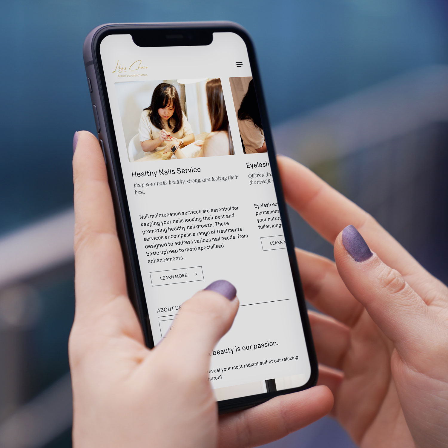
Mobile-first web design NZ example on smartphone for Christchurch based beauty & cosmetic tattoo business
Local Example

Lily’s Choice, Christchurch

A great example of conversion-focused website design in action is Lily’s Choice, a boutique beauty studio based in Christchurch. Lily’s Choice specialises in personalised cosmetic treatments designed to enhance natural beauty while making clients feel confident and cared for from the very first interaction.

When designing the website, the focus was on creating a calm, premium feel that reflects the in-studio experience, while also making it easy for visitors to understand services, build trust, and take the next step. Clear service descriptions, strong visual hierarchy, mobile-friendly booking pathways, and subtle trust cues were all built in to support conversions — especially for users browsing on mobile.

The result is a website that not only looks beautiful, but works as a practical tool for attracting and converting local Christchurch clients.

Final Thoughts: Conversion Is About Relevance and Trust

A high-converting website for Christchurch businesses isn’t about tricks or trends. It’s about:

  • Understanding local users
  • Building trust quickly
  • Making mobile effortless
  • Guiding visitors clearly
  • Removing friction at every step

When web design, SEO, and user experience work together, your website becomes more than an online brochure — it becomes a consistent lead-generation asset.

If your current website isn’t converting visitors into enquiries, it’s not a reflection of your business — it’s a sign your website needs a smarter, more locally focused approach. At Sky Media, we design high-performing websites built specifically for Christchurch businesses, combining conversion-focused design, mobile-first performance, and SEO that actually drives results. If you’re ready to turn your website into a consistent source of leads in 2026, get in touch with our team for a no-obligation chat about your goals.

Why a Fresh Website is Your #1 SEO Tool

Why Your “Set and Forget” Website is Hurting Your Business

By SEO, Web Design

You launched your website years ago. It looked great, showed off your services, and you hoped it would bring in customers. Then life and the day-to-day of running your business took over. Your website became that project you finished, and you haven’t touched it since—a digital “set and forget.”

Here’s the hard truth: that approach is now actively working against you. In the eyes of both Google and your potential customers, a static, outdated website signals a business that is no longer active, relevant, or trustworthy.

Why a Fresh Website is Your #1 SEO Tool

Think of SEO not as a one-time technical fix, but as an ongoing conversation with both your customers and Google. Updating your website regularly is how you keep that conversation lively, relevant, and successful. Let’s break down exactly why this is so critical, and how we’ve helped other Kiwi businesses transform their results by breaking the “set and forget” habit.

1. Google Rewards Freshness: The Algorithm Loves an Active Site

At its core, Google’s mission is to provide the best, most relevant, and most current answer to a searcher’s question. Which result do you think it will prefer when someone searches for “campervan hire NZ 2026” or “sustainable home builders Auckland”?

  • A website with “Latest News” from 2020.
  • A site with a regularly updated blog, fresh customer testimonials, and updated service pages reflecting current offers.

The answer is obvious. Google has a built-in “freshness factor.” By regularly updating your site, you send clear signals that it’s a living, active source of information. This can lead directly to a rankings boost, especially for time-sensitive or competitive searches.

In simple terms: A regularly updated website is like a shop with its lights on and fresh stock in the window. A stale site is like a shop with dusty shelves—people assume it’s closed or doesn’t care.

2. It’s Your Chance to Answer New Customer Questions

Your business evolves. The questions your customers ask evolve, too. A few years ago, people might have searched for “home builder.” Now, they’re looking for “energy-efficient passive home design” or “campervan hire with bike racks.”

If your website only has the old content, you’re invisible to people asking new questions. Regular updates allow you to:

  • Create new pages or blog posts that target these emerging trends and keywords.
  • Expand your service pages to reflect new offerings or FAQs you hear daily.
  • Showcase recent work to prove you’re actively excelling in your field.

Every new, relevant page is another front door to your business online. More doors mean more opportunities for customers to find you.

3. Updating Old Content: Your Secret SEO Weapon

Creating new content is great, but one of the most powerful strategies is updating and republishing what you already have.

That service page or blog post from a few years ago that used to get traffic? It might be slipping because it’s outdated. The process is simple:

  • Find it: Identify pages with potential that are now underperforming.
  • Refresh it: Update statistics, add new insights, include recent case studies or testimonials, and improve the images.
  • Republish it: Change the “last updated” date and share it again.

Why does this work? You’re taking a page that already has some SEO authority and making it 10x more valuable. It’s like renovating a well-located house instead of building on a new plot—the results are often faster and more dramatic.

Real-World Transformations: From Static to Strategic

These concepts might sound abstract, but their impact is incredibly concrete. Let’s look at two recent Sky Media clients and the tangible results of moving from a “set and forget” to an “always fresh” mindset.

Case Study 1: Kia Ora Campers – Driving Online Bookings Off the Chart

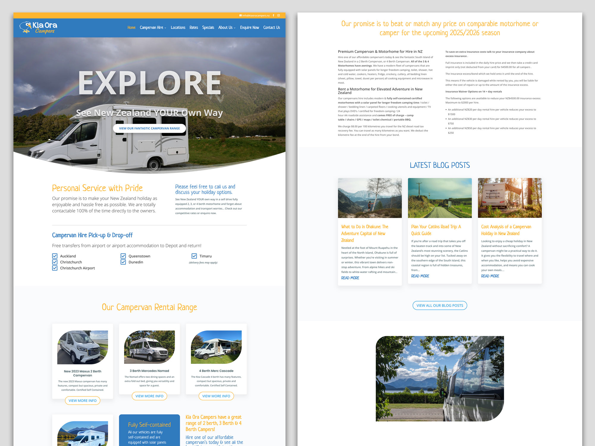
The ‘Before’ website: A Static Fleet List: The original Kia Ora Campers site functioned primarily as an online brochure. It listed vehicles and contact details, but the blog was hard to read, and key information for travellers (like detailed insurance explanations or current travel tips) wasn’t easily accessible. The site wasn’t actively working to answer the myriad questions potential renters have when planning a big trip.

Kia Ora Campers Website Before

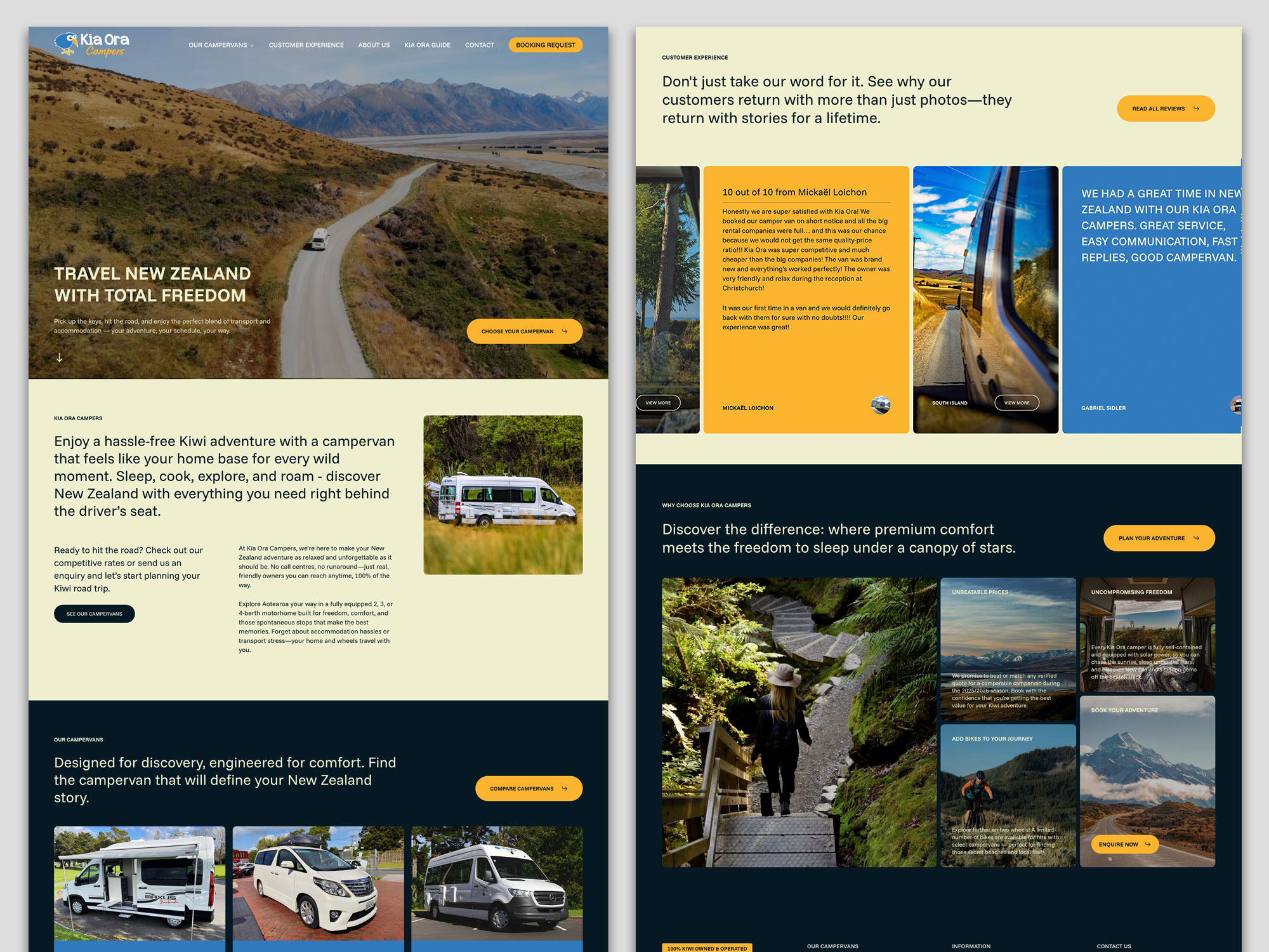
The ‘After’ Strategy – Becoming a Travel Resource: We worked with Kia Ora Campers to shift their site from a brochure to a comprehensive travel hub. The strategy centred on consistent, valuable content updates:

  • A Visual, Editorial-Standard Blog: Moving beyond basic posts, we developed a blog with a magazine-grade design. Featuring compelling layouts, high-quality imagery, and scannable sections
  • Transparent & Detailed Content: Key pages were expanded with clear, reassuring details on insurance, bond processes, and what “fully self-contained” truly means for freedom camping.
  • Fresh Social Proof: The integration of recent, detailed customer reviews builds immense trust.

The Result: The site is no longer just a list of vans; it’s a trusted planning tool. By consistently publishing content that targets what travellers are searching for.

Kia Ora Campers Website After

Case Study 2: Integrated Homes – Building Authority in a Competitive Market

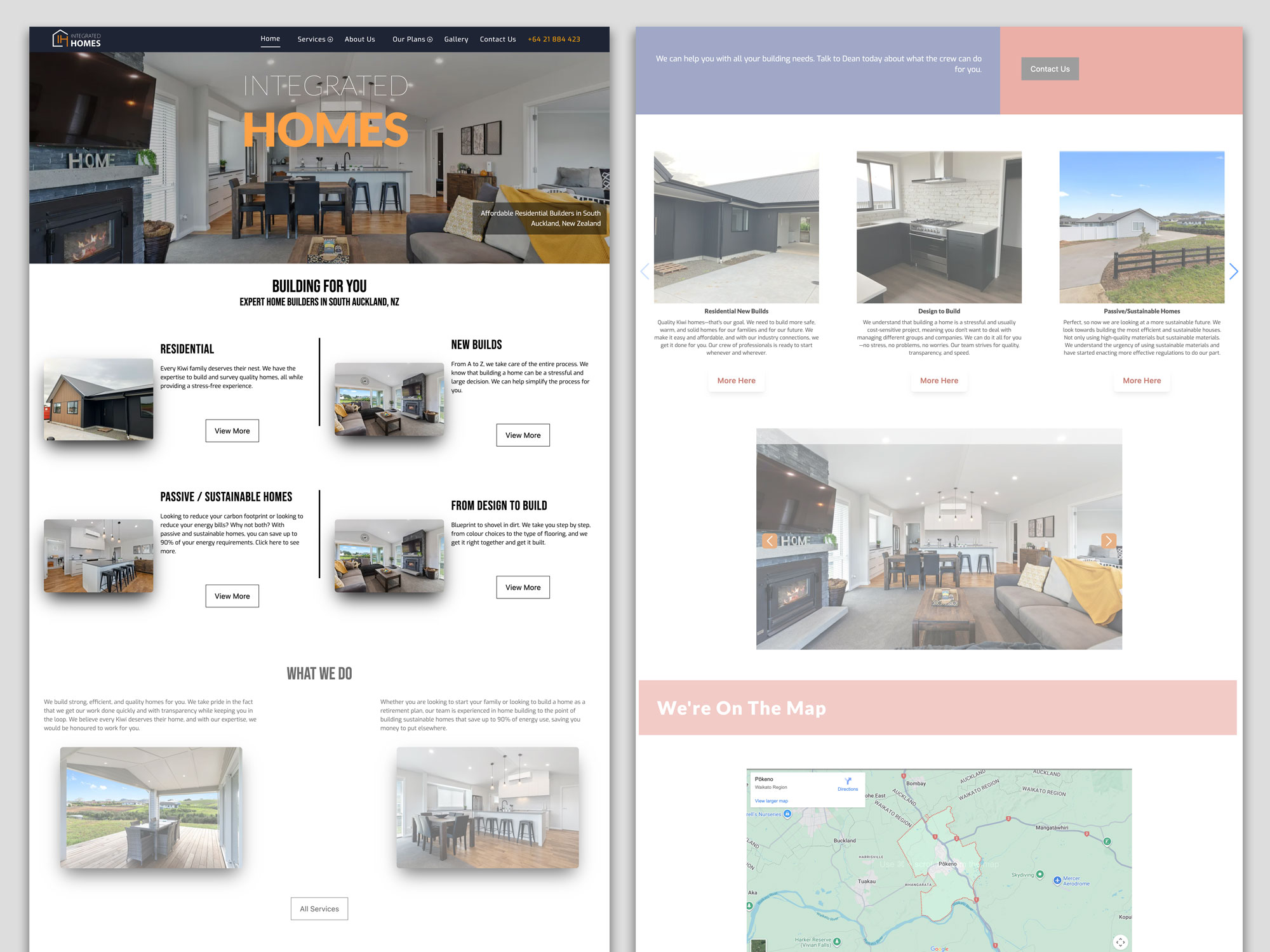
The ‘Before’ – A Generic Builder Site: Integrated Homes’ original site contained the essential information—they built quality homes—but it struggled to stand out in the crowded Auckland building market. The messaging was broad, and the site lacked the specific, expertise-driven content needed to attract clients looking for more than just a builder.

Integrated Homes Website Before

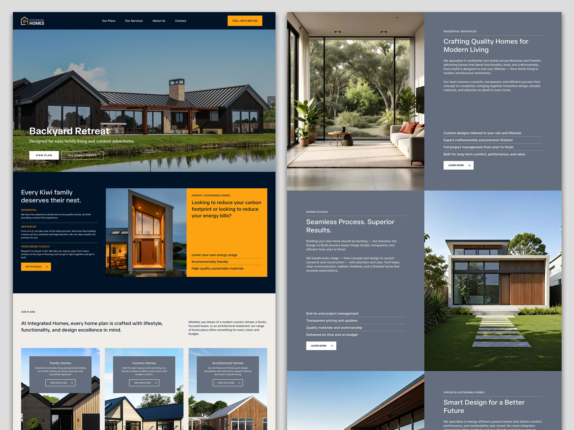
The ‘After’ Strategy – Owning a Niche with Expertise: Our focus was on positioning Integrated Homes as specialists, not generalists. This was achieved through targeted updates and content that showcased deep knowledge:

  • Highlighting Specialisations: We worked to clearly define and promote their service pillars, especially “Passive / Sustainable Homes,” moving it from a bullet point to a key differentiator. The content explains the benefits (like “saving up to 90% of your energy requirements”) in clear, compelling language.
  • Project-Focused Storytelling: The site now uses its house plans more effectively, presenting homes like “Your Own Elmshade Resort” or “Your Brick solid Windermere Home.” This tells a story of craftsmanship and results, not just showing pictures.
  • Building Trust through Transparency: Pages were updated to prominently feature certifications (LBP, NZCB Halo), clearly stating “Our team prides itself on our experience and quality craftsmanship.”

The Result: By consistently emphasising their specialised expertise in sustainable building and showcasing completed projects with narrative depth, Integrated Homes is able to attract clients who are specifically looking for their skill set.

Integrated Homes Website After

4. Building Trust and Authority: The Human Element

Regular updates build what Google calls EEAT (Experience, Expertise, Authoritativeness, Trustworthiness). This is shown through:

  • Fresh testimonials and case studies: Proof you’re doing great work now (as seen in both case studies above).
  • Industry commentary: Showing you’re engaged and knowledgeable.
  • Updated “About Us” and credentials: Like Integrated Homes’ builder certifications.
  • An active, helpful blog: Like Kia Ora’s travel guides, which build authority before a customer even picks up the phone.

A static website erodes trust. An active, updated website builds it with every visit.

5. Technical Health: Keeping the Digital Lights On

Websites are built on software that needs updates for security, speed, and mobile-friendliness. An outdated backend is a major risk and can slow your site down, causing both Google and users to bounce away. Regular maintenance is the non-negotiable digital equivalent of a Warrant of Fitness for your online presence.

“But I’m Too Busy Running My Business!” Your Action Plan

This is the most valid concern. You’re an expert in building or hospitality, not in content marketing. The key is to start small and be consistent, or partner with experts (like us) to handle it for you.

  1. Audit Your Key Pages: Pick your top 3 service pages. Are the descriptions, prices, and benefits accurate and compelling? Update them first.
  2. Add Fresh Proof: Upload your two most recent client testimonials or project photos this month.
  3. Revive One Old Piece: Find one blog post or page that has good history but old info. Spend an hour updating it.
  4. Schedule Time: Block out 90 minutes in your calendar next month to repeat this process. Consistency is everything.
  5. Talk to Your Experts: This is what we do at Sky Media. We become an extension of your team, creating and implementing a manageable, strategic update plan that turns your website from a static cost into your hardest-working business development tool.

In conclusion, your website is the heart of your digital presence. Just like your physical business needs ongoing care, your website needs regular attention to thrive. By committing to regular updates, you’re ensuring your business remains visible, relevant, and trusted. The transformation for Kia Ora Campers and Integrated Homes wasn’t magic—it was the systematic application of treating their website as the living, growing asset it truly is.

Ready to move from “set and forget” to “always growing”? Contact the Sky Media team today for a free, no-obligation website audit. Let’s build a plan that works for your business.

Modern website design generating online enquiries and sales leads.

Simple Ways to Get Better Leads from Your Website

By Tips and Guides, Web Design

Every business wants more website traffic. But traffic alone doesn’t pay the bills — quality leads do.

At Sky Media, we often meet business owners who’ve invested in a new website that sadly brings in little to no work. The truth is: design alone isn’t enough. To make your website work as a real sales tool, you need strategy, structure, and clear communication.

Modern website design generating online enquiries and sales leads.

Below, we break down how the Sky Media team approaches building a website that not only looks great, but consistently attracts and converts the right kind of leads — the ones that fit your services, your values, and your price point.

1. Start With the Goal — Not the Design

Before picking colours or fonts, get clear on what success looks like.
Ask yourself: what do you actually want people to do when they land on your website? Do you want them to call you, request a quote, make a booking, or download a guide?

Once you know the goal, everything else — the layout, images, and copy — should serve that purpose. A site without a goal is like a billboard with no message.

For example, a trades company might have one primary goal: get quote requests. That means the contact form, CTA buttons, and copy should all nudge visitors toward that action.

Tip: Write your main goal at the top of your design brief. Every section of your website should move visitors closer to that goal. If it doesn’t, it probably doesn’t need to be there.

2. Know Who You’re Talking To

You can’t speak to everyone. The best-performing websites speak clearly to a defined audience — and make those people feel understood.

  • Start by thinking about your ideal client:
  • What do they want most?
  • What problems or frustrations do they face?

What would make them trust you?

Once you understand your audience, reflect that understanding through your design and words. A scaffolding company in Dunedin, for example, might focus on reliability and winter shrink-wrapping solutions, while a dance academy might highlight family-friendly classes and community connection.

When people feel your website “gets” them, they’re far more likely to get in touch.

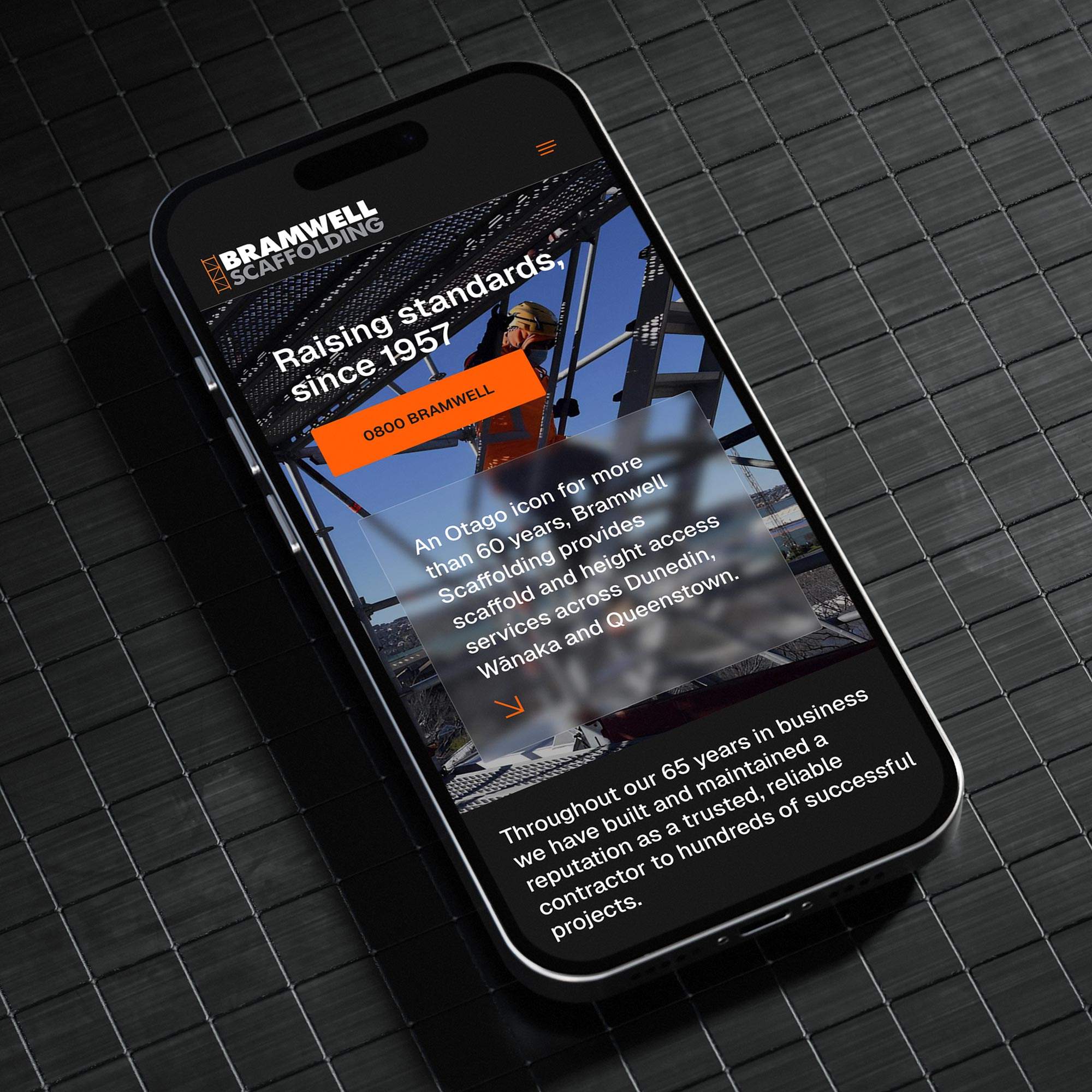
A scaffolding company in Dunedin - Bramwell Scaffolding website
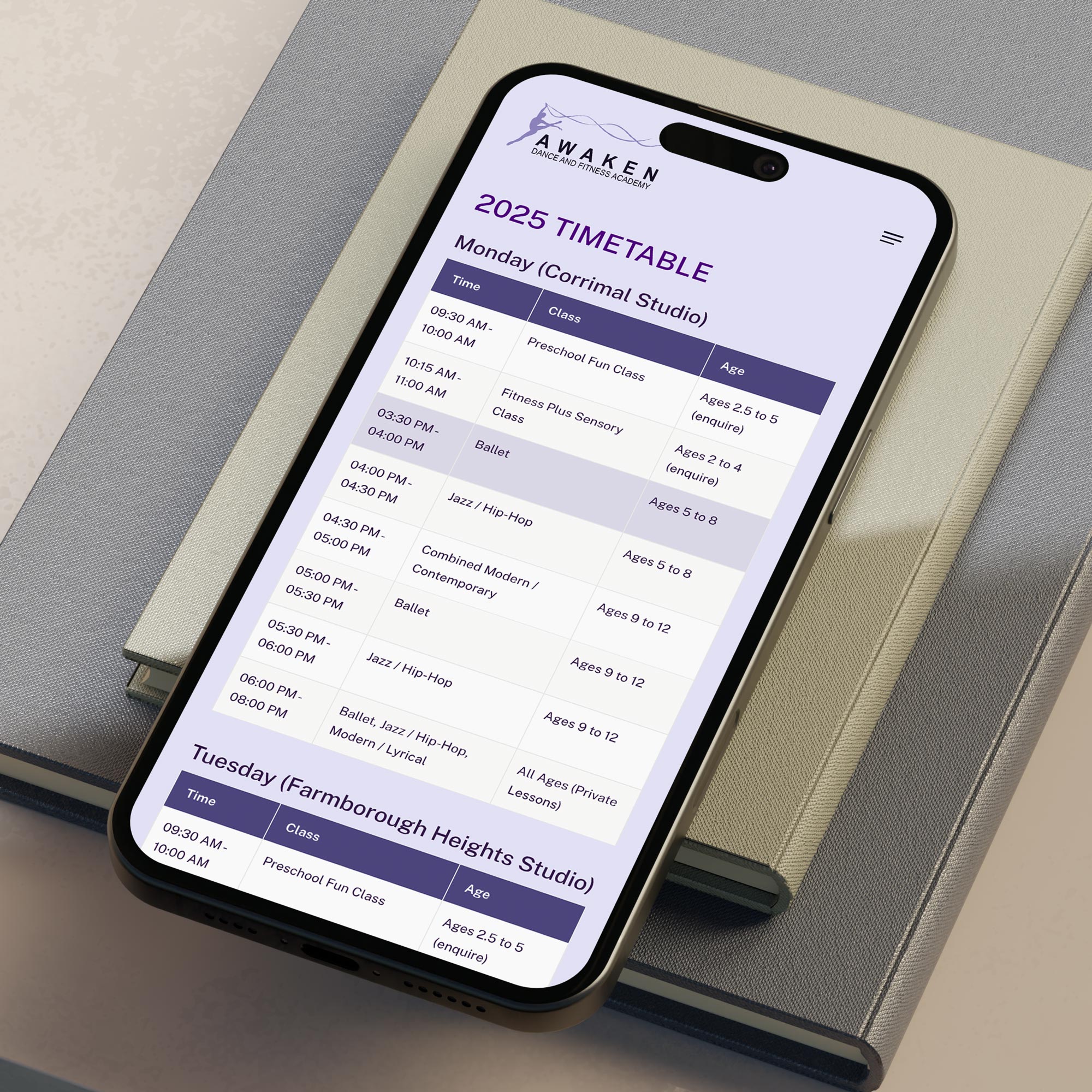
Awaken Dance a dance academy website design

3. Design for Action, Not Distraction

Beautiful websites don’t automatically perform well. Function should lead form. Your design should guide people — not just impress them.

That means using clean layouts, plenty of white space, and logical flow. Too many colours, flashing banners, or competing buttons just confuse visitors.

Every page should have one clear next step: book a call, get a quote, sign up. When someone lands on your homepage, it should take no more than three seconds to see what you offer and what to do next.

Use language that’s helpful and specific. Instead of a generic “Submit” button, say “Get A Quote” or “Book A Free Call.”

The goal is to make action feel easy and obvious.

4. Turn Every Service Page into a Sales Page

Think of each service or product page as a mini sales pitch. Your homepage gives the overview, but it’s the deeper pages that actually close the deal.

Each service page should have:

A clear headline that promises value (“Fast, Reliable Scaffolding for Dunedin Builders”).

A few paragraphs explaining how you help and why it matters.

Proof that builds trust — testimonials, client logos, or short case studies.

A strong call-to-action encouraging the next step.

For example, if you’re an electrician, a service page about “New Build Wiring” could include photos of past projects, your safety certifications, and a form that says, “Tell us about your new build — we’ll reply within 24 hours.”

Remember: people don’t buy services, they buy outcomes. Tell them what they’ll gain — not just what you’ll do.

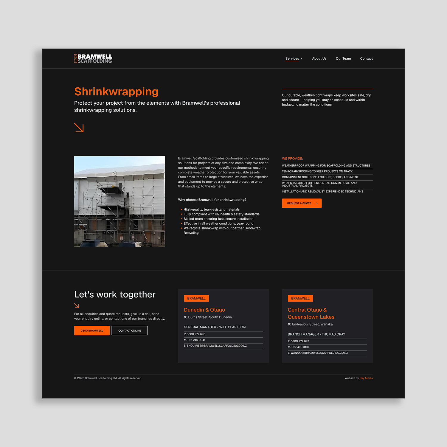
Bramwell Scaffolding services page design example for lead generation
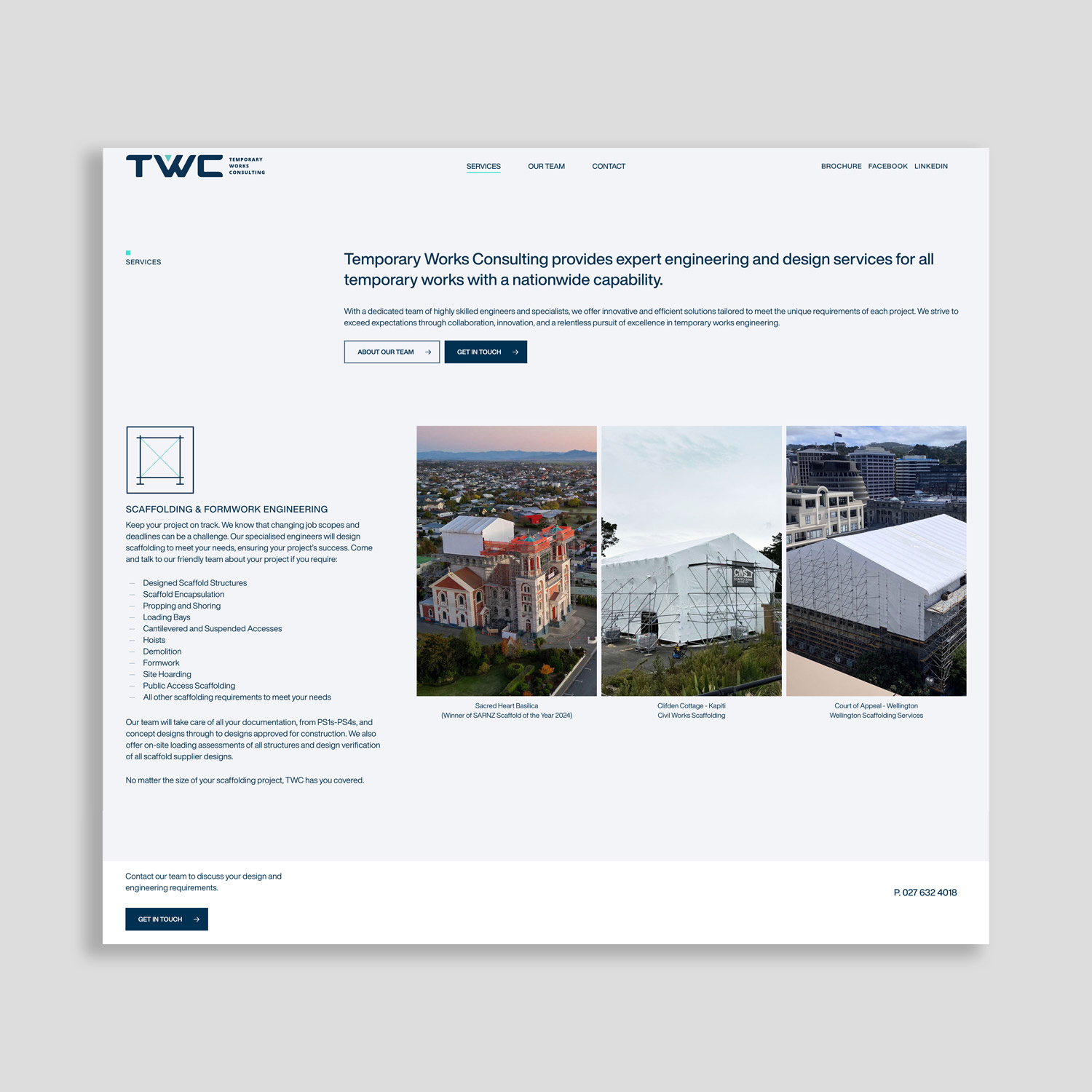
TWC website service page design example for lead generation

5. Speak Like a Human (Copy That Builds Trust)

Good website copy doesn’t sound clever — it sounds clear.

Your visitors are busy. They don’t want jargon or buzzwords like “innovative solutions” or “synergistic platforms.” They want to know, quickly, whether you can solve their problem.

Use plain language, short sentences, and active verbs. Focus on benefits — what your service does for them.

Example:
Instead of saying “We deliver innovative scaffolding solutions.”, say: “We build strong, safe scaffolds that help your team finish faster.”

Small changes in tone can transform your message from vague to confident.

Also, use your customer’s language. If they say “house painting,” don’t call it “residential coating systems.” Speak their words back to them — that’s what builds connection.

6. Speed, Mobile, and SEO — The Silent Heroes

Even the best copy won’t help if your site takes ten seconds to load or doesn’t work on mobile.

Most visitors decide within seconds whether to stay or leave. If your pages are slow or broken on mobile, they’ll bounce before reading a word.

That’s why at Sky Media we prioritise:

  • Fast loading times (compressed images, optimised code).
  • Mobile-first design that looks great on every screen.
  • SEO-friendly structure — clear headings, internal links, and page titles that match what people search for.

Search engine optimisation (SEO) isn’t just about ranking on Google — it’s about helping the right people find you. If someone searches “Villa Painting Auckland,” they should land on a page that answers that need directly — not your homepage with a generic message.

7. Make Getting in Touch Effortless

If someone has to dig around to find your contact form, you’ve already lost them. Make the next step obvious and easy.

Keep your forms short — name, email or phone, and one key question is often enough. On mobile, make sure phone numbers are clickable so people can call with one tap.

Tools like Calendly or booking systems are great for service businesses. They let potential clients book a chat or consultation instantly — no back-and-forth emails required.

And don’t forget your thank-you page. It’s a small but powerful touchpoint. Use it to confirm you’ve received their message, tell them when they’ll hear back, and maybe offer a useful resource while they wait.

8. Measure, Review, and Improve

A great website isn’t built once and forgotten. It evolves.

Sky Media uses analytics tools like Google Analytics and Google Site Kit to see what’s working — and what’s not. Which pages bring in the most enquiries? Where do people drop off? Which buttons get clicked?

With that data, we can make small, strategic changes. Test a new headline, rewrite a call-to-action, or simplify your form.

Even minor tweaks can dramatically boost conversion rates. We’ve seen clients increase the number of their leads just by refining button text or rearranging key content.

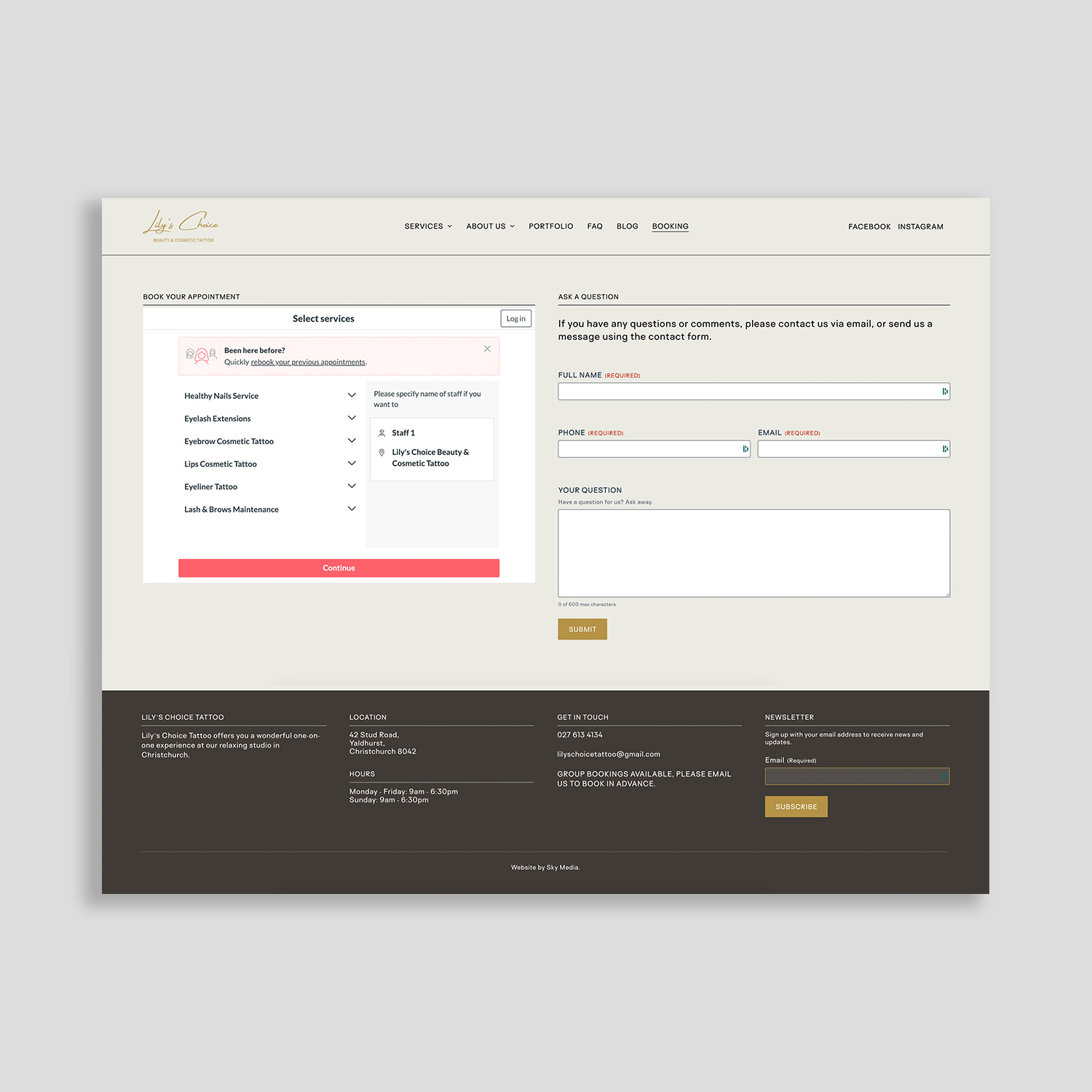
Calendly booking systems on the Lily's Choice website
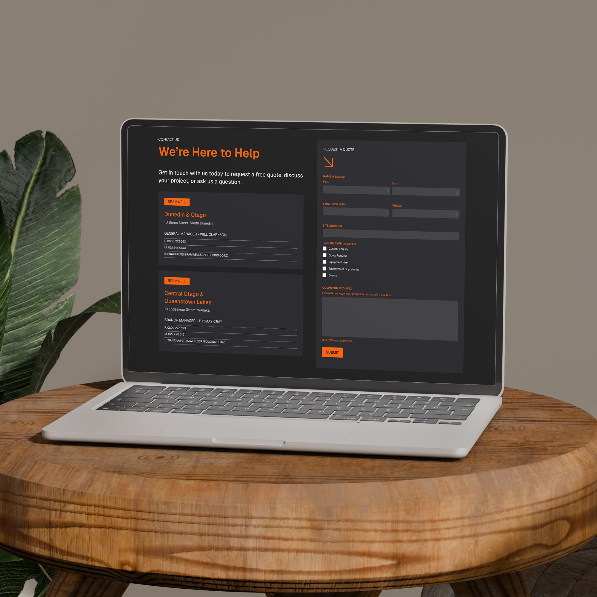
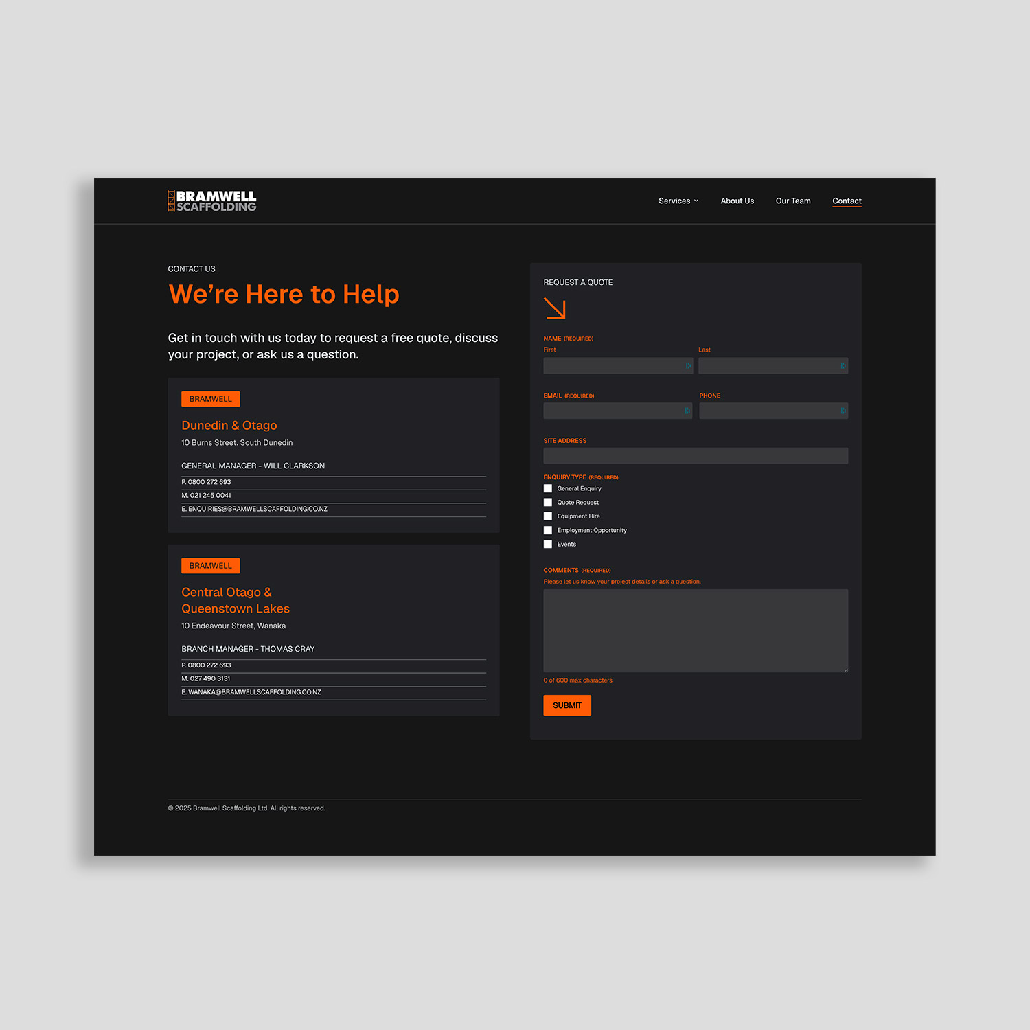
Request a quote contact page design on Bramwell website

9. Common Lead-Killing Mistakes to Avoid

Many websites fail because of small but costly mistakes:

  • Too many options: Too many menu items or buttons overwhelm users. Guide them clearly.
  • Walls of text: Break up long paragraphs with headings, short sentences, and images.
  • Slow pages: Optimise your images — large, uncompressed files can slow you to a crawl.
  • Weak CTAs: “Contact Us” is fine, but “Get a Free Quote in 24 Hours” works better.
  • Vague messages: Be specific about what you do and where you do it.

Fixing these basics can instantly make your site feel smoother and more professional — and that confidence translates into more leads.

10. Turn Your Website into Your Best Salesperson

When your website is built with purpose, clarity, and empathy, it becomes more than an online brochure — it becomes your hardest-working salesperson.

It never takes holidays, it doesn’t forget to follow up, and it presents your business exactly how you want to be seen, 24 hours a day.

The combination of strategy, smart design, and consistent optimisation is what turns a static site into a lead-generating asset. And that’s exactly what we build for our clients at Sky Media.

Ready to Turn Your Website into a Lead-Winning Machine?

At Sky Media, we design and develop WordPress websites that look sharp and bring in the right kind of enquiries. From initial strategy to ongoing SEO, we focus on clarity, conversion, and measurable results.

Let’s chat about how your current site could perform better — we can provide a quick review, highlight missed opportunities, and outline a plan to get you more of the leads you actually want. Book a 15-Minute Strategy Call.

Is it Time for a New Website?

By Web Design

One of the most common questions we receive is, ‘When is it the right time for a new website?’ Look, there’s no one-size-fits-all answer, so the real question could be: Is your website showcasing your business in the best light?

You probably wouldn’t use the same tools, computer, vehicle, marketing, or business plan year after year, because things change, and things go out of date. Nowadays, everything’s changing so quickly, and that’s especially true in the digital era with technology. As a general rule, most websites stay up to date for 3 – 4 years at best.

If you’re not yet online and you have a business, (or want a business), then now is 100% the right time to get a website. If you already have a website, then it’s worth considering if it’s still fit for purpose. How do you know if it’s fit for purpose? Well, to start we’d recommend trying to answer the following 5 questions:

Do You Like Your Website?

It might seem like a silly question, but it’s a great place to start. Do you like your website? What does your team think? What about your friends and family? Is this a website you can be proud of? Ask yourself: What works well? What looks good? What doesn’t? Does your current website showcase you and your business in the best light?

Is Your Website a WordPress Website?

Wix? Squarespace? Yellow? Yes, they can often look the part, but these websites are entry-level. As if that’s not enough, with New Zealand’s own Yellow, you don’t even own your own website. With WordPress you own your website 100%, yes, no matter what happens, you have full rights to your own website, and so you should. We would expect (and suggest) no less.

1/3 of the entire internet uses WordPress, because it’s considered the world’s best. Why is it the world’s best? It’s fully customisable, high-speed, and SEO-savvy, making it Google’s preferred website platform. If you’re still using an entry-level platform, it may be time to consider moving to the world’s best?

Is Your Website Mobile Responsive?

More than 50% of web traffic comes from mobile devices and that will continue to grow, because nowadays everyone’s on their mobile phone. If your website’s not designed for mobile phones, where do you think 50% of your website visitors will go? To your competitor with a site that works on their phone!

Google knows phones are the way of the future, so nowadays they prioritise websites that are mobile optimised. If your website’s not compatible with mobile devices, Google will just say, ‘Get to the back of the line.’ If you don’t have a phone-friendly website, sorry to say, you’re well and truly behind the times.

Is Your Website Competitive?

You’re probably aware that your website is the online calling card for your business. Let’s be frank, if you were looking at your website, would you choose you, or would you go elsewhere? When you look at the websites of your top 3 competitors, how does your website fare? Sure, in the real world your business might be the best there is, but if your website doesn’t reflect that, how are people to know? Word of mouth, of course, but where will they go when they hear about you? Probably to Google, because that’s what we all do. If they like what they see, they’re far more likely to choose you. If you want to get the pick of the jobs, the cream of the crop, a leading website can make your business come out on top.

What’s Your Website’s Performance Like?

We’ve all been there… A website loads quickly, it’s easy to use and we find exactly what we need in seconds. Perfect. We’ve also been to outdated websites that are painfully slow to load… We can’t find what we want, and no matter how many times we click the mouse, or refresh the page, we’re getting nothing but delays, so what do we do? Abort mission!

With today’s attention spans, a high-speed user-friendly website is absolutely key. Our team can assess your page load speed, and look behind the scenes to find out how people perceive and receive your website. If you want to be fit to fly online, then a well-designed mobile and SEO optimised website is what it takes to reach new heights.

So, is your website fit to fly online? Is it showcasing you and your business in the best light? If not, perhaps it’s time to speak to us. We can design, develop and deliver a high-flying website in a matter of weeks, while you barely lift a finger. Our down-to-earth team makes the often overcomplicated world of digital marketing easy-peasy.