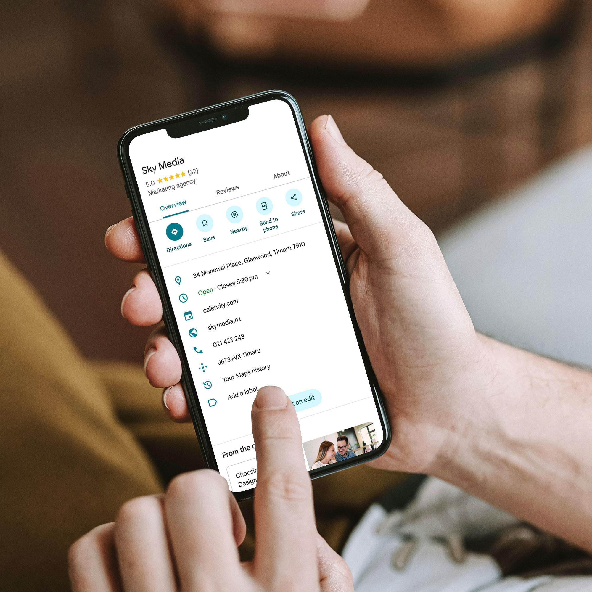
Your Google Business Profile (GBP) is often the very first thing a potential customer sees — before your website, before your ads, before your reviews, and although, it’s completely free, often businesses don’t make the most of it.
The difference between a profile that sits there doing nothing and one that consistently brings in calls, bookings, and walk-ins comes down to how well it’s set up — and how actively it’s maintained.
This guide walks you through exactly how to do that.
Why Your GBP Matters More Than You Think
When someone searches for a local service — “plumber Auckland”, “dentist Christchurch”, “café near me” — Google shows a map pack of three local businesses before any other organic results. That map pack is powered almost entirely by Google Business Profiles.
If your profile is incomplete, inaccurate, or thin on detail, you won’t appear there — or you’ll appear but fail to earn the click.
Google is explicit about what influences local rankings: relevance, distance, and prominence. Your GBP is your primary lever for relevance and prominence. You can’t change your location — but you can absolutely change how well your profile communicates who you are and why you’re the best choice.
Step 1: Claim and Verify Your Profile (If You Haven’t Already)
Before anything else: make sure you actually own your profile. Plenty of NZ businesses have an unclaimed GBP sitting out there — often with wrong information, no photos, and no one managing it.
Go to google.com/business and follow the prompts to claim and verify. Verification is typically done via postcard, phone, or email depending on your business type.
Once verified, you control what appears — and you can start optimising.
Step 2: Get the Basics Exactly Right
This sounds obvious, but you’d be surprised how often it goes wrong. Google cross-references your profile details against your website, local directories, and other sources. Inconsistencies — even small ones like “St” vs “Street” — create doubt.
Make sure these are accurate and consistent across every platform:
- Business name (exactly as it appears on your signage and website)
- Physical address or service area
- Phone number (ideally a local NZ number)
- Website URL
- Opening hours — including public holidays if you’re open
If you’re a service-area business (you go to clients, not the other way around), you can hide your physical address and instead list the areas you serve. Don’t use a fake address or a P.O. box — Google can suspend profiles that don’t meet their guidelines.
Step 3: Choose Your Categories Carefully
Your primary category is one of the most important signals you send to Google. It tells the algorithm what kind of business you are — and which searches you should appear for.
Pick the most specific, accurate category available — not the one that sounds most impressive. “Plumber” beats “Trade Services”. “Family Law Attorney” beats “Lawyer”. “Café” beats “Food and Beverage”.
You can also add secondary categories for other services you offer — but be selective. Only add them if you genuinely provide those services. Irrelevant categories dilute your relevance signal.
Step 4: Write a Business Description That Actually Converts
Your description (up to 750 characters) is your pitch. Don’t waste it with vague fluff like “we’re passionate about delivering quality solutions for all your needs”.
Instead, use it to:
- Describe what you do in plain language
- Name the specific services or products you offer
- Mention the areas you serve (e.g., “Serving Auckland’s North Shore and surrounding suburbs”)
- Include one or two trust signals (years in business, certifications, or a specific customer promise)
Good example: “Auckland Electrical has been providing residential and commercial electrical services across Auckland since 2008. We specialise in EV charger installations, smart home wiring, and after-hours call-outs. All work is certified and guaranteed. Serving Auckland City, North Shore, Manukau, and West Auckland.”
That description tells Google exactly who you are, what you do, and where — and it tells a potential customer why they should call you.
Step 5: Add Your Services (Don’t Skip This)
The Services section is one of the most underused parts of a GBP — and one of the most valuable.
For each service you offer, you can add a name, a description, and a price (optional). This isn’t just good for users — it gives Google more signals about what you actually do, which can help you appear for more specific searches.
Write service names the way customers search, not the way your industry talks. “Blocked drain repair” instead of “drainage remediation”. “Kids haircuts” instead of “junior grooming services”.
For product-based businesses, the Products section works the same way — add your most important lines with clear names and descriptions.
Step 6: Use Real Photos (Not Stock Images)
Photos matter more than most businesses realise. Profiles with photos consistently outperform those without — in clicks, calls, and direction requests.
The key word is real. Stock images signal nothing. They don’t build trust, and savvy customers can spot them instantly.
What works instead:
- Photos of your actual team at work
- Before and after shots (great for tradies, landscapers, cleaners)
- Your premises — exterior and interior
- Your products or completed projects
- The team (a friendly face goes a long way for service businesses)
Aim for at least 10 photos to start with, and keep adding. Fresh photos signal an active, legitimate business — which Google (and customers) respond well to.
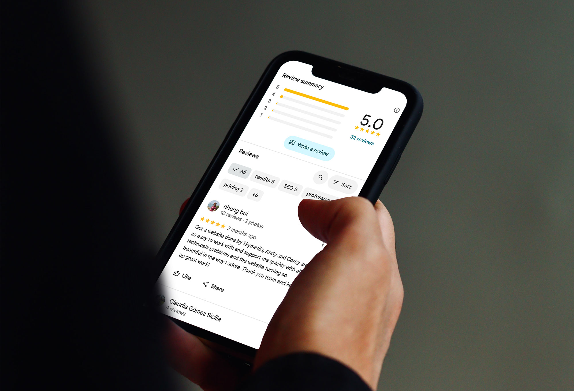
Step 7: Build a Review Engine (Then Keep It Running)
Reviews are your most powerful conversion signal. A business with 80 genuine, detailed reviews will almost always outperform one with 10 — even if those 10 are all five-star.
The goal isn’t a one-off surge — it’s a steady flow. Google rewards recency as well as volume.
Here’s what works for NZ businesses:
- Ask every happy customer — make it a habit, not an afterthought
- Send a direct link (Google makes this easy via your GBP dashboard)
- Ask for a review in the right time — right after a job is done, or following a positive interaction
- Encourage specifics: ask them to mention the service, location, or problem you solved
- Reply to every review — positive and negative
That last point is often overlooked. Responding to reviews shows Google and prospective customers that you’re active and accountable. A thoughtful response to a negative review can do more to build trust than five new five-star reviews.
Step 8: Use GBP Posts to Stay Active and Relevant
Most businesses set up their GBP and then forget about it. The ones that win treat it more like a social media profile — updated regularly, with things worth reading.
GBP Posts let you publish updates, offers, events, and news directly on your profile. They appear in your knowledge panel in search results.
You don’t need to post constantly. A few times a month with genuinely useful content is better than daily filler.
Good post ideas:
- Seasonal promotions or service reminders
- A recently completed project (with a photo)
- New services or products you’ve added
- A quick answer to a frequently asked question
- Local events you’re part of or sponsoring
Each post has a call-to-action button — use it. Whether that’s “Call now”, “Learn more”, or “Book”, make it easy for a reader to take the next step.
Step 9: Seed and Answer the Q&A Section
Google Business Profiles have a Q&A section that anyone can contribute to — which means if you don’t manage it, someone else might answer questions about your business inaccurately.
Get ahead of it. Think about the questions you get asked all the time — pricing, parking, whether you do call-outs, payment types, turnaround times — and answer them yourself. This makes your profile more useful, reduces friction for potential customers, and gives Google more context about your business.
Step 10: Monitor Your Profile and Don’t Ignore the Insights
Once your profile is set up and active, check it regularly. Google allows anyone to suggest edits to your profile — including competitors — and sometimes those edits get applied automatically.
Log into your GBP dashboard at least once a week and check:
- Are your hours still correct?
- Have any suggested edits been applied?
- Are there new reviews to respond to?
- Are there new questions in the Q&A?
The Insights tab in your dashboard shows how many people found your profile, what searches triggered it, and what actions they took (calls, website visits, direction requests). This is useful data for understanding what’s working — and where there’s room to improve.
The GBP + SEO Connection: Why Your Website Matters Too
Your Google Business Profile doesn’t operate in isolation. It works best when it’s backed by a well-structured, locally optimised website.
Google uses your website to validate and expand what’s in your profile. If your GBP says you offer roof painting in Wellington, but your website has nothing about Wellington or roof painting — that creates a disconnect.
The businesses that consistently dominate local search aren’t just running a good GBP. They have:
- Dedicated service pages that mirror what’s on their GBP
- Location-specific content that shows up in local searches
- Consistent NAP details across their site, their GBP, and directories
- Reviews that mention real services and real locations
Think of your GBP as the front door and your website as the house behind it. Both need to be right.
Quick-Reference: GBP Checklist for NZ Businesses
- Profile claimed and verified
- NAP consistent with website and directories
- Primary category chosen accurately
- Business description: specific, local, and service-focused
- Services (and products if applicable) added
- Minimum 10 real photos uploaded
- Review request process in place
- All reviews replied to
- GBP Posts going out at least 2–3x per month
- Q&A seeded with common questions and answers
- Profile checked weekly for edits and new activity
Your GBP Is Your Most Powerful Free Marketing Tool — Use It
Done properly, a Google Business Profile doesn’t just help people find you — it actively persuades them to choose you over a competitor. It builds trust before the first phone call. It answers questions before they’re even asked.
The businesses that treat their GBP as a living part of their marketing (not a box to tick and forget) are the ones that consistently appear at the top of local search — and convert that visibility into actual customers.
If you’d like help optimising your Google Business Profile as part of a broader local SEO strategy, Sky Media can take a look at what you’ve got and build a plan that compounds over time.