Web Design26

Stay ahead with Sky Media’s latest SEO, web design, and Google Ads tips. Practical advice for Kiwi businesses to boost their online success.

How NZ Retailers Can Compete With Big Chains Online

How NZ Retailers Can Compete With the Big Chains Online

By SEO, Tips and Guides, Web Design

Bunnings. Harvey Norman. Mitre 10. The Warehouse. Farmers. These are businesses with enormous marketing budgets, national brand recognition, and hundreds of thousands of dollars invested in their digital presence.

How NZ Retailers Can Compete With Big Chains Online

Competing with them online can feel impossible, especially for an independent NZ retailer managing everything from one store or a small group of them. But here’s what those big names can’t do: they can’t have your local knowledge, your specialist expertise, your relationships with the community you serve, or your ability to pivot quickly and serve customers in ways a national chain simply isn’t built for.

The businesses that thrive alongside the big chains aren’t trying to beat them at their own game. They’re playing a different game entirely, one that independent retailers are actually set up to win.

The Playing Field Is More Level Than It Looks

It’s easy to assume that a bigger budget means better Google rankings. For some things, that’s true. But local search doesn’t work that way, and local search is where independent NZ retailers have a genuine structural advantage.

When someone in Napier searches “outdoor furniture store Napier” or “running shoes near me”, Google isn’t necessarily showing the biggest national retailer. It’s surfacing the most relevant local option. A well-optimised independent retailer with a strong Google Business Profile, local reviews, and a website that clearly signals its location and speciality can consistently outrank national chains for those high-intent local searches.

Harvey Norman’s national SEO budget doesn’t help them win a local search in your city if your profile and website are better tuned to that specific geography. That’s the fundamental opportunity.

Where Independent NZ Retailers Have the Edge

Before getting into the practical digital strategy, it’s worth naming the real advantages you have because your online strategy should be built around them, not in spite of them.

AdvantageBig chainIndependent NZ retailer
Local knowledgeGeneric, national-level contentKnows the local market, customers, and community
Personal serviceCall centres, chatbots, long wait timesReal people, fast responses, genuine relationships
Niche expertiseBroad product ranges, shallow knowledgeDeep expertise in a specific category
FlexibilityRigid pricing, slow to respond to trendsCan pivot fast, offer custom solutions
Community trustSeen as a corporate chainEmbedded in local community
Google local searchHard to rank locally as a national chainLocal stores naturally rank for nearby searches

Strategy 1: Win Local Search Before Anything Else

Local SEO is your highest-leverage starting point. Most independent retailers are significantly underinvesting here which means there’s low-hanging fruit available right now.

Your Google Business Profile

This is non-negotiable. Your GBP is what determines whether you appear in the local map pack, the three businesses shown at the top of local search results, above everything else.
For a local retailer, a well-maintained GBP should include:

Your correct business category — be specific (“Outdoor Furniture Store”, not just “Furniture Store”)

  • Every product category and service you offer listed individually
  • Real photos of your shopfront, interior, products, and team updated regularly
  • Opening hours kept accurate, including public holidays
  • A steady flow of Google reviews from real customers
  • Posts announcing new stock, promotions, or seasonal ranges

The big chains have GBPs too but they’re often managed centrally and inconsistently at the local level. An owner-operated store that actively maintains its profile has a real advantage here.

Location-specific pages on your website

Your website needs to clearly and repeatedly signal where you are and what you sell. This sounds obvious, but most small retailer websites are vague about both.

A page that says “quality homewares at great prices” tells Google almost nothing. A page that says “homeware store in Tauranga including kitchenware, linen, and décor for Tauranga homes” gives Google the signals it needs to rank you for local searches in that market.

Strategy 2: Use Google Shopping to Get Your Products in Front of Buyers

Google Shopping is the row of product images with prices that appears at the top of search results when someone searches for something to buy “cordless drill”, “queen duvet”, “kids mountain bike”.

This is a channel where independent retailers can genuinely compete with the big chains and in some cases, beat them, because Google Shopping surfaces products, not brands. A shopper searching for a specific product doesn’t necessarily see the biggest retailer first. They see the most relevant listing, at a competitive price, from a store Google trusts.

Getting set up

Google Shopping runs through Google Merchant Center, which connects your product catalogue to Google’s ad ecosystem. If your website is on Shopify, WooCommerce, or most major e-commerce platforms, the integration is straightforward and your products sync automatically and appear in Shopping results.

There are two ways to appear in Shopping results:

  • Free product listings.  Google introduced free Shopping listings in 2020, meaning your products can appear in the Shopping tab and sometimes in the main results without paying for ads. Getting your Merchant Center feed set up correctly and keeping it healthy is the foundation.
  • Google Shopping Ads. Paid listings that appear more prominently and more consistently. For retailers with products that have good margins and clear demand, Shopping Ads can deliver an excellent return because you only pay when someone clicks through to your product.

Where smaller retailers can win

Big chains often have messy, poorly optimised product feeds: thousands of products managed at scale, with generic titles and minimal detail. An independent retailer with 50-200 products who takes the time to write clear, specific product titles, accurate descriptions, and high-quality images will often outperform larger competitors in Shopping results.

An example of product title optimisation

The second title matches far more specific searches, signals local availability, and gives a buyer the information they need to click with confidence.

Generic title (big chain approach)

Garden Chair
Model GC44

Optimised title (independent retailer)

Outdoor Folding Garden Chair
Weatherproof Aluminium
NZ Stock.
Seat Height 45cm

Strategy 3: Build a Website That Converts Local Shoppers

A lot of independent retailer websites are effectively digital brochures. They show what the store sells, but they don’t actively work to turn browsers into buyers or visitors into in-store customers.

Your website needs to do three things well for local retail:

1. Make it easy to find and visit you

This sounds basic but it’s frequently done poorly. Your address, phone number, and opening hours should be immediately visible, not buried in a footer. Adding Google Map directions links helps as well. If you have a car park or are open during the weekends, say so.

2. Show your stock and specialisation clearly

Independent retailers often have a depth of range in their niche that chains can’t match. Lead with that. If you’re a hardware store that specialises in trade-quality tools, say so explicitly. If you’re a baby goods store that carries brands the big chains don’t stock, name them.

Specificity builds confidence and differentiates you from generic competitors.
Even if you don’t sell online, a well-organised product catalogue on your website with photos, descriptions, and pricing where possible lets customers research before they visit. And customers who research before visiting are far more likely to buy.

A real example: Donco Services, Christchurch

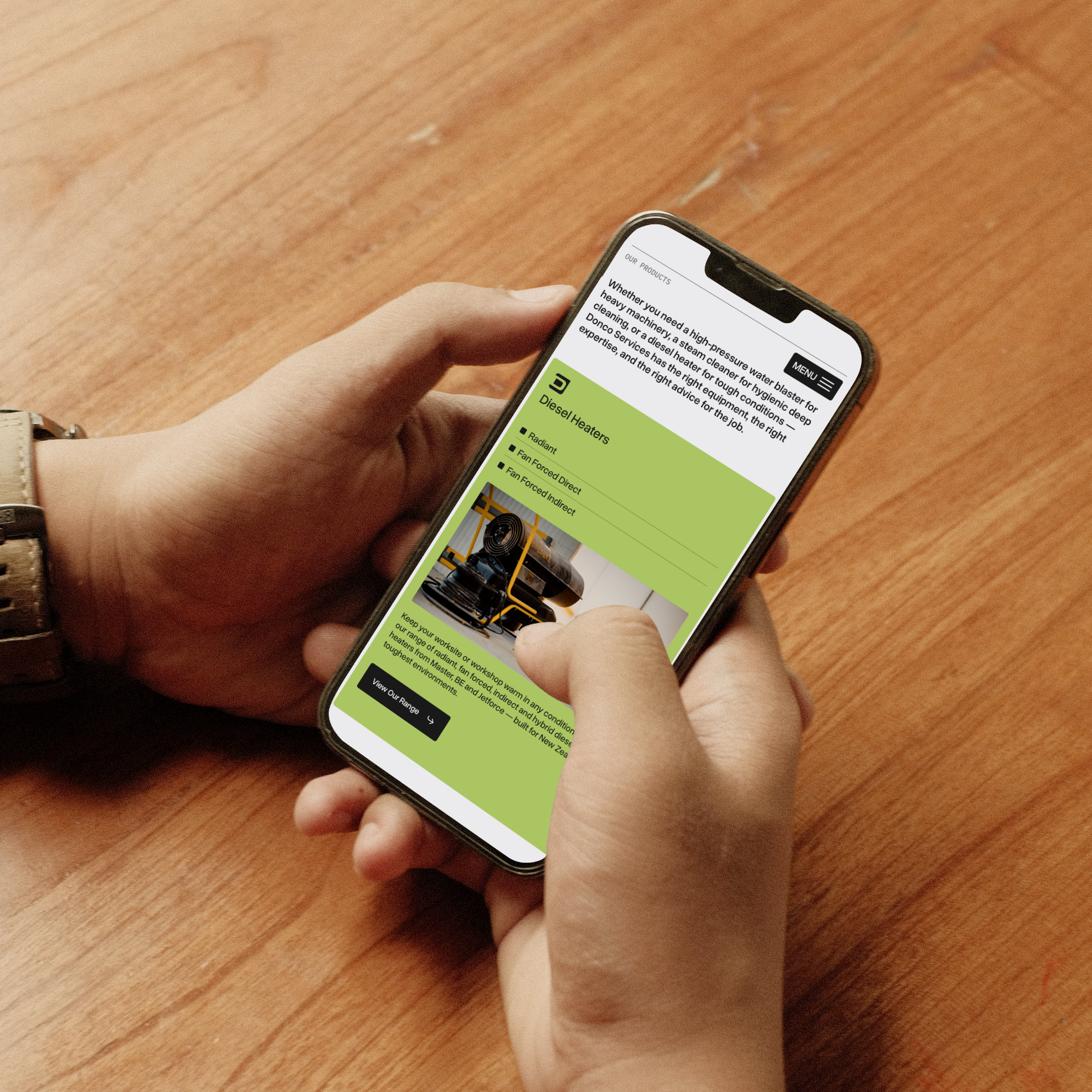
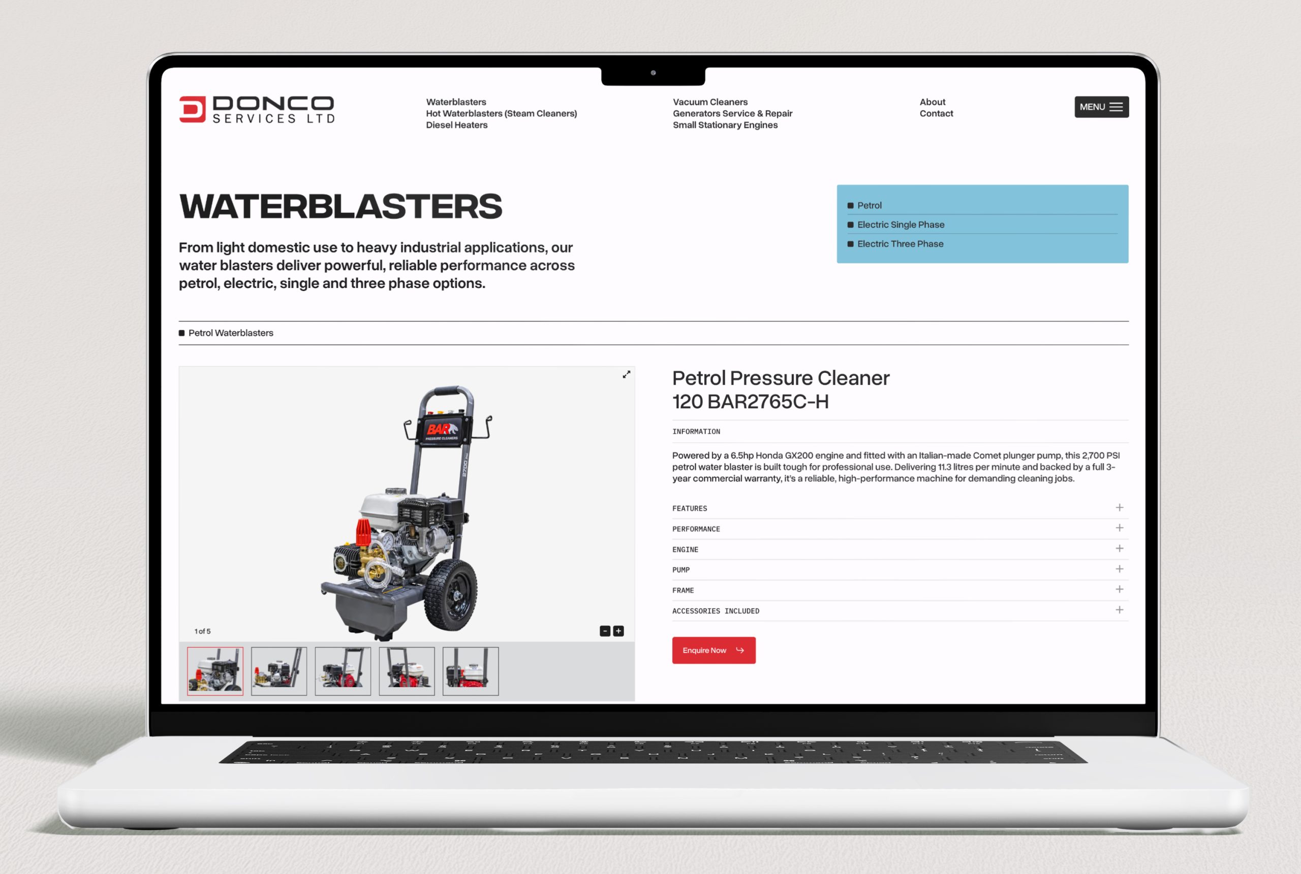
Donco Services is a Christchurch-based supplier and servicer of industrial equipment — water blasters, steam cleaners, diesel heaters, vacuum cleaners, generators, and small stationary engines — with over 30 years in the industry.

They don’t sell online. But their website does the pre-visit research job exceptionally well. Each product category is broken down in detail — waterblasters split into petrol, electric single phase, and electric three phase; diesel heaters separated into radiant, fan forced direct, and fan forced indirect — with clear descriptions, specifications, and guidance on what each option is suited for. A customer trying to figure out which water blaster is right for their operation can get most of the way to a decision before they’ve spoken to anyone.

That level of detail does several things at once: it builds confidence in Donco’s expertise, it saves time for both the customer and the sales team, and it signals to Google exactly what the business stocks and who it serves — helping Donco rank for specific, high-intent searches that a generic product page never would.

Sky Media built the Donco website on WordPress, designed around their product range and the way their customers actually research and buy. You can see it at donco.co.nz.

Donco Services WordPress website built by Sky Media, showing categorised industrial equipment catalogue with detailed product descriptions and specifications.

The Donco Services website built by Sky Media, a detailed product catalogue that helps customers research and self-qualify before visiting the Christchurch showroom.

3. Make it fast and easy on mobile

Most local shopping searches happen on a phone, often while someone is already out and about. If your website loads slowly, is hard to navigate on a small screen, or makes it difficult to find your phone number or address, you’re losing customers at the moment of highest intent.

A customer who searches “outdoor furniture store open now near me”, clicks your website, and immediately finds your address and phone number in a tap-to-call format will call you. The same customer who clicks your website and has to wait four seconds for it to load, then scroll through a full-screen homepage banner to find your contact details, will click back and try the next result.

Strategy 4: Use Reviews as a Competitive Weapon

Here’s something the big chains genuinely can’t replicate: authentic, personal, relationship-driven reviews from real local customers.

Bunnings has thousands of reviews but they’re national, generic, and largely about parking and wait times. An independent outdoor furniture store in Hamilton with 85 reviews that mention specific staff members by name, comment on the quality of advice they received, and describe what they bought and why. That review profile tells a completely different story, one that no chain can manufacture.

Reviews matter for three reasons in this context:

  • Local SEO rankings. Google’s local algorithm weights review volume and recency as a significant ranking signal and having more good reviews means better map pack placement.
  • Click-through rate. In a row of local search results, a business with 95 reviews and 4.8 stars will get more clicks than one with 12 reviews and 4.1 stars, even if both appear in the same position.
  • Conversion. Reviews that describe specific products, specific advice, and specific staff members are extraordinarily persuasive. They do the sales job before the customer has even walked in the door.

Build a system for collecting reviews consistently: ask every happy customer, send a direct link, and make it a part of the post-sale or post-visit routine. A steady stream of fresh reviews is one of the biggest advantages a local retailer has over a national chain.

Strategy 5: Create the Content Your Competitors Ignore

Large chains produce generic content at scale. They don’t have time to go deep on local topics, niche product knowledge, or the specific questions that your particular customers ask. That’s a gap you can fill and it builds SEO value over time.

A few examples of content that works well for independent NZ retailers:

  • Buying guides for your niche. “How to choose the right outdoor furniture for a NZ coastal property”, “The difference between entry-level and trade-grade power tools”, “What to look for when buying a kids bike for NZ terrain”. These attract research-phase buyers and position you as the expert.
  • Local-angle content. “Best plants for Canterbury gardens”, “Outdoor furniture built for NZ summers”, “Why NZ homes need [specific product]”. This content ranks for searches big chains simply won’t write about.
  • New arrivals and brand spotlights. Regular posts about new stock, new brands, or seasonal ranges keep your site fresh, give Google new content to index, and give customers a reason to come back.

You don’t need to publish constantly. Four to six well-written, genuinely useful posts per year will compound in value over time far more than a dozen thin pieces.

Strategy 6: Be Findable for “Near Me” and Same-Day Searches

One of the clearest advantages local retailers have over online-only big chains is physical presence, and Google increasingly rewards this for shoppers who want something now.

Searches like “outdoor chairs near me open now”, “power tools Christchurch same day”, and “baby clothes store open Saturday” are high-intent queries that independent retailers are uniquely positioned to win. The person searching isn’t looking for the cheapest price or the biggest range instead they want it today, locally.

To capture these searches:

  • Keep your Google Business Profile hours scrupulously accurate, including public holidays
  • Enable the “In-store pickup” and “Visit in store” attributes on your GBP if applicable
  • Use the Products section of your GBP to show what you carry as this feeds into Google’s local inventory-style results
  • If you have real-time inventory, platforms like Shopify can sync stock to Google Merchant Center, letting Google show whether a product is in-store right now

This last point is genuinely powerful. A local customer who can see that the specific item they want is in stock at a store two kilometres away will drive there before they’ll wait for delivery from an online retailer.

Putting It Together: Where to Start

If you’re an independent NZ retailer and this all feels like a lot, the priority order is straightforward:

  1. Get your Google Business Profile complete and actively maintained. This is your highest-leverage, lowest-cost starting point.
  2. Make sure your website loads fast on mobile, shows your location and hours immediately, and clearly describes your specialisation.
  3. Build a system for collecting Google reviews consistently.
  4. If you sell online or want to, set up Google Merchant Center and get your products into free Shopping listings.
  5. Consider Google Shopping Ads for your best-margin products once your feed is clean and optimised.
  6. Start producing local, niche content that the chains won’t write.

None of these require a massive budget but they require consistency and attention which independent retailers, by their nature, are better positioned to deliver than a national chain managing hundreds of locations.

Ready to Compete More Effectively Online?

Sky Media works with NZ retailers on the full picture: website design and development, local SEO, Google Shopping setup, and digital marketing strategy. Whether you’re starting from scratch or want to get more from what you’ve already built, we can help you figure out where the biggest opportunities are.

If you’d like a straight-talking assessment of where your current online presence is leaving opportunities on the table, get in touch.

If You Want to Charge More, You Need to Look Like You're Worth It

If You Want to Charge More, You Need to Look Like You’re Worth It

By Tips and Guides, Web Design

Here’s a question worth sitting with: if someone landed on your website right now with no referral, no prior knowledge of your business, would they be willing to pay your prices?

Not “would they find the information they need” or “would they know what you do”. Would the experience of your website, your branding, your online presence make them feel like you’re worth what you charge?

If You Want to Charge More, You Need to Look Like You're Worth It

For a lot of NZ businesses, the honest answer is: probably not. The gap between what you actually deliver and what you appear to deliver online is costing you more than you realise, not just in lost enquiries but in the price you’re able to charge too.

People Decide Before They Think

We like to believe purchasing decisions are rational. We research, we compare, we weigh up the options, and we make a logical choice. That’s the story we tell ourselves. But the reality is closer to the opposite. Studies in consumer behaviour consistently show that people form an emotional impression first, often within seconds, and then use logic to justify the decision they’ve already made emotionally.

This isn’t a flaw. It’s how human beings are wired. We use visual and contextual cues to assess trustworthiness, quality, and value almost instantaneously. It’s a mental shortcut that helps us make thousands of micro-decisions every day without burning out.

For businesses, this has a very practical implication: the first impression your brand and website creates carries enormous weight. Before a potential customer reads a single word of your copy, before they’ve seen your pricing, before they’ve contacted you, they’ve already formed a view of what kind of business you are and what you’re probably worth.

Your online presence isn’t just telling people what you do. It’s telling them what you’re worth.

The Gap Between What You Do and What You Look Like

We work with a lot of NZ businesses that are genuinely excellent at what they do. Real expertise, strong results, loyal clients, fair pricing. But their website, their branding, or their overall online presence doesn’t reflect any of that.

It might be a website built five years ago that hasn’t been touched since. A logo designed on Canva that doesn’t hold up at larger sizes. Inconsistent fonts and colours across different pages. Blurry photos taken on a phone. A contact form that looks like it was borrowed from 2012.

None of these things reflect the quality of the actual work. But they all shape how a prospective customer feels about the business before they’ve experienced it firsthand. The result is a trust deficit, and trust deficits show up in your bottom line.

They show up as price resistance, or customers choosing a competitor who looks more polished, even if your service is better, or enquiries that go cold because the website didn’t do enough to earn confidence but also as the constant need to justify your pricing rather than having your positioning do that work for you.

What “Looking the Part” Actually Means

Looking premium doesn’t mean looking flashy. It doesn’t mean an elaborate website with animations on everything and a costly full brand refresh. Some of the most effective, high-converting websites we’ve built for NZ businesses are clean, straightforward, and fast.
What it does mean is consistency, intention, and professionalism across every touchpoint a prospective customer encounters.

In practice, that looks like:

  • A website that loads quickly and works properly on mobile. Nothing signals “we haven’t invested in this” faster than a slow, broken mobile experience. Most of your potential customers are on their phones.
  • Visual consistency. The same fonts, the same colours, the same general aesthetic across your website, your social media, your email signature, your Google Business Profile. Inconsistency creates subconscious doubt.
  • Professional photography. Real images of your work, your team, or your products. Real photos signal confidence.
  • Copy that sounds like you. Not corporate filler, not AI boilerplate, not vague promises. Writing that’s clear, specific, and speaks directly to the person reading it.
  • A clear value proposition. Within the first few seconds on your website, a visitor should understand what you do, who you do it for, and why you’re the right choice. If they have to work to figure that out, you’ve already lost ground.
  • Social proof in the right places. Reviews, testimonials, case studies, logos of clients or certifications, positioned where they do the most work, not buried at the bottom of your website sub-page.

These aren’t cosmetic considerations. Each one is a signal. These signals compound positively or negatively.

The Behaviour Side: How You Act Online Matters Too

Your business perception isn’t built by design alone. It’s also built (or quietly eroded) by how a business behaves across its digital touchpoints.

Think about the experience of visiting a website that ticks all the visual boxes: clean design, good photography, clear messaging, and then immediately triggers a discount pop-up, a chat bot that won’t go away, a countdown timer trying to manufacture urgency, and a cookie banner that takes up half the screen.

In an instant, the carefully constructed impression of quality collapses. The signals are now all pointing in a different direction: this business is desperate for the sale. That’s not a premium experience. That’s the opposite.

The same principle applies in other ways. A slow response to enquiries. An automated reply that doesn’t sound like a human wrote it. Social media posts that look like they were thrown together in five minutes. A Google Business Profile with photos from 2019 and no responses to reviews.

Every interaction (or lack of one) is data that a potential customer is subconsciously processing. The businesses that command premium pricing are the ones that are intentional about all of it, not just the logo.

Why Inconsistency Is the Thing That Quietly Kills Enquiries

There’s a particular kind of brand damage that happens slowly, almost invisibly, and is difficult to reverse once it sets in: inconsistency.

It often starts innocuously. Someone on the team creates a flyer using a slightly different font because it looked better. A social media post goes out in a different tone because a new person is running the account. The website gets updated in one section but not another. A new promotional graphic is made in a hurry with colours that are close but not quite right.

None of these feel like a big deal in isolation. But over time, the accumulated effect is a business image that feels undefined, and undefined busineses feel less trustworthy, which makes premium pricing harder to sustain.

Our brains are pattern-recognition machines. When a brand shows up consistently, it registers as reliable. When it doesn’t, something feels slightly off, even if a person couldn’t articulate exactly why. That feeling of “something’s not quite right” is enough to lose a sale.

Consistency isn’t about being rigid. It’s about being recognisable, and recognisable businesses are trusted brands.

The Real Cost of Looking Like Less Than You Are

Let’s put a number shape on this, even if it’s hypothetical. Say your service is priced at $3,000. A competitor with a better-looking website and more polished brand is charging $4,500 for something comparable. If your online presence is creating a perception gap, meaning customers see you as the budget option before they’ve even spoken to you, you’re not just losing on price. You’re attracting a different kind of customer: one who shops on price, who negotiates harder, and who is more likely to be disappointed because their expectations were shaped by the lower price point.

Meanwhile, the business with the better presentation is attracting customers who have already self-selected into a higher-value relationship. They’re less price-sensitive. They’re easier to work with. They’re more likely to refer.

The investment in looking the part pays for itself, not immediately, but consistently, over time. And the cost of not doing it compounds in the other direction.

Where to Start if Your Online Presence Doesn’t Match Your Ambitions

If you’re reading this and recognising a gap between what your business actually delivers and how it presents online, the good news is that it’s fixable, and it doesn’t necessarily require a complete overhaul to see meaningful improvement.

A few places to start:

  • Audit your website honestly. Load it on your phone. Time how long it takes. Read the homepage with fresh eyes. Would you trust this business if you’d never heard of them? If not, that’s where to start.
  • Check your visual consistency. Compare your website, your social profiles, your Google Business Profile, your email signature. Do they feel like they belong to the same business?
  • Look at your photography. Are the images on your website and social media genuinely representative of the quality of your work? Or are they placeholders you’ve been meaning to update for two years?
  • Read your copy out loud. Does it sound like a real person talking? Does it clearly answer the questions your customers actually have? Or is it vague, generic, or written for no one in particular?
  • Google yourself. What does someone find when they search your business name? Your Google Business Profile, your reviews, your social media. Do they all reinforce the same message?

You don’t need to fix everything at once. But you do need to be honest about where the gaps are, because your potential customers are noticing them, even if they can’t name them.

Your Website Is Your Most Hardworking Sales Tool

For most NZ businesses, the website is where the buying decision gets made or lost. It’s the thing people check before they call. The thing they compare against your competitors at 10pm on a Sunday. The thing that either earns trust or quietly creates doubt.

A website that looks the part, that is fast, clear, consistent, and professional, isn’t just a better reflection of your business. It’s a commercial asset that actively works to convert interest into enquiries, and enquiries into customers willing to pay what you’re worth.

And a website that doesn’t look the part? It’s doing the opposite thing every day.

The businesses that win at premium pricing aren’t always the ones doing the best work. They’re the ones making the strongest case online that their work is worth the investment. The presentation is part of your product or service.

Bramwell Scaffolding's previous website — functional, but not reflecting the company's experience or reputation.

Bramwell Scaffolding’s previous website: functional, but not reflecting the company’s experience or reputation.

The new Bramwell Scaffolding website designed by Sky Media — professional, fast, and mobile-friendly, matching the standard of work they deliver on-site.

The new Bramwell Scaffolding website designed by Sky Media: professional, fast, and mobile-friendly, matching the standard of work they deliver.

Does Your Online Presence Reflect What Your Business Is Actually Worth?

Sky Media works with NZ businesses to close the gap between what they deliver and how they show up online through web design, branding, and digital marketing that positions you as the premium choice in your market.

If you’re not sure whether your website and online presence are helping or hurting your pricing power, we’re happy to take a look and give you an honest free assessment. Talk to Sky Media.
Is Your Website Quietly Killing Your Conversions

Is Your Website Quietly Killing Your Conversions?

By Tips and Guides, Web Design

Most businesses invest money getting people to their website — through SEO, Google Ads, social media, or word of mouth. But what happens when visitors arrive and leave without doing anything? No enquiry. No purchase. No sign-up.

That’s a conversion problem, and it’s more common than you’d think.

Is Your Website Quietly Killing Your Conversions

Before you spend another dollar driving traffic, it’s worth asking: is your website actually set up to convert the people already landing on it?
In this post, we’re breaking down the most common website mistakes that silently sabotage your results and what to do about them.

What Does a “Good” Conversion Rate Look Like?

A conversion is any action you want a visitor to take: filling out a contact form, making a purchase, booking a call, downloading a resource. Your conversion rate is simply the percentage of visitors who complete that action.

Most industry sources place a healthy website conversion rate somewhere between 2% and 5%. Businesses consistently sitting above 6% are genuinely performing well. If you’re below 2%, there’s almost certainly something on your site that’s getting in the way.

That said, what counts as “good” varies depending on your industry, your price point, and what you’re asking people to do. A law firm asking visitors to book a free consultation will convert differently than an e-commerce store selling $30 products. Context matters — but the principles below apply across the board.

15 Reasons Your Website Isn’t Converting

1. Poor Quality Images

Visuals shape first impressions faster than any headline can. Blurry photos, stretched images, or tired stock imagery that looks like it came from a 2010 corporate brochure all erode the trust you’re trying to build.

Every modern smartphone produces high-quality photos, and there are plenty of excellent free and paid image libraries available. There’s no reason to put substandard imagery on your site and visitors will notice.

2. Slow Page Load Times

People are impatient online. If your page takes more than a few seconds to load, a significant portion of your visitors will leave before they ever see your content. They’ll simply go back to Google and click the next result.

Page speed is also a ranking factor, so slow pages hurt your SEO too. Run your site through Google PageSpeed Insights and address whatever’s dragging it down — oversized images, too many plugins, and large video files are common culprits.

3. An Abandoned Blog

A blog that hasn’t been updated in six months (or longer) sends a quiet but damaging message: nobody’s home. If a potential customer lands on your insights page and the most recent post is from last year, it raises doubts about whether you’re still active and engaged.

Either commit to publishing consistently, even once a month makes a difference, or take the blog down entirely. A blank space is less damaging than a neglected one.

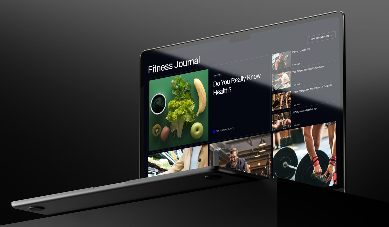
An example of a modern well-updated blog Sky Media created for Health Perfomance Club.

An example of a modern well-updated blog Sky Media created for Health Perfomance Club.

4. Spelling and Grammar Mistakes

The occasional typo is forgivable. Multiple errors across your website, however, undermine your credibility in a way that’s hard to recover from. Visitors reasonably wonder: if you don’t pay attention to detail here, how careful will you be with their project or money?

Proofread everything, use a grammar tool, and get a second set of eyes on your copy before it goes live. It’s a small effort with a meaningful payoff.

5. Accessibility Gaps

A website that’s difficult or impossible to use for people with disabilities isn’t just an ethical issue — it’s a conversion issue. If your site can’t be navigated by keyboard, uses low-contrast text that’s hard to read, has buttons that are too small to tap on mobile, or lacks alt text on images, you’re locking out potential customers.

Accessibility standards are also moving toward becoming a legal requirement in many markets. Getting ahead of this now protects your business and widens your audience.

6. Pushy, Pressure-Filled Copy

People can smell desperation online just as easily as they can in a shop. If every section of your website is screaming at visitors to buy now, act fast, or don’t miss out, before you’ve given them any reason to trust you, they’ll disengage quickly.

Good web copy earns conversions by demonstrating value, building credibility, and guiding people naturally toward a decision. Pressure tactics work in the short term for certain products, but for most service-based businesses and higher-value purchases, they actively repel customers.

7. Confusing Navigation

If a visitor can’t figure out where to go on your site, they’ll go somewhere else. Navigation problems are one of the most common and easily overlooked conversion killers.

Think about the journey a potential customer needs to take to enquire or buy. Is that path clear and logical? Are menu labels intuitive? Are there too many options competing for attention? Are your calls-to-action easy to find? Walk through your own site as a first-time visitor and pay attention to what feels unclear.

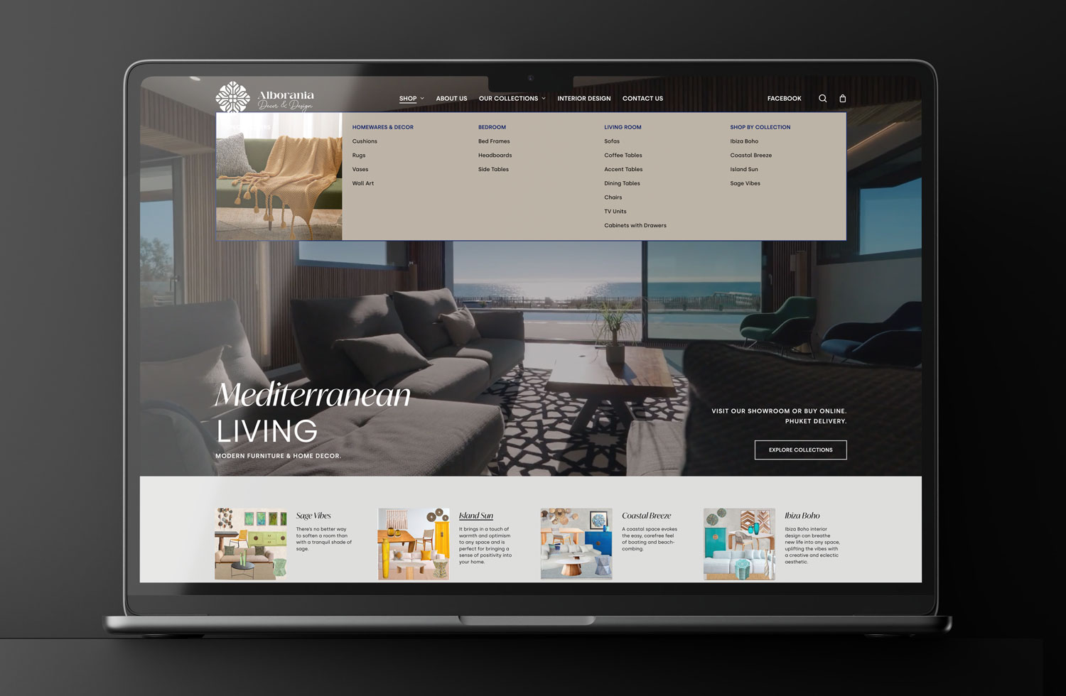
An example of an easy and structured navigation for Alborania Decor & Design E-Commerce website by Sky Media.
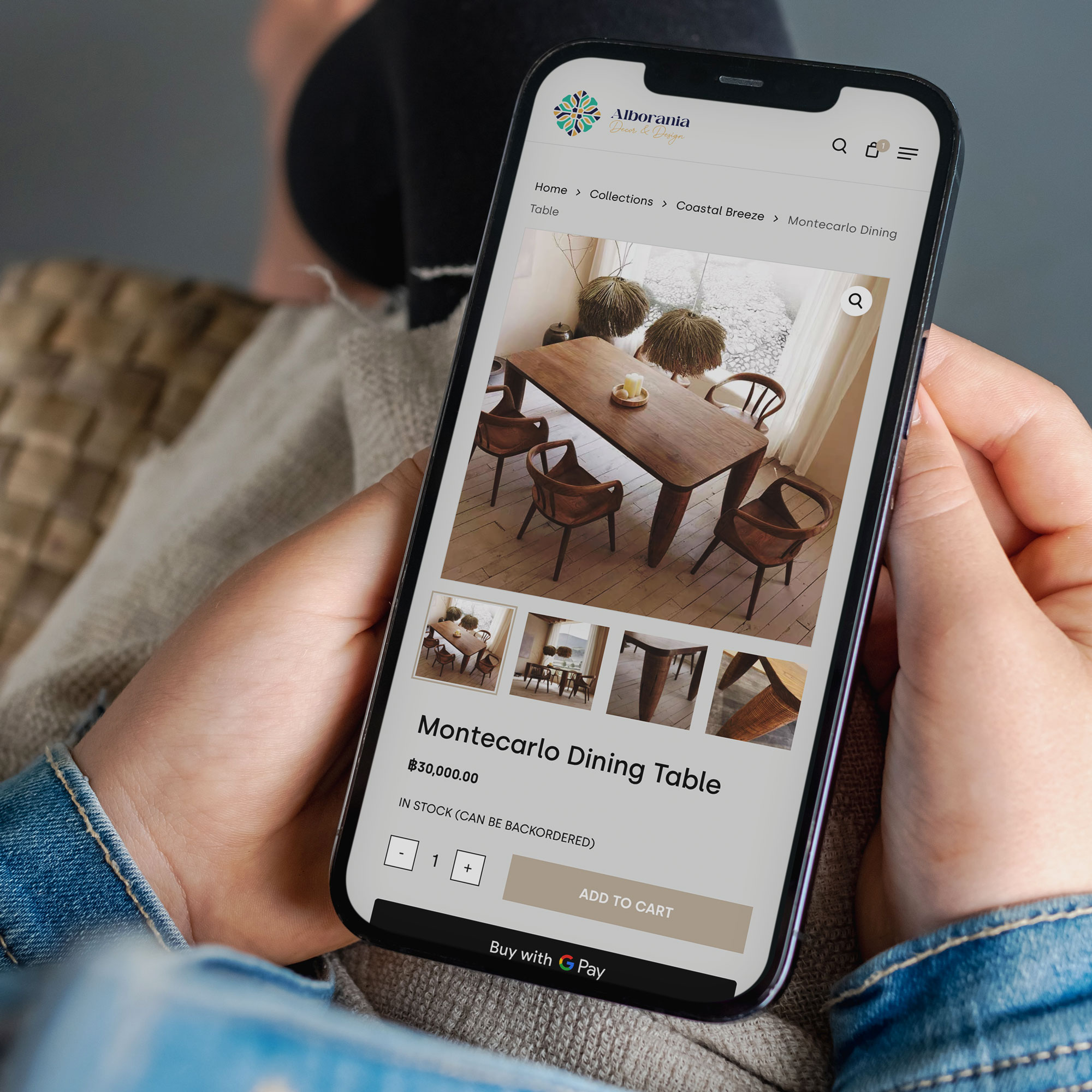
An example of an easy and structured navigation for Alborania Decor & Design E-Commerce website by Sky Media.

8. Brand Voice Inconsistency

Your website, ads, social media posts, and emails should feel like they all come from the same company. When the tone shifts dramatically between channels — formal on the website, casual on social, and oddly formal again in ads — visitors notice the disconnect, even if they can’t put their finger on why.

Beyond consistency between channels, make sure your brand voice is appropriate for your audience. A law firm that tries too hard to be casual can feel unprofessional. A business selling to stressed customers that uses overly chipper, breezy copy can feel tone-deaf. Get this right and your conversions will reflect it.

9. An Outdated Design

Your website is your most visible salesperson. It’s working 24 hours a day, seven days a week, representing your business to people who are deciding whether to trust you with their money.

A design that looks like it hasn’t been touched in five or more years signals stagnation. Broken image links, walls of text, old branding, and clunky layouts all undermine confidence. If your site no longer reflects the quality and professionalism of your business, a redesign isn’t a luxury — it’s a priority.

10. Unclear Value Proposition

Within the first few seconds of landing on your site, a visitor should know exactly what you do, who you do it for, and why they should choose you. If your hero section is vague, jargon-heavy, or tries to be too clever, people will simply leave.

Clarity beats creativity every time on a homepage. Explain what you offer in plain language, and make it immediately obvious why that matters to your ideal customer.

11. Poor Mobile Experience

In New Zealand, as elsewhere, the majority of web browsing now happens on smartphones. If your website isn’t properly optimised for mobile with readable text, easy-to-tap buttons, no horizontal scrolling, and menus that actually work on a small screen, you’re handing a large portion of your potential customers a frustrating experience.

Test your site on a real phone. Better yet, ask someone unfamiliar with your site to try to complete a task on their phone and watch what happens. Google Search Console will also flag mobile usability issues worth addressing.

12. Intrusive Pop-Ups

Used well, a pop-up can capture email subscribers or promote an offer. Used badly, they drive people off your site before they’ve had a chance to engage.

Pop-ups that appear immediately on page load, block the entire screen, are difficult to close, or appear multiple times in a single session are among the most annoying experiences a website can deliver. Keep them tasteful, well-timed, and easy to dismiss.

13. A Complicated Checkout or Enquiry Process

Every unnecessary step in your checkout or contact process is an opportunity for a potential customer to abandon the journey. Hidden fees that appear late, mandatory account creation, excessive form fields, or an unclear path to the checkout all contribute to drop-off.

If you have an E-Commerce store, use analytics tools to identify exactly where people are leaving your checkout flow — then work to remove that friction. For service businesses, make your contact form as short as it needs to be and no longer.

14. No Social Proof

People trust other people more than they trust businesses. Reviews, testimonials, case studies, client logos, and media mentions all do a lot of the heavy lifting when it comes to converting hesitant visitors.

If your website has no evidence of past success — no client feedback, no examples of work, no credentials — you’re asking people to take a leap of faith. The more reassurance you can provide, the easier it is for someone to say yes.

An example of an easy and structured navigation for Alborania Decor & Design E-Commerce website by Sky Media.

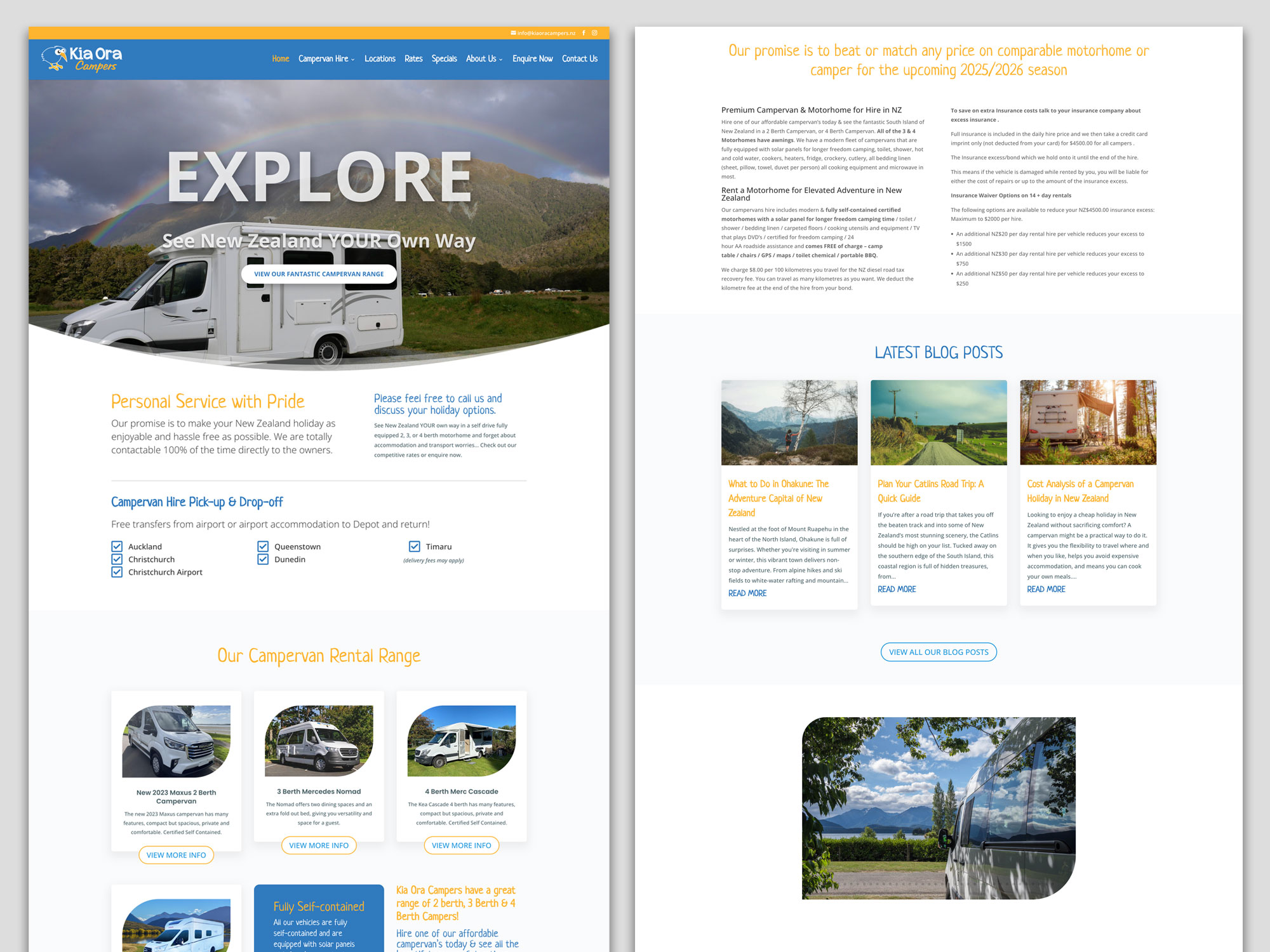
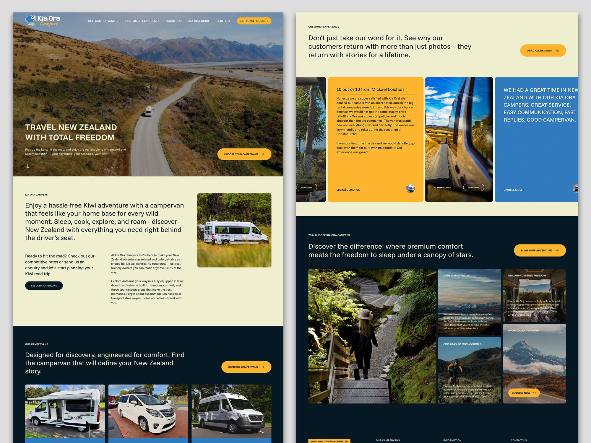
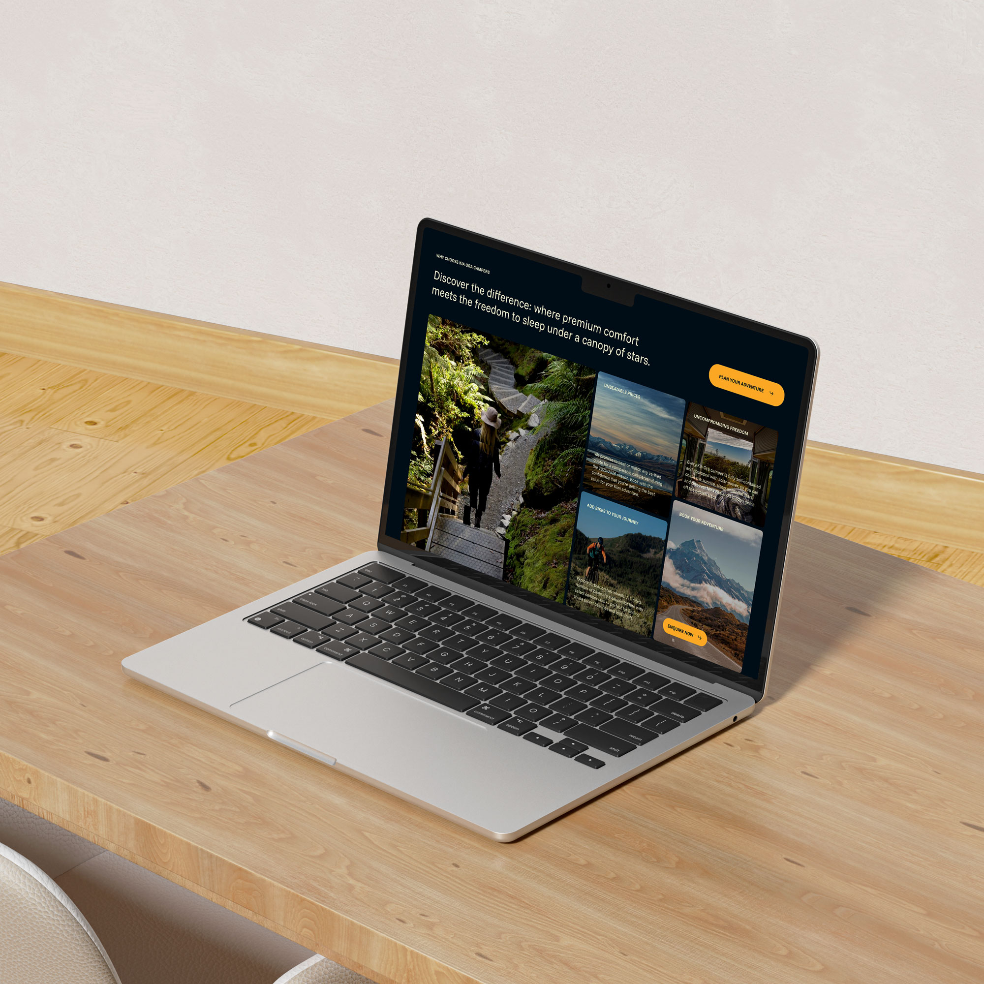
See how Sky Media team implemented a Customer Experience page into Kia Ora Campers website redesign.

15. Your Site Goes Down and You Don’t Notice

This one sounds obvious, but it happens more often than you’d expect. If your website is offline — due to a hosting issue, a plugin conflict, a server problem, or a cyber attack — every visitor during that period sees an error instead of your business.

If you’re not monitoring your site’s uptime, you could lose hours (or days) of potential leads before a frustrated customer contacts you to let you know. Set up uptime monitoring and make sure your hosting is reliable.

Start With the Fundamentals

If your conversion rate isn’t where you want it to be, the solution isn’t always a full rebuild. Often, targeted improvements to a handful of the issues above can make a measurable difference.

Start by auditing your site honestly — or have someone else do it for you. Identify the two or three issues most likely to be affecting your results, make changes, and give them time to show results before moving on.

If you’d like an expert set of eyes on your website’s performance, Sky Media offers free website audits for NZ businesses. Get in touch with our team — we’d love to help you get more from the traffic you’re already receiving.

Business owner reviewing website performance metrics and analytics on a laptop screen

Is Your Website Actually Working? 7 Simple Ways to Measure Website Performance

By Digital Marketing, Web Design

Many businesses invest in a website and then treat it like a digital brochure, something that simply exists online. But a good website should do more than look professional. It should help your business grow. It should attract visitors, guide them toward the right information, and turn interest into enquiries or sales.

Business owner reviewing website performance metrics and analytics on a laptop screen

The challenge is that many business owners don’t know how to tell whether their website is performing well. They might hear about analytics, SEO metrics, or technical performance scores, but those can feel overwhelming and overly technical.

The good news is that measuring website performance doesn’t have to be complicated. You don’t need to be a developer or data analyst to understand whether your site is helping your business.

Here are seven practical ways to measure how well your website is really performing and what to look for if something needs improvement.

1. Are You Getting the Right Visitors?

One of the most basic measures of website performance is traffic: how many people are visiting your site.

But the number alone doesn’t tell the whole story. What matters more is whether the right people are finding your website.

For example, a landscaping company in Christchurch doesn’t benefit much from hundreds of visitors in other countries. What matters is attracting homeowners in the local area who are looking for landscaping services.

Tools like Google Analytics can show where your visitors come from, which pages they land on, and how they found you: through Google searches, social media, referrals, or direct visits.

If your traffic is growing and the majority of visitors are coming from relevant sources, that’s a positive signal your website is reaching the right audience.

If traffic is low or coming from unrelated places, it may mean your SEO, content strategy, or marketing channels need adjustment.

Google Analytics dashboard showing website traffic, visitor behaviour, and the pages people view most often.

Google Analytics dashboard showing website traffic, visitor behaviour, and the pages people view most often.

2. Are Visitors Staying or Leaving Immediately?

Another useful indicator is how long visitors stay on your site.

If people arrive and leave within a few seconds, it often suggests something is wrong. Perhaps the page didn’t match what they expected, the message wasn’t clear, or the website felt confusing.

This is often referred to as a bounce rate – the percentage of visitors who leave after viewing only one page.

A high bounce rate isn’t always bad. For example, someone might visit a contact page, get the phone number, and leave. But if visitors consistently leave your homepage or key service pages quickly, it may indicate that your introduction section isn’t doing its job.

Clear messaging, simple navigation, and strong headlines can make a big difference here.

3. Are Visitors Taking the Next Step?

Ultimately, the purpose of most business websites is to encourage action.

That action might be:

  • Filling out a contact form
  • Booking a consultation
  • Calling your business
  • Downloading a guide
  • Purchasing a product

These actions are known as conversions.

If your website attracts plenty of visitors but very few enquiries, the issue may not be traffic, it may be the way the site guides visitors toward the next step.

Simple improvements can often increase conversions significantly. Clear call-to-action buttons, well-structured service pages, and trust signals like testimonials or reviews help visitors feel confident taking action.

4. Are Your Most Important Pages Being Viewed?

Not every page on your website carries the same importance.

For many businesses, a few key pages do most of the work:

  • Homepage
  • Main service pages
  • Pricing pages
  • Contact page
  • Key blog articles

Looking at which pages people visit most often can reveal whether visitors are finding the information that matters.

If your service pages receive very little traffic, it could mean visitors are struggling to navigate the site or search engines aren’t ranking those pages well.

On the other hand, if certain blog articles attract consistent traffic, they may be worth expanding or linking to more prominently.

Understanding which pages perform well helps guide future improvements.

5. How Fast Does Your Website Load?

Speed has become an important part of the online experience.

Most people expect websites to load quickly. If a page takes too long, many visitors will leave before it finishes loading.

Page speed affects not only user experience but also search engine visibility. Search engines prefer fast websites because they provide a better experience for users.

There are simple tools, such as Google PageSpeed Insights, that can give you a rough idea of how fast your site loads.

You don’t need to understand every technical detail, but it’s helpful to know whether your website performs well on mobile devices and whether any obvious issues are slowing it down.

Common causes of slow websites include very large images, unnecessary scripts, or outdated hosting.

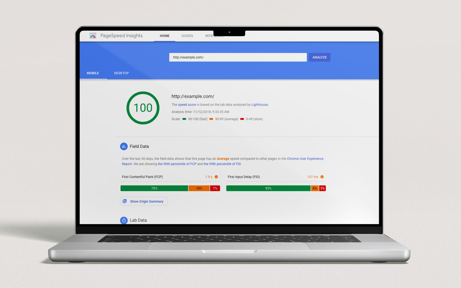
Google PageSpeed Insights helps evaluate how fast your website loads and highlights opportunities to improve performance.

Google PageSpeed Insights helps evaluate how fast your website loads and highlights opportunities to improve performance.

6. Are People Finding You Through Search Engines?

For many businesses, search engines remain one of the most valuable sources of website visitors.

If someone searches for services you offer, for example, “house renovation Christchurch” or “accountant for small business”, ideally your website should appear somewhere in those results.

You can measure this by checking whether visitors are arriving through organic search (Google or other search engines).

Google Search Console is a helpful tool that shows which keywords people are searching for when they discover your site. It can also reveal which pages appear in search results most often.

If your website rarely appears in search results, improving SEO, through clearer service pages, helpful blog content, and technical improvements, can make a significant difference over time.

Google Search Console dashboard showing how your website appears in search results and which queries bring visitors to your site.

Google Search Console dashboard showing how your website appears in search results and which queries bring visitors to your site.

7. Are Visitors Using Your Website Easily?

One of the most overlooked measures of website performance is usability.

Ask yourself:

  • Is it easy to find key information?
  • Are important pages only one or two clicks away?
  • Does the site work smoothly on mobile devices?
  • Is the next step obvious?

A website might technically function well but still frustrate users if navigation is confusing or content is difficult to scan.

One of the simplest ways to evaluate usability is to watch how real people interact with your site. Ask a colleague or customer to try finding a service or booking a consultation and observe what happens.

If they hesitate, get lost, or ask questions like “Where do I click?”, that’s valuable feedback.

Good website design should feel intuitive — visitors shouldn’t need instructions.

Why Measuring Website Performance Matters

A website is never truly finished.

Just like a physical business location evolves over time, your website should continue improving as you learn how people use it.

By regularly checking a few simple indicators: traffic, engagement, conversions, page performance, search visibility, speed, and usability, you gain a clearer picture of whether your website is helping your business or holding it back.

The goal isn’t to obsess over numbers. It’s to understand whether your website is guiding visitors toward becoming customers.

Final Thoughts

Your website should be one of the hardest-working tools in your business. But without measuring performance, it’s difficult to know whether it’s doing its job.

The good news is that you don’t need complex analytics dashboards to get started. Paying attention to a handful of key indicators can reveal a lot about how well your site performs.

Small improvements, such as clearer messaging, faster loading pages, stronger calls to action, can often make a significant difference.

Over time, those improvements compound into better visibility, more enquiries, and a stronger online presence.

Would like a Free Website Audit?

If you’re not sure how well your website is performing, we can help.

Send us your website link and we’ll review it from a usability, design, and performance perspective, highlighting practical improvements that can help turn more visitors into enquiries.

Website Introduction Section: Header & Hero Tips

The Website Introduction Section: How to Get Your Header and Hero Right

By Tips and Guides, Web Design

When someone lands on your website, they form an opinion almost immediately. They don’t take minutes of reading or careful comparison. Within a few seconds, they’re already deciding whether your business feels relevant, trustworthy, and worth exploring further.

That first screen, what we’ll call your introduction section, carries most of that responsibility.

Website Introduction Section: Header & Hero Tips

The introduction section is made up of two parts:

  • Your header (logo, navigation, key call-to-action)
  • Your hero section (main headline, supporting message, image or video and primary action)

Together, they answer four silent questions every visitor has:

  1. Am I in the right place?
  2. What does this business actually do?
  3. Can I trust them?
  4. What should I do next?

If your introduction section gets these right, the rest of your website becomes easier. If it gets them wrong, even a beautiful site can underperform.

Let’s break down how to get both your header and hero section working properly, in clear, practical terms.

Part 1: Getting Your Header Right

Your header is the strip at the very top of your website. It usually includes your logo, navigation menu, and a call-to-action button.

It appears on every page which means small problems become big problems quickly.

1. Make Your Brand Instantly Recognisable

Your logo doesn’t need to be huge. It needs to be clear.

Visitors should be able to glance at the top left and know whose website they’re on. Avoid shrinking your logo so small that it’s unreadable, but also avoid making it dominate half the screen.

Clarity builds confidence.

2. Simplify Your Navigation (More Than You Think)

Most businesses overload their navigation.

They treat the menu like a storage cupboard for every page they’ve ever created. The result? Visitors hesitate instead of clicking.

Your navigation should guide people, not overwhelm them.

Use simple labels:

  • Services
  • About
  • Pricing
  • Our Work
  • Blog
  • Contact

Avoid vague menu titles like “Solutions” or “Capabilities” unless they’re extremely clear in your industry.

And remember: you don’t need 12 top-level items. Five or six is often plenty.

If someone has to think too hard about where to click, they’ll leave.

3. Include One Clear Call-To-Action

Your header should include one primary action.

Examples:

  • Get a Quote
  • Book a Consultation
  • Request a Callback
  • Call Now

Make it visible. Make it specific. Make it match how customers buy from you.

If you’re a high-consideration service (law firm, architecture, consulting), “Book a Consult” makes more sense than “Buy Now”.

If you’re an emergency plumbing company, “Call Now” should be obvious and tappable.

Your header should gently push people toward action without feeling aggressive.

4. Make Sure Your Designer Uses Mobile First Approach

Most people will see your website on their phone. That means your header needs to:

  • Have an easy-to-tap menu icon
  • Keep the logo compact
  • Make the call-to-action accessible
  • Avoid giant dropdowns that feel messy

Open your site on your phone and try using it one-handed. If it feels awkward, it needs improvement. Mobile friction kills conversions quietly.

5. Don’t Overload It With Badges and Noise

Trust matters but too many trust symbols can backfire.

  • A phone number? Great.
  • A subtle review rating? Helpful.
  • “NZ Owned” or “20+ Years Experience”? Strong if true.

But stacking awards, certifications, icons, and banners in the header makes it feel cluttered and desperate.

Example of a clear website introduction section — simple navigation, organised service dropdown, strong headline, and a visible “Book Now” call-to-action guiding users instantly.

Example of a clear website introduction section Sky Media created for Lily’s Choice — simple navigation, organised service dropdown, strong headline, and a visible “Book Now” call-to-action guiding users instantly.

Part 2: Getting Your Hero Section Right

Now let’s talk about the hero section — the large area directly beneath your header. This is where most websites either win or lose attention.

1. Replace “Welcome” With a Real Headline

“Welcome to our website.” This is one of the most cliché lines on the internet.

Your hero headline should clearly explain:

  • What you do
  • Who it’s for
  • What result you provide

For example:

“Landscaping Design and Installation That Transforms Outdoor Spaces”
“Residential Heat Pump Installation in Wellington — Fast, Reliable Service”

No clever metaphors. No vague slogans. Just clarity. People shouldn’t have to decode your business.

2. Support the Headline With Context

Your subheading (the smaller text under the headline) should answer:

Why choose you?

This is where you mention experience, specialisation, speed, quality, or unique approach. Keep it short: two or three sentences at most.

Your hero section is not the place for a full company history.

3. Use One Strong Primary Button (or Primary and Secondary Buttons)

Your hero section should have a clear action.

Usually:

  • Primary button: Get a Quote / Book Now
  • Secondary button (optional): View Services / See Our Work

Make sure the primary button stands out visually.

If everything is the same colour and weight, nothing feels important.

4. Choose Images or Videos That Support — Not Distract

Hero images can elevate your brand or make it feel generic.

Avoid overused stock photos of:

  • People high-fiving in boardrooms
  • Handshakes against city skylines
  • Abstract “success” visuals

Instead, use:

  • Real photos of your team
  • Real photos or videos of your completed projects
  • Real photos of your products
  • Real photos or videos of environments, like your office, your building site etc.

Authenticity builds trust faster than perfection.

Also, make sure your image or video  doesn’t slow down the page. Large, unoptimised images or videos can hurt loading speed, especially on mobile.

A fast-loading website feels professional.

5. Keep It Visually Calm

A common mistake is trying to say everything at once.

Headline. Subheadline. Three badges. Two buttons. Background video. Animated text. Scrolling logos.

It’s too much.

Your hero section should feel focused. One clear message. One clear next step.

Whitespace is not empty space — it’s breathing room and the tool to guide visitors’ attention into the right place.

6. Make It Clear You’re a Real Business

Small credibility signals in the hero area can increase trust:

  • Years in business
  • Number of projects completed
  • Google rating
  • Short testimonial snippet

But again: subtlety wins. Trust is built through clarity, not clutter.

How Header and Hero Work Together

Think of your introduction section like this:

  • Your header is the roadmap.
  • Your hero is the explanation.

The header helps people move around. The hero helps them decide whether to stay.

If your header is clean but your hero is vague, visitors feel unsure.

If your hero is strong but your header is confusing, they struggle to navigate.

They must work together.

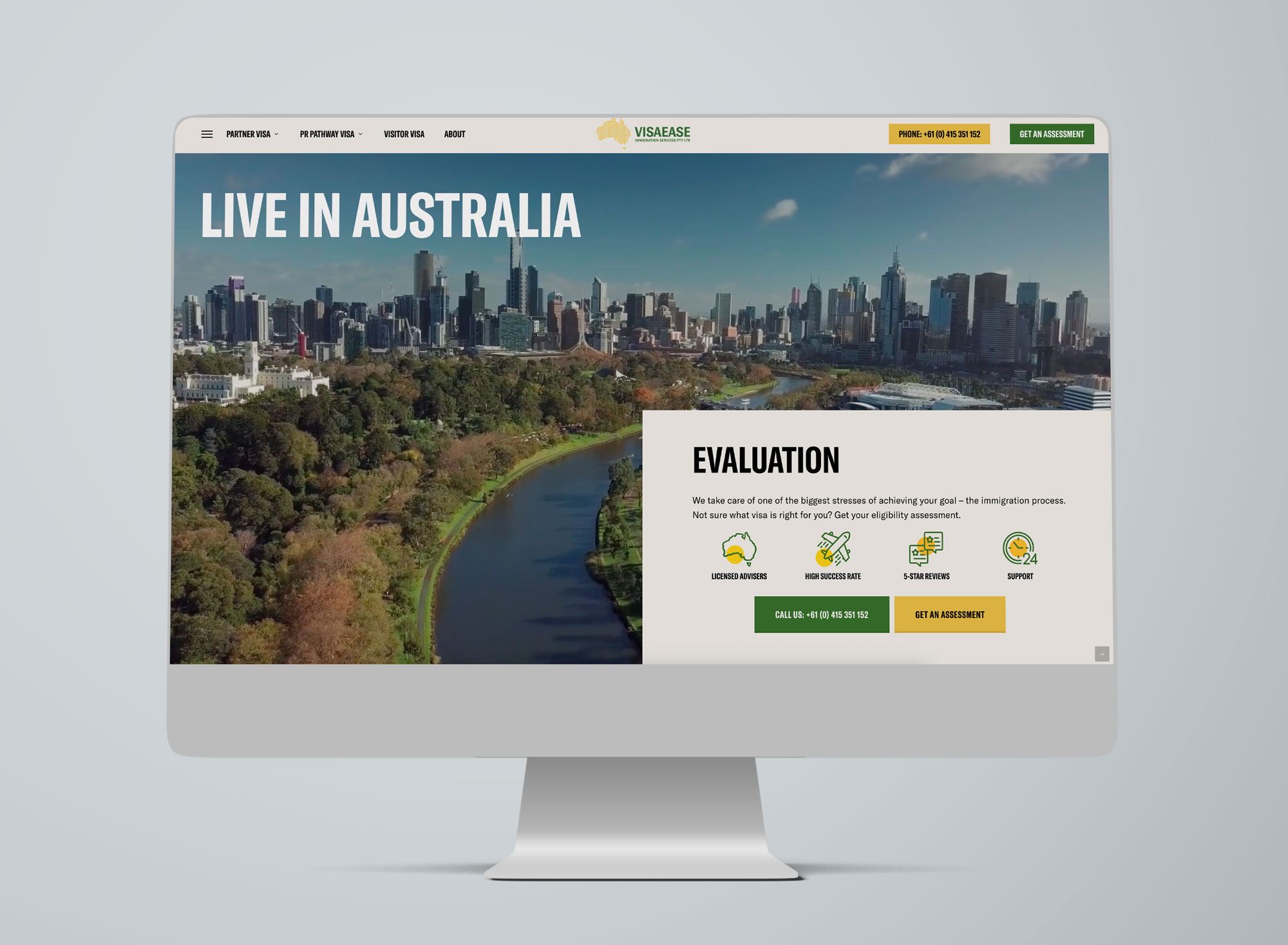
Example of a strong hero section — clear value proposition, trust signals, and prominent call-to-action buttons guiding visitors to call or request an assessment immediately.

Example of a strong hero section Sky Media created for Visa Ease featuring clear value proposition, trust signals, and prominent call-to-action buttons guiding visitors to call or request an assessment immediately.

A Simple Self-Test

Open your homepage and ask:

  • Can I tell what this business does in three seconds?
  • Is the main action obvious?
  • Is the navigation simple and easy to understand?
  • Does it feel calm and confident — not busy and chaotic?

If any answer is “not really”, your introduction section needs refinement.

Would like a Website Audit?

If you’re not sure whether your header and hero section are helping or hurting your conversions, let’s take a look.

Send us your website link and we’ll provide a practical website audit with clear recommendations on what to improve, simplify, and optimise for better results.

Are WordPress Websites Still the Best Option in 2026?

By Web Design

Every year or two, someone declares WordPress “done”.

A new website builder pops up with slick ads and a promise: No code. No hassle. Launch today. Then AI website generators arrive and the hype cycle starts all over again. You’d think WordPress would be pushed aside by now.

But in 2026, it’s still everywhere — quietly powering everything from local trades and professional services to publishers, ecommerce stores, and serious brand sites. Not because it’s trendy… but because it keeps doing the job businesses actually need a website to do. And that job isn’t “exist online.” It’s to attract customers, build trust, and convert attention into enquiries or sales.

Here’s why WordPress still dominates — explained in real-world terms, without the tech jargon.

The biggest reason? Businesses don’t want to rent their website.

A lot of modern website platforms are convenient… right up until they’re not.

They’re like renting a fully furnished apartment. It looks great. It’s easy to move in. But you can’t knock down a wall, you can’t change the layout much, and if the landlord decides to change the rules (or the rent), you don’t have much say.

That’s how many “all-in-one” website builders work. Your site lives inside their system. Your options are limited to their templates, their features, and their pricing tiers. If you want to move later, it can be surprisingly painful.

WordPress is different. A WordPress website is something you own. You control your domain, your hosting, your content, and what happens next. That freedom might not sound exciting on day one — but it becomes incredibly valuable once your business grows or your marketing changes.

It’s the difference between a website that fits right now… and a website that still fits three years from now.

WordPress is built for growth, not just launch day

A lot of business owners have the same experience:

They build a website, launch it, feel relieved… and then reality kicks in.

Now they want leads. Now they want bookings. Now they want to add more services. Now they want to rank on Google. Now they want the site to “do more” than just sit there.

This is where WordPress shines, because it doesn’t force you to rebuild every time your business evolves.

You might start with a clean five-page site. Later you add a booking tool. Then you integrate a CRM. Then you create a library of FAQs and guides that bring in organic traffic every month. Then you open a second location and need location pages, service-area content, and better tracking.

That’s not a rare scenario — that’s normal business growth. WordPress supports that journey.

Other platforms can support growth too, but they often cap out when you want something specific, custom, or deeply integrated. WordPress is still one of the few platforms where the answer is usually, “Yes, we can do that,” instead of, “Not unless you upgrade to the enterprise plan” (or “Not possible”).

SEO still matters in 2026 — and WordPress still makes it easier to do properly

AI has changed how people search. Social media influences decisions earlier. Google results pages are busier than ever.

But here’s what hasn’t changed: if your business shows up at the right moment, when someone is ready to buy, you win.

SEO is still one of the most consistent ways to do that. And WordPress remains a strong SEO platform because it gives you control over the things that actually affect performance.

You can structure pages properly. You can organise content in a way Google understands. You can fix technical issues instead of being stuck with them. And you can publish content easily — which matters more than ever now that buyers want proof, clarity, and answers before they contact you.

A lot of platforms claim to be “SEO friendly.” WordPress actually lets you do SEO.

That difference becomes obvious when you’re trying to rank for competitive searches in your area and every small improvement counts.

The design doesn’t have to look like… “WordPress”

This is another misconception that’s surprisingly common.

Some people hear “WordPress” and picture clunky layouts, outdated fonts, and a site that looks like it was built in 2014.

But WordPress doesn’t dictate design. The quality comes down to how it’s built.

A modern WordPress website can look and feel premium: clean spacing, strong typography, smooth mobile experience, fast loading, and a user journey designed for conversions. You’re not limited to generic blocks that look like everyone else’s website.

In fact, WordPress is often the better option if you want a site that looks unique but still stays practical to manage.

Because here’s the truth: good design isn’t about fancy visuals. It’s about clarity. It’s about making it easy for a customer to understand what you do, trust you, and take the next step.

WordPress gives you the freedom to design around that purpose.

“But isn’t WordPress insecure?”

WordPress gets blamed for security issues the same way cars get blamed for accidents.

WordPress itself is one of the best maintained, updated, and widely tested platforms. The problems usually come from what’s layered on top — outdated plugins, poor hosting, weak passwords, and websites that haven’t been updated in years.

If a WordPress site is treated like a “set and forget” asset, it becomes vulnerable. But that’s true for any platform.

A properly built WordPress website with good hosting, regular updates, and basic security hygiene is extremely safe. And the upside is that you have options: you can strengthen security, monitor, update, and improve — you’re not relying on a closed system where you can’t see what’s happening behind the scenes.

For many business owners, the real “security” benefit isn’t just protection from hacking; it’s peace of mind that the site is supported and maintainable long-term.

WordPress is no longer slow — slow websites are just built poorly

Speed is one of those things everyone cares about but few people prioritise until it hurts.

A slow site means fewer enquiries. More drop-offs. Less trust. And yes, often worse SEO performance too.

WordPress used to have a reputation for being heavy, mainly because people installed everything under the sun and stacked low-quality themes with dozens of unnecessary scripts.

In 2026, that’s simply not the standard anymore.

A well-built WordPress website can be super fast, because you can choose performance-focused hosting, implement modern caching, optimise images properly, and build with a cleaner structure.

The platform isn’t the problem. The build is.

And this is one reason WordPress continues to dominate: it gives professionals the tools to create high-performing sites instead of being restricted by platform limitations.

Ecommerce? WordPress still plays a serious role

Shopify is fantastic for many E-Commerce businesses, especially if you want a streamlined product and checkout system with minimal customisation.

But WordPress (via WooCommerce) continues to be popular in 2026 because it’s flexible.

Some businesses don’t just want “a store.” They want E-Commerce integrated into the broader marketing website. They want content driving product discovery. They want custom bundles, membership perks, subscriptions, unique shipping rules, or a checkout journey built around how their customers buy.

WooCommerce makes sense when E-Commerce isn’t a standalone “storefront,” but part of a bigger digital strategy.

It’s not about one platform being “better.” It’s about choosing what fits your business model and WordPress still fits a lot of them.

Content marketing is back in the spotlight (and WordPress has always been good at it)

Here’s a pattern we see again and again:

Businesses that publish helpful content, even just once or twice a month, tend to build momentum over time. They rank for more searches, earn more trust, and reduce reliance on paid ads.

In 2026, this matters more because people want reassurance before they enquire. They want answers. They want to know what things cost, how the process works, what to expect, and what makes you different.

WordPress was built for publishing. It’s one of the easiest platforms to maintain a blog, add FAQs, build resource libraries, and expand service pages without turning it into a technical project every time.

When content is part of your growth plan, WordPress supports that naturally.

It’s still the most “future-proof” choice for many businesses

Trends come and go. Platforms rise and fall. But WordPress has remained dominant because it’s not tied to one company’s pricing model or design philosophy.

It evolves. It adapts. It has a huge global community. And because it’s open-source, it doesn’t disappear if a product team decides to “pivot.”

For business owners, that stability is a big deal.

A website isn’t an app you try for a month. It’s a long-term asset. You want the option to improve it, grow it, and keep it relevant without being forced into a rebuild every time the market changes.

WordPress offers that path.

Thinking about a new WordPress website — or upgrading what you already have?

If your website is meant to drive growth and you care about SEO, lead generation, scalability, and building a real digital asset, WordPress remains one of the smartest choices in 2026.

Sky Media builds modern WordPress websites designed for one thing: turning traffic into enquiries. If you want a site that loads fast, ranks well, and feels trustworthy from the first click, let’s talk.

What Makes a High-Converting Website for Christchurch Businesses in 2026

What Makes a High-Converting Website for Christchurch Businesses in 2026?

By Tips and Guides, Web Design

In 2026, having a website isn’t enough. For businesses in Christchurch, your website needs to convert — turning local visitors into enquiries, bookings, and sales. With competition increasing across trades, professional services, hospitality, and e-commerce, the difference between an average site and a high-converting one often comes down to how well it reflects local user behaviour, builds trust, performs on mobile, and guides people to take action.

What Makes a High-Converting Website for Christchurch Businesses in 2026

At Sky Media, we see a clear pattern: Christchurch websites that convert well aren’t flashy for the sake of it. They’re clear, fast, credible, and built around how Cantabrians actually browse, compare, and decide.

Let’s break down what truly makes a high-converting website for Christchurch businesses in 2026 — and how you can apply these principles to your own site.

1. Understanding Local User Behaviour in Christchurch

High conversion starts with understanding who is using your website and how they behave.

Christchurch users are practical decision-makers

Christchurch customers tend to value:

  • Clear information over hype
  • Proof and credibility over bold promises
  • Straightforward pricing or next steps

They often compare multiple local providers before making contact. A high-converting website anticipates this by answering key questions early:

  • What do you do?
  • Who is this for?
  • Why should I trust you?
  • What do I do next?

Local intent is strong

That means your website should immediately confirm relevance:

  • Mention Christchurch naturally
  • Reference local industries or challenges
  • Show real local examples and testimonials

When visitors feel “this business is for people like me, in my city,” conversion rates increase dramatically.

2. Trust Signals Matter More Than Ever

In 2026, trust is currency. Christchurch users are cautious, especially when committing to services that require upfront investment.

Essential trust elements for Christchurch websites

High-converting local websites consistently include:

  • Real testimonials from Christchurch clients
  • Photos of real people (not stock-only imagery)
  • Clear contact details with a local presence
  • Transparent explanations of process and pricing

If a visitor has to guess whether you’re legitimate, you’ve already lost them.

Local proof beats generic authority

National awards are nice, but for Christchurch audiences:

  • A testimonial from a Sydenham tradie
  • A case study from a Riccarton business
  • A project completed in the CBD

…often converts better than international logos. Local familiarity reduces perceived risk.

3. Mobile-First Is No Longer Optional

By 2026, most Christchurch website traffic comes from mobile — and not just for hospitality or retail. Professional services, trades, and B2B businesses all see strong mobile usage.

What mobile users in Christchurch expect

A high-converting mobile experience includes:

  • Fast loading times (especially on mobile data)
  • Click-to-call buttons
  • Simple forms (no endless fields)
  • Readable text without zooming
  • Clear navigation with minimal clutter

If your mobile site feels cramped, slow, or confusing, users won’t “check it later” — they’ll bounce and contact a competitor.

Mobile design influences trust

A poorly designed mobile site signals:

  • Outdated business practices
  • Lack of attention to detail
  • Potential communication issues

A smooth mobile experience instantly builds confidence and makes it easier for users to take action.

4. Clear Conversion Paths (No Guessing Required)

One of the biggest reasons Christchurch websites fail to convert is unclear next steps.

High-converting websites answer the question:
“What do you want me to do next?”

Strong calls-to-action that work locally

Effective Christchurch websites use CTAs like:

  • “Get a Quote”
  • “Book a Free Consultation”
  • “Talk to our team”
  • “Request a Call Back”

These are specific, low-pressure, and aligned with local expectations.

One page, one primary goal

Each page should have a dominant action:

  • Home page → enquiry
  • Service page → quote request
  • Contact page → call or form

Too many competing CTAs create hesitation — and hesitation kills conversions.

5. Page Speed and Performance Still Win

Christchurch users won’t tolerate slow websites — especially on mobile. Speed directly affects:

  • Bounce rates
  • SEO visibility
  • Conversion rates

What slows Christchurch websites down

Common issues include:

  • Heavy image files
  • Cheap hosting
  • Bloated themes
  • Unnecessary animations

High-converting websites are lean, optimised, and built with performance in mind from day one.

Speed isn’t just technical — it’s psychological. Fast sites feel professional and trustworthy.

6. Content That Speaks to Christchurch Audiences

Generic content doesn’t convert. Localised, relevant content does.

What effective Christchurch website content includes

  • References to local conditions or industries
  • Language that sounds human, not corporate
  • Clear explanations without jargon
  • Answers to real customer questions

For example, a web design page that explains how website design helps Christchurch businesses get more enquiries will outperform one that simply lists features.

7. SEO and Conversion Working Together

In 2026, SEO and conversion optimisation are inseparable.

A website designed purely for rankings but not humans won’t convert. A beautiful website with no SEO won’t be found.

High-converting Christchurch websites:

  • Target relevant local keywords naturally
  • Use clear headings and structure
  • Align content with real search intent
  • Load fast and work perfectly on mobile

This is why web design Christchurch and website design Christchurch should be treated as user intent topics, not just keywords.

8. Forms That Don’t Scare People Away

Forms are often the final conversion point — and where many websites fail.

What converts better in Christchurch

  • Short forms (name, email, message)
  • Optional phone number
  • Clear privacy reassurance
  • Friendly, conversational labels

Long, aggressive forms feel salesy and reduce trust. In Christchurch, users prefer a softer, more respectful approach.

9. Visual Design That Feels Modern — Not Trendy

Christchurch businesses don’t need ultra-experimental design. They need:

  • Clean layouts
  • Clear typography
  • Consistent branding
  • Easy readability

High-converting sites feel current without being confusing. Design should support clarity, not distract from it.

10. Continuous Improvement Beats “Set and Forget”

Finally, the best converting websites in Christchurch are never finished. Read our “Why Your “Set and Forget” Website is Hurting Your Business” post to learn why you need take care of your website on a regular basis.

  • Monitor user behaviour
  • Improve underperforming pages
  • Update content regularly
  • Refine CTAs based on real data

In 2026, conversion optimisation is an ongoing process — not a one-time project.

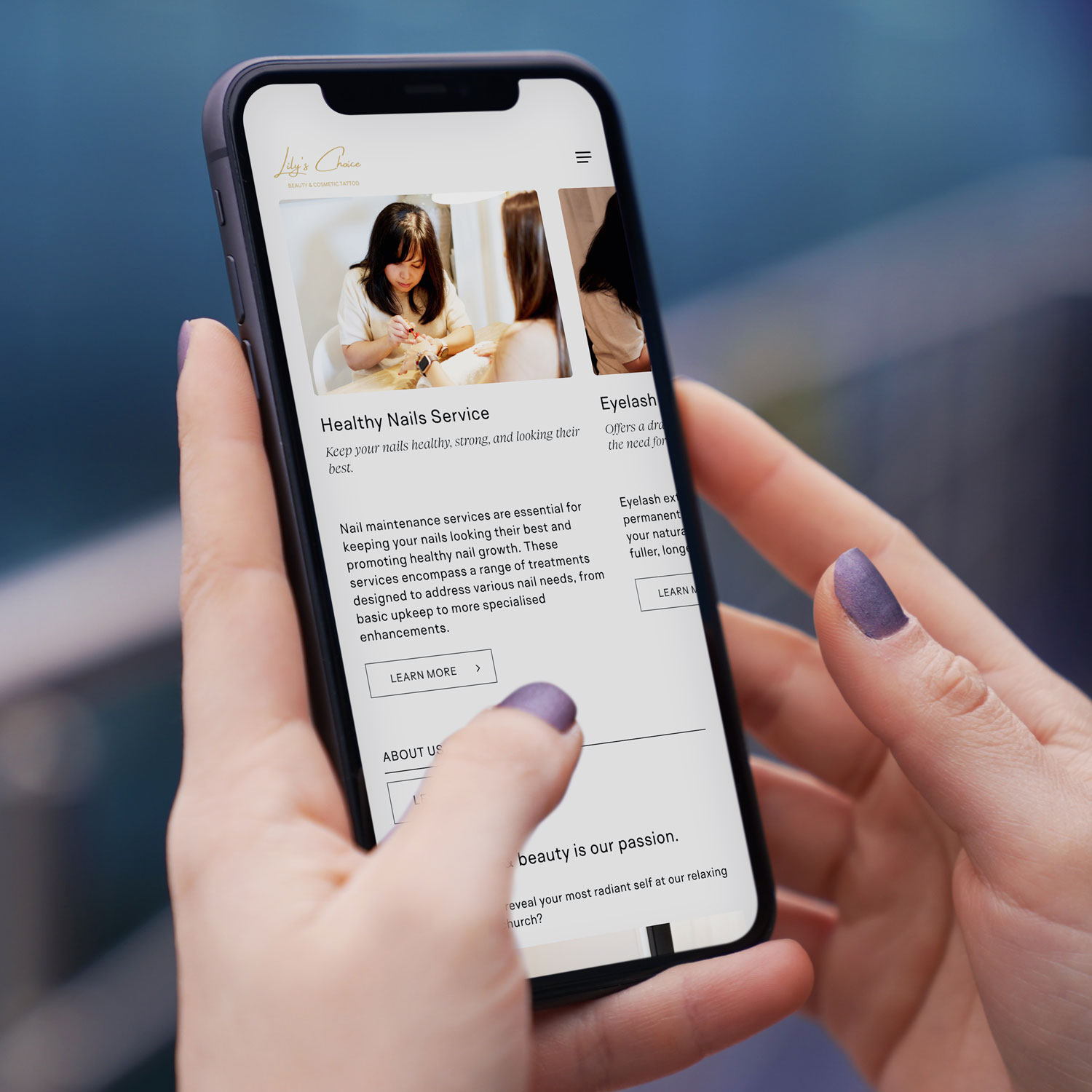
Mobile-first web design NZ example on smartphone for Christchurch based beauty & cosmetic tattoo business
Local Example

Lily’s Choice, Christchurch

A great example of conversion-focused website design in action is Lily’s Choice, a boutique beauty studio based in Christchurch. Lily’s Choice specialises in personalised cosmetic treatments designed to enhance natural beauty while making clients feel confident and cared for from the very first interaction.

When designing the website, the focus was on creating a calm, premium feel that reflects the in-studio experience, while also making it easy for visitors to understand services, build trust, and take the next step. Clear service descriptions, strong visual hierarchy, mobile-friendly booking pathways, and subtle trust cues were all built in to support conversions — especially for users browsing on mobile.

The result is a website that not only looks beautiful, but works as a practical tool for attracting and converting local Christchurch clients.

Final Thoughts: Conversion Is About Relevance and Trust

A high-converting website for Christchurch businesses isn’t about tricks or trends. It’s about:

  • Understanding local users
  • Building trust quickly
  • Making mobile effortless
  • Guiding visitors clearly
  • Removing friction at every step

When web design, SEO, and user experience work together, your website becomes more than an online brochure — it becomes a consistent lead-generation asset.

If your current website isn’t converting visitors into enquiries, it’s not a reflection of your business — it’s a sign your website needs a smarter, more locally focused approach. At Sky Media, we design high-performing websites built specifically for Christchurch businesses, combining conversion-focused design, mobile-first performance, and SEO that actually drives results. If you’re ready to turn your website into a consistent source of leads in 2026, get in touch with our team for a no-obligation chat about your goals.

Why a Fresh Website is Your #1 SEO Tool

Why Your “Set and Forget” Website is Hurting Your Business

By SEO, Web Design

You launched your website years ago. It looked great, showed off your services, and you hoped it would bring in customers. Then life and the day-to-day of running your business took over. Your website became that project you finished, and you haven’t touched it since—a digital “set and forget.”

Here’s the hard truth: that approach is now actively working against you. In the eyes of both Google and your potential customers, a static, outdated website signals a business that is no longer active, relevant, or trustworthy.

Why a Fresh Website is Your #1 SEO Tool

Think of SEO not as a one-time technical fix, but as an ongoing conversation with both your customers and Google. Updating your website regularly is how you keep that conversation lively, relevant, and successful. Let’s break down exactly why this is so critical, and how we’ve helped other Kiwi businesses transform their results by breaking the “set and forget” habit.

1. Google Rewards Freshness: The Algorithm Loves an Active Site

At its core, Google’s mission is to provide the best, most relevant, and most current answer to a searcher’s question. Which result do you think it will prefer when someone searches for “campervan hire NZ 2026” or “sustainable home builders Auckland”?

  • A website with “Latest News” from 2020.
  • A site with a regularly updated blog, fresh customer testimonials, and updated service pages reflecting current offers.

The answer is obvious. Google has a built-in “freshness factor.” By regularly updating your site, you send clear signals that it’s a living, active source of information. This can lead directly to a rankings boost, especially for time-sensitive or competitive searches.

In simple terms: A regularly updated website is like a shop with its lights on and fresh stock in the window. A stale site is like a shop with dusty shelves—people assume it’s closed or doesn’t care.

2. It’s Your Chance to Answer New Customer Questions

Your business evolves. The questions your customers ask evolve, too. A few years ago, people might have searched for “home builder.” Now, they’re looking for “energy-efficient passive home design” or “campervan hire with bike racks.”

If your website only has the old content, you’re invisible to people asking new questions. Regular updates allow you to:

  • Create new pages or blog posts that target these emerging trends and keywords.
  • Expand your service pages to reflect new offerings or FAQs you hear daily.
  • Showcase recent work to prove you’re actively excelling in your field.

Every new, relevant page is another front door to your business online. More doors mean more opportunities for customers to find you.

3. Updating Old Content: Your Secret SEO Weapon

Creating new content is great, but one of the most powerful strategies is updating and republishing what you already have.

That service page or blog post from a few years ago that used to get traffic? It might be slipping because it’s outdated. The process is simple:

  • Find it: Identify pages with potential that are now underperforming.
  • Refresh it: Update statistics, add new insights, include recent case studies or testimonials, and improve the images.
  • Republish it: Change the “last updated” date and share it again.

Why does this work? You’re taking a page that already has some SEO authority and making it 10x more valuable. It’s like renovating a well-located house instead of building on a new plot—the results are often faster and more dramatic.

Real-World Transformations: From Static to Strategic

These concepts might sound abstract, but their impact is incredibly concrete. Let’s look at two recent Sky Media clients and the tangible results of moving from a “set and forget” to an “always fresh” mindset.

Case Study 1: Kia Ora Campers – Driving Online Bookings Off the Chart

The ‘Before’ website: A Static Fleet List: The original Kia Ora Campers site functioned primarily as an online brochure. It listed vehicles and contact details, but the blog was hard to read, and key information for travellers (like detailed insurance explanations or current travel tips) wasn’t easily accessible. The site wasn’t actively working to answer the myriad questions potential renters have when planning a big trip.

Kia Ora Campers Website Before

The ‘After’ Strategy – Becoming a Travel Resource: We worked with Kia Ora Campers to shift their site from a brochure to a comprehensive travel hub. The strategy centred on consistent, valuable content updates:

  • A Visual, Editorial-Standard Blog: Moving beyond basic posts, we developed a blog with a magazine-grade design. Featuring compelling layouts, high-quality imagery, and scannable sections
  • Transparent & Detailed Content: Key pages were expanded with clear, reassuring details on insurance, bond processes, and what “fully self-contained” truly means for freedom camping.
  • Fresh Social Proof: The integration of recent, detailed customer reviews builds immense trust.

The Result: The site is no longer just a list of vans; it’s a trusted planning tool. By consistently publishing content that targets what travellers are searching for.

Kia Ora Campers Website After

Case Study 2: Integrated Homes – Building Authority in a Competitive Market

The ‘Before’ – A Generic Builder Site: Integrated Homes’ original site contained the essential information—they built quality homes—but it struggled to stand out in the crowded Auckland building market. The messaging was broad, and the site lacked the specific, expertise-driven content needed to attract clients looking for more than just a builder.

Integrated Homes Website Before

The ‘After’ Strategy – Owning a Niche with Expertise: Our focus was on positioning Integrated Homes as specialists, not generalists. This was achieved through targeted updates and content that showcased deep knowledge:

  • Highlighting Specialisations: We worked to clearly define and promote their service pillars, especially “Passive / Sustainable Homes,” moving it from a bullet point to a key differentiator. The content explains the benefits (like “saving up to 90% of your energy requirements”) in clear, compelling language.
  • Project-Focused Storytelling: The site now uses its house plans more effectively, presenting homes like “Your Own Elmshade Resort” or “Your Brick solid Windermere Home.” This tells a story of craftsmanship and results, not just showing pictures.
  • Building Trust through Transparency: Pages were updated to prominently feature certifications (LBP, NZCB Halo), clearly stating “Our team prides itself on our experience and quality craftsmanship.”

The Result: By consistently emphasising their specialised expertise in sustainable building and showcasing completed projects with narrative depth, Integrated Homes is able to attract clients who are specifically looking for their skill set.

Integrated Homes Website After

4. Building Trust and Authority: The Human Element

Regular updates build what Google calls EEAT (Experience, Expertise, Authoritativeness, Trustworthiness). This is shown through:

  • Fresh testimonials and case studies: Proof you’re doing great work now (as seen in both case studies above).
  • Industry commentary: Showing you’re engaged and knowledgeable.
  • Updated “About Us” and credentials: Like Integrated Homes’ builder certifications.
  • An active, helpful blog: Like Kia Ora’s travel guides, which build authority before a customer even picks up the phone.

A static website erodes trust. An active, updated website builds it with every visit.

5. Technical Health: Keeping the Digital Lights On

Websites are built on software that needs updates for security, speed, and mobile-friendliness. An outdated backend is a major risk and can slow your site down, causing both Google and users to bounce away. Regular maintenance is the non-negotiable digital equivalent of a Warrant of Fitness for your online presence.

“But I’m Too Busy Running My Business!” Your Action Plan

This is the most valid concern. You’re an expert in building or hospitality, not in content marketing. The key is to start small and be consistent, or partner with experts (like us) to handle it for you.

  1. Audit Your Key Pages: Pick your top 3 service pages. Are the descriptions, prices, and benefits accurate and compelling? Update them first.
  2. Add Fresh Proof: Upload your two most recent client testimonials or project photos this month.
  3. Revive One Old Piece: Find one blog post or page that has good history but old info. Spend an hour updating it.
  4. Schedule Time: Block out 90 minutes in your calendar next month to repeat this process. Consistency is everything.
  5. Talk to Your Experts: This is what we do at Sky Media. We become an extension of your team, creating and implementing a manageable, strategic update plan that turns your website from a static cost into your hardest-working business development tool.

In conclusion, your website is the heart of your digital presence. Just like your physical business needs ongoing care, your website needs regular attention to thrive. By committing to regular updates, you’re ensuring your business remains visible, relevant, and trusted. The transformation for Kia Ora Campers and Integrated Homes wasn’t magic—it was the systematic application of treating their website as the living, growing asset it truly is.

Ready to move from “set and forget” to “always growing”? Contact the Sky Media team today for a free, no-obligation website audit. Let’s build a plan that works for your business.

2025 Wrapped: A Year of Stories, Strategy & Sky-High Results

By Digital Marketing, Web Design

At Sky Media, years aren’t just measured in months, but in milestones. In the stories we’ve helped tell, the brands we’ve helped amplify, and the digital landscapes we’ve transformed. As we step into 2026, we’re pausing to look back on a year of incredible partnerships, creative breakthroughs, and results that have left a lasting mark.

This isn’t just our year in review—it’s a celebration of our clients’ vision and the tangible impact of aligning bold ideas with bulletproof strategy. From the high-stakes world of construction to the refined realm of single malt whisky, here are the projects that defined our 2025.

Geeves Scaffolding – Building a Digital Framework for Safety & Trust

The Challenge: In an industry built on physical safety and reliability, Geeves Scaffolding’s online presence wasn’t reflecting their market-leading stature. Their digital facade needed a complete rebuild to inspire the confidence of commercial clients and project managers.

Our 2025 Playbook: We approached this like a precision construction project. Our strategy was built on a foundation of trust and authority.

  • Creating a Industry-Leading Site: We designed a new website that was robust, user-friendly, and safety-first in its messaging. Clean lines, intuitive navigation, and powerful visuals of their projects in action replaced generic stock imagery.
  • Content that Holds Weight: We developed a content strategy focused on thought leadership — blog posts on compliance updates, case studies of complex projects, and guides on scaffold selection. This positioned Geeves not as a supplier, but as an essential partner in successful project planning.
  • Targeted Lead Generation: Through strategic Google Ads targeting high-value commercial construction keywords and Facebook campaigns aimed at project managers and tradies, we built a pipeline of qualified leads, not just clicks.

The Sky-High Result: Significant increase in qualified lead generation from digital channels, and a website that now serves as a 24/7 testament to their professionalism, directly contributing to new contract wins. We didn’t just build a website; we built a digital flagship.

Geeves Scaffolding Website Design

Epic Event Structures – Engineering the Foundations for Unforgettable Moments

The Challenge: Epic creates stages for New Zealand’s biggest events — from concert platforms to grandstand seating. However, their online presence wasn’t fully showcasing the engineering excellence, safety innovation, and creative design that sets them apart. They were being seen as a supplier of parts, not the strategic partner who builds the event’s foundational canvas.

Our 2025 Playbook: We shifted the narrative from simply listing services to showcasing masterful event infrastructure. Our strategy was built on demonstrating how their temporary structures are the critical, unseen hero of every successful event.

  • Showcasing the Scale & Precision: We transformed their digital portfolio into a showcase of engineering artistry. Using detailed case studies, we highlighted the process from initial design to on-site execution, emphasising their in-house engineering certification.
  • Content Built on Authority: We developed content that positioned Epic as thought leaders in event safety and logistics. This included guides on event planning compliance, insights into managing complex sites, and highlighting their nationwide reach with 16 branches, assuring clients they have the resources for any event, anywhere.
  • Targeting the Decision-Makers: Through strategic Google Ads campaigns and content aimed at event producers, festival directors, and commercial brand managers, we focused on the key concerns: safety, reliability, innovation, and creating that “wow factor” within budget.

The Sky-High Result: Website engagement from targeted commercial and event management sectors increased significantly, with time spent on key service pages doubling. Most importantly, inbound inquiries evolved from basic price requests to detailed consultations for custom, large-scale projects, reflecting the established position as premium partners for event infrastructure.

AOne Productions – Orchestrating Visual Narratives from Phuket to the World

The Challenge: AOne Productions, our esteemed client from Phuket, Thailand, possesses masterful talent across photography, videography, aerial and drone videos, and post-production. However, their diverse services were presented as separate offerings rather than a cohesive visual storytelling suite, making it difficult for international resorts, brands, and agencies to see them as a single, premier source for end-to-end visual production.

Our 2025 Playbook: Our mission was to harmonize their offerings into a compelling brand story that showcased Phuket-based excellence with world-class appeal, targeting an international clientele seeking premium visual content.

  • Unifying the Visual & Verbal Brand: We refined their messaging to present “Photography. Videography. Storytelling.” as interconnected chapters of one service. We developed a sleek, portfolio-focused website that showcased their stunning work—from cinematic resort promos and dynamic aerial footage of Thai landscapes to event videos —demonstrating seamless quality across all mediums.
  • The “Global Visual Partner” Pitch: We repositioned AOne not as a local vendor, but as a strategic visual partner for international clients. Our content strategy highlighted their unique advantage: the ability to produce high-quality visuals with the efficiency, local knowledge, and breathtaking backdrop of Phuket and Southeast Asia.
  • Strategic International Showcasing: We optimised their digital presence for global discovery, using targeted SEO for keywords like “international video production Thailand” and “premium aerial photography Asia.” Facebook and Instagram campaigns were strategically aimed at marketing directors of luxury hospitality brands, international ad agencies, and global corporations looking for stunning visual content from the region.

The Sky-High Result: AOne Productions brand is now clearly positioned as a top-tier, one-stop visual production house, successfully translating their Phuket-based talent into a powerful global value proposition.

AOne Productions Website Design

Alborania Decor & Design – Curating a Digital Showroom of Dreams

The Challenge: Alborania, a promising startup from Thailand, sells exquisite, custom-made decor with immense global appeal. However, their potential was locked behind a logistical barrier: without a direct-to-consumer sales channel, reaching their potential customers was complex and fragmented. They needed more than a digital brochure; they required a fully-functional, luxurious e-commerce platform that could seamlessly translate the artistry of their pieces into a trustworthy and convenient shopping experience.

Our 2025 Playbook: Our mission was to engineer a complete digital retail ecosystem. We moved beyond building a brand to building a sales engine, designing an online store that married inspirational storytelling with intuitive, E-Commerce functionality.

  • Designing a Conversion-Focused Experience: We architected the website as a premium digital boutique. The user journey was meticulously crafted: from immersive, high-fidelity product galleries with zoom functionality and lifestyle videos, to a streamlined checkout process with transparent shipping calculators. Every element was designed to build confidence and reduce purchase friction.
  • Product Narratives that Convert: We embedded powerful storytelling directly into the product pages. Each item’s description was crafted as a mini-narrative, detailing the artisan techniques, material provenance, and cultural inspiration behind the piece. This transformed product listings from simple specifications into compelling stories that justified value and fostered an emotional connection, directly encouraging purchase decisions.
  • Driving Direct Sales Through Paid Traffic: With a beautiful storefront built, we launched targeted social media campaigns. We used visually stunning carousels on Facebook and Instagram, targeting demographics interested in luxury interior design, artisanal goods, and Asian aesthetics, with a clear call-to-action driving traffic directly to product pages.The Sky-High Result: Alborania successfully transacted its first orders within weeks of launch. The platform established a direct, profitable sales channel, eliminating intermediary barriers.

The Sky-High Result: From a standing start, Alborania’s digital showroom generated significant traffic and high-intent inquiries within the first quarter of launch. Facebook and Instagram became their primary discovery channels, directly driving a sales pipeline.

Alborania Website Design

Laughing Owl Whisky – Distilling a Legacy in the Digital Age

The Challenge: Launching a premium spirits brand in a saturated global market is a monumental task. Laughing Owl Whisky needed to establish a legacy from day one – to tell a story so compelling it would justify a premium price point and cultivate a loyal following of connoisseurs and curious drinkers alike.

Our 2025 Playbook: We crafted a launch strategy steeped in legend, locality, and luxury. Every element was designed to bottle the essence of their story.

  • Story as the Spirit’s Soul: We built the entire brand narrative around the enigmatic Laughing Owl (Whēkau), its haunting call, and its connection to the untamed spirit of Aotearoa. This wasn’t just whisky; it was a liquid story.
  • E-Commerce Engineered for Exclusivity: The launch campaign was integrated directly into a high-conversion website. We built advanced e-commerce functionality including limited-release product queues, real-time inventory counters, and a robust waiting list system to manage high demand and create scarcity. The checkout process was optimised for clarity, with detailed information on regional shipping.
  • E-Commerce Engineered for Exclusivity: The “Parliament” membership is the central e-commerce feature. This copy-driven strategy creates digital scarcity and community, encouraging immediate action. The website copy, from the evocative product description (“Mānuka smoke… Mānuka wood… uniquely bold flavour”) to the clear “Buy Now” and “Become a Member” calls-to-action, is designed to guide visitors from story to sale without external media.The Sky-High Result: Launch day delivered extraordinary demand, with the first wave of inventory moving swiftly and driving immediate, high-value sales through the new platform. The launch established Laughing Owl not as another whisky, but as a coveted New Zealand icon in the making.

The Sky-High Result: The platform’s launch generated powerful initial sales momentum and has sustained significant, ongoing demand. The strategic copywriting and “Parliament” membership model successfully converted brand story into commercial action, building a robust waitlist of engaged customers.

Wrapping Up a Year of Transformative Partnerships

2025 at Sky Media reaffirmed a core belief: powerful digital marketing is never just about clicks and conversions. It’s about understanding the soul of a business.

These five highlights are a testament to the collaborative spirit we share with our clients. Here’s to the stories we told, the challenges we tackled, and the results we achieved together. As we look to the horizon, we’re excited to write the next chapter of innovation and impact.

Ready to make 2026 your brand’s most impactful year yet? Let’s talk about your business.

A productive partnership between a business owner and a NZ web designer, discussing a project plan.

Choosing Your Web Design Partner: 12 Essential Traits of a Top NZ Agency

By Web Design

A quick search for “best web design agency New Zealand” returns hundreds of options. From one-person freelancers to full-service digital studios, the choice can be overwhelming. How do you cut through the noise and find a true partner, not just a vendor?

A productive partnership between a business owner and a NZ web designer, discussing a project plan.

The key is to stop looking for a “designer” and start looking for a “business partner.” You need an agency that understands your goals, your audience, and the unique nuances of the New Zealand market.

After years of seeing what makes a website project succeed or fail, we’ve compiled the 12 non-negotiable traits you should look for when choosing your local web design partner.

1. A Stellar Portfolio with Real-World Results

Any agency can show you pretty pictures. A top-tier agency will show you effective websites.

Look Beyond Aesthetics: Don’t just ask, “Do I like how this looks?” Ask, “What did this website achieve for the client?” Look for case studies that detail the business problem and how the website solved it.

Relevance to Your Industry & Scale: An agency that only designs for large corporates might not be the best fit for a small business, and vice-versa. Seek out portfolios with projects similar in size and complexity to yours.

Diversity and Quality: A strong portfolio shows range but maintains a high standard of quality. It demonstrates the agency can adapt its skills to different brand voices and business models.

Mobile First web design Hamilton for WME
Geeves Scaffolding Dunedin Branch website

2. A Process Built on Strategy, Not Just Art

A beautiful website that doesn’t convert visitors is a work of art, not a business asset. The best agencies lead with strategy.

The Discovery Phase: Your first meetings shouldn’t be about colour palettes. They should be about your business goals, target audience, key competitors, and what “success” means for you. A rigorous discovery process is the foundation of a successful project.

Ask “Why?”: A strategic partner will always be able to explain why they are making a specific recommendation. “We’re placing the call-to-action here because eye-tracking studies show…” is a far better answer than, “Because it looks good there.”

3. Mastery of User Experience (UX) Design

User Experience (UX) is the silent salesperson on your website. It’s the science of making your site intuitive, easy to use, and enjoyable for your visitors.

It’s About the Journey: A great UX agency will map out the entire customer journey—from a user’s first click on a Google ad to finally making a purchase or filling out a contact form. They remove friction at every step.

Mobile-First Mentality: In New Zealand, mobile internet usage is dominant. Your agency must design for mobile first, ensuring a flawless experience on smartphones and tablets before scaling up to a desktop view.

4. Expertise in Search Engine Optimisation (SEO)

What good is a stunning website if no one can find it? SEO should be baked into the design and development process from day one, not tacked on as an afterthought.

On-Page SEO Fundamentals: The agency should have a proven process for optimising page titles, meta descriptions, header tags, image alt-text, and URL structures.

Technical SEO: This is the behind-the-scenes magic. It includes site speed optimisation, clean code, mobile-friendliness, and a logical site structure that search engines love.

Local NZ SEO: If you serve local customers, your agency must understand local SEO. This includes optimising for Google Business Profile, ensuring consistent NAP (Name, Address, Phone Number) citations across the web, and understanding local search intent.

SEO results Sky Media delivered to our customers

5. A Focus on Conversion Rate Optimisation (CRO)

Your website should do more than just attract visitors; it should persuade them to act. This is Conversion Rate Optimisation (CRO).

Clear Calls-to-Action (CTAs): Are buttons compelling and placed strategically? An expert agency will design CTAs that stand out and guide users.

Trust Signals: Do they incorporate customer testimonials, trust badges, case studies, and logos of clients you recognise? These elements build credibility and reduce hesitation.

Data-Driven Design: The best CRO decisions are based on data, not guesswork. Your agency should talk about using Google Analytics to inform design choices.

6. Transparent Pricing and Clear Contracts

Surprise costs are a major red flag. A professional agency is transparent about its pricing and what’s included.

Detailed Proposals: The proposal should break down costs for strategy, design, development, content, and testing. It should clearly state what is not included (e.g., premium plugins, stock imagery, hosting).

Project vs. Retainer Model: Understand how they charge. Is it a fixed project price or an ongoing monthly retainer? Both are valid, but the model should be clear.

The Contract: The contract should protect both parties and clearly outline the project scope, timelines, payment schedules, and ownership rights (you should own the final website and its content).

7. A Content Management System (CMS) You Can Use

Your website is a living asset that you’ll need to update. The agency should build it on a user-friendly Content Management System (CMS).

WordPress, Shopify, or Custom?: In New Zealand, platforms like WordPress and Shopify are popular for a reason: they are powerful and relatively easy for clients to manage. Be wary of agencies that push for a fully custom, proprietary CMS that locks you in with them forever. Have a look at our CMS comparison post.

Training and Handover: A good partner provides thorough training on how to use your new CMS. You should feel confident making basic text, image, and page updates on your own after the project is complete.

8. A Collaborative, Partnership Mindset

This is a partnership. Your insights into your business are invaluable. The best agencies listen more than they talk.

Your Role as the Expert: You are the expert on your business, your customers, and your industry. The agency is the expert on design, UX, and technology. The magic happens when these two areas of expertise collaborate.

Open Communication: Ensure they have a clear process for communication. How often will you have status updates? Who is your single point of contact?

9. Technical Proficiency and Future-Proofing

A website is a technical asset. The agency must build it with modern, secure, and scalable code.

Website Speed: A slow website loses visitors and hurts your SEO. Ask the agency about their specific strategies for optimising site speed (e.g., image optimisation, caching, clean code).

Security: With cyber threats on the rise, security is paramount. They should discuss their approach to SSL certificates, regular security updates, and secure hosting environments.

Scalability: Your business will grow. Your website should be built on a foundation that can grow with it, handling more traffic, products, or content without needing a complete rebuild.

10. A Clear Post-Launch Support Plan

The project isn’t over when the website goes live. What happens next is critical.

Hosting and Maintenance: Do they offer ongoing hosting and maintenance plans? A website needs regular updates to its core software and plugins to remain secure and functional.

Bug Fixing Warranty: Most agencies offer a warranty period (e.g., 30-60 days) after launch to fix any bugs that appear.

Ongoing Partnership: The best client-agency relationships continue long after launch. Look for a partner who can support your digital growth with ongoing marketing, SEO, and content creation services.

11. Reviews and Verifiable Testimonials

What are their past clients saying? Authentic social proof is one of the most powerful indicators of a quality agency.

Google Reviews & Case Studies: Check their Google Business Profile for reviews. Read their detailed case studies on their website. Do the testimonials speak to the agency’s strategic value, or just their design skills?

Sky Media 5-Star Google reviews from our clients

12. Cultural Fit and Local Understanding

Finally, don’t underestimate the importance of personality and local context.

Do You Like Working With Them?: You will be spending a significant amount of time communicating with this team. Choose an agency whose values and communication style align with your own.

The Local Advantage: An agency based in New Zealand inherently understands Kiwi culture, consumer behaviour, and the local business environment. They get the subtleties — from public holiday trading hours to regional nuances — that an overseas provider would likely miss.

Your Next Step: From Searching to Selecting

Armed with these 12 criteria, your search for the “best web design agency in New Zealand” can now be a strategic evaluation, not a guessing game.

Create a shortlist of 3-4 agencies that seem to fit the bill. Then, use this list as a scorecard during your initial consultations. Ask pointed questions about their process, their approach to SEO and CRO, and their post-launch support.

The right agency won’t just see you as another project. They will see you as a partner and will be genuinely invested in using their skills to help your business thrive online. By choosing a partner who excels in these 12 areas, you’re not just buying a website—you’re investing in one of your most valuable business assets.

You’ve read the checklist. Now, see the difference.

Schedule a free, no-obligation consultation with the Sky Media team. Let’s discuss your business goals and show you how our strategic approach to web design can build a website that doesn’t just look great — it drives real growth.